Search results
-

the REAL profession level for maxing items (weapons)
Would be lovely, thanks Witte. :) @jenny Actually, I don't even buy weapons these days :) OFC everybody should double-check the info. But sometimes newbies don't, sometimes people are to eager. Sometimes you can forget or whatever. The point is that this info really should be more "visible" :)...- DuncanS
- Post #21
- Forum: Entropedia/EntropiaWiki
-
the REAL profession level for maxing items (weapons)
Last time I checked, 25% of 20 was 5 :) Or maybe it's 25% of level at which SIB starts? :) I've been using Entropedia for a long, long time and haven't really seen anything about items maxed at SIB+25%. I don't say that it's not out there, but WHERE is that information anyway? You mind showing...- DuncanS
- Post #17
- Forum: Entropedia/EntropiaWiki
-
the REAL profession level for maxing items (weapons)
I'm 100% sure you guys are right with the high-level-super-sweet weapons (that they have no data on entropedia because almost nobody uses them, and if they do, they don't brag about it on the site) However, what we really need is to check what's up with whole maxing the weapon thing. I'll soon...- DuncanS
- Post #14
- Forum: Entropedia/EntropiaWiki
-
the REAL profession level for maxing items (weapons)
I'm not sure you understand what I mean. The thing is that on the site it's said that EnKnuckles are maxed at level 5. That is correct for SIBs, (Hit Ability, Critical Hit Ability and Damage) but maxing out SIB does NOT mean that you have maxed out the weapon because you don't reach max Attacks...- DuncanS
- Post #10
- Forum: Entropedia/EntropiaWiki
-
the REAL profession level for maxing items (weapons)
As you can see from the screenie - no, my Dmg Brawler is not lvl 5. It's about lvl 8 or sth like that. Will check it later if you need precise data.- DuncanS
- Post #7
- Forum: Entropedia/EntropiaWiki
-
EU World Boxing Championships - Draw, Results and Schedule
Sorry, but I couldn't help to notice :) Cyc = tit in Polish ^^ Anyways, I can't promise anything, cause Lilly's my first opponent :) GL to all! -
the REAL profession level for maxing items (weapons)
I probably could add a column myself but wanna consult with people before altering anything :) I might check it later, because now I have lots of exams to take care of, but it will be going through my mind, I'm sure. Like I said many times on EF, MA has some favorite formulas they apply to...- DuncanS
- Post #3
- Forum: Entropedia/EntropiaWiki
-
the REAL profession level for maxing items (weapons)
Entropedia states that TT fist (Castorian EnKnuckles-A) is maxed at level 5. That's correct. Partially. Yes, at level 5 (Brawler) you do max: damage interval, hit ability, critical hit ability. At this point SIB no longer works. However, you still haven't got attacks per minute maxed. I...- DuncanS
- Thread
- Replies: 22
- Forum: Entropedia/EntropiaWiki
-
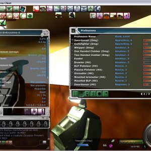
TT First at Brawler levels (HIT = 5, DMG = 8)
It's obvious, that it's NOT maxed at level 5. Of course SIB is available till 5th level, but it AIN'T maxed at that point.- DuncanS
- Media item
- Comments: 0
- Category: Items
-
EU World Boxing Championships - Draw, Results and Schedule
http://graphicssoft.about.com/od/microsoft/ht/snippingtool.htm - how to take screenshots using Vista/7 tool http://graphicssoft.about.com/cs/general/ht/winscreenshot.htm - capturing screenshots in any Windows appears Vista/7 have blocked programs from taking screenshots, because many people... -
EU World Boxing Championships - Draw, Results and Schedule
If Oleg's OK with it then... I'd like to announce unofficial warmup between 10:00 and 12:00 MA time at Billy's Spaceship Afterworld, both Saturday and Sunday. People who do not particiapte are also welcome. You OK with that Oleg? EDIT: Oleg approved, so let's roll :) -
Forum Transition: Status Update
Bottom of the page: 1. shouldn't there be a background in "bookmarks" section? 2. Contact us, privacy, ToS, portal etc. links are NOT clearly visible at all. Besides, there's waaay too much space between blocks (menu, menu2, banner, header etc.) it's a waste of place and time for scrolling...- DuncanS
- Post #109
- Forum: About PlanetCalypsoForum
-
Forum Transition: Status Update
First of all, some icons are not displayed (add rep, report post, multi-quote) EDIT: visible now. Second of all, I wonder if anyone can explain on thing to me. EF was NOT about calypso. It was about in-game mechanics, blueprints, hofs, chats and first of all - PLAYERS. So what are you...- DuncanS
- Post #17
- Forum: About PlanetCalypsoForum
-
Uber fighters (221+ HP) needed for EU World Boxing Championships!
it was a rethorical question :) but still I wonder why he wrote it :P -
Uber fighters (221+ HP) needed for EU World Boxing Championships!
I thought that fists can be tiered, they just can't be enhanced, am I right? I mean that they can have tier > 0.0 but no enhancer in it. 983?! :eek: Is it really possible? :P -
EU World Boxing Championships - Draw, Results and Schedule
1. I agree it's kinda short, but a) you could send him a PM that you won't be online for a few days right after registration. Some dude said he won't be able to participate on oct 2nd between x and y, 2 weeks earlier. I don't think it would be such a difficult thing to send that PM right after... -
-
EU World Boxing Championships - Draw, Results and Schedule
Actually you're right. I feel like a smart guy (in a positive meaning :) Seriously though, that's not very feminine nor polite approach you know. Making a mistakes is not a bad thing. But pushing guilt on others is quite childish. Reminds me of a child in a sandbox saying: "fine, I'm taking... -
No problem, I can't stand people who act like kids - in a bad way of course :) The comparison is...
No problem, I can't stand people who act like kids - in a bad way of course :) The comparison is justified due to fact that some people just can't read and understand what's written. But hey, Internet sometimes IS like a pre-school :) Maybe that's good, who knows.- DuncanS
- Profile post
-
EU World Boxing Championships - Draw, Results and Schedule
Lol dude, you've got to be kidding me. It was in the FIRST post. I guess that if you sign up for something you should read the terms, right? So I believe that if you read HOW TO REGISTER in the event, you could as well read the few lines below, am I right? No hard feelings, but your reply is... -
EU World Boxing Championships - Draw, Results and Schedule
Sweet :smoke: You better forfeit youself or you will forfeit and be forfeited :] :boxer: -
Uber fighters (221+ HP) needed for EU World Boxing Championships!
I'm pretty sure I get your point, I was saying absolutely the same. BUT :) I was using this argument to REANIMATE super heavyweight. People wouldn't join SHW because 1 guy has 300 HP. So Oleg resigned from this category and joined it with Heavyweight. The problem is that it creates even bigger... -
Uber fighters (221+ HP) needed for EU World Boxing Championships!
You almost killed me :D It's not about that at all. It's about creating something unique, making EU a special place where something actually happens, people participate, have fun and learn. It's just that most people don't want to participate not because they REALLY DON'T WANT TO, but they... -
Event: EU World Boxing Championships 2010 – Sponsored by FPC
Hm. Probably won't make it as it will take about 30 more mins to download :/ As I believe the results of the draw will be posted today? Whos, wheres and whens? :) -
Uber fighters (221+ HP) needed for EU World Boxing Championships!
I'd say take your chances. There ARE some MAJOR reasons: entrance is FREE costs are like few PEDs on weapon - that's all you can win (or at least compete) for some cool stuff you can meet lots of ppl you can learn some techniques. They may be usefull when hunting (tricks to increase your...