- Joined
- Jul 8, 2009
- Posts
- 1,797
- Location
- Sweden
- Avatar Name
- Formerly "Darkaruki Dorkaruki Kakiro"
1. Weapons should not have their efficiency values written on top of the gradient bar, it's not intuitive at all and feels very poorly designed.
Image showing this:
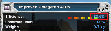
2. It would really be nice if it went one decimal place further, like 51.54% instead of 51.5%, I don't believe one limiting it to one decimal place has much purpose and I feel as though it isn't very precise the way it is currently.
I hope these two suggestions are taken into consideration and we can see this some improvements here at some point before I spend 10-20 hours adding Efficiency values for items that aren't nearly as precise as they could and should be, while being forced to squint extremely hard over and over for every item above 70-80% efficiency.
Image showing this:
2. It would really be nice if it went one decimal place further, like 51.54% instead of 51.5%, I don't believe one limiting it to one decimal place has much purpose and I feel as though it isn't very precise the way it is currently.
I hope these two suggestions are taken into consideration and we can see this some improvements here at some point before I spend 10-20 hours adding Efficiency values for items that aren't nearly as precise as they could and should be, while being forced to squint extremely hard over and over for every item above 70-80% efficiency.
