Recent content by Remus
-

mining data 2012
More than a year ago I made an app similar to LBML to track my mining visually and collect distribution data. Chart is showing some 90k+ drops over a period of more than a year now. Most of them were double drops (both ore and enm) so that explains why chart X axis ends at ~49200. Red marked...- Remus
- Post #184
- Forum: Loot Theories
-
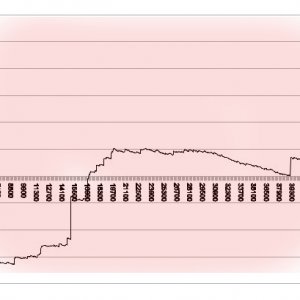
Mining journey
- Remus
- Media item
- Comments: 0
- Category: Misc pics (EU related ONLY)
-
Entropia Universe 14.0.1 Release Notes
Hoverpod was nerfed and fixed back in a day. Spear v1 still sucks donkey balls big-time.. no need to hurry.. only months have passed.- Remus
- Post #105
- Forum: Content Releases/VU Info
-
Potentially serious Auction problem
Select Magerian Spray under enmatters on the left hand side manu of auction. Sort by value and some unrelated new items start appearing. Wrote support case few mins ago.- Remus
- Thread
- Replies: 2
- Forum: Bug Reports
-
Hidden Changes?!
Their first mistake was to introduce it with specs as they did.. as they messed up (crafters and thus miners) with giving free vehicles etc But it was a right thing to fix it. I am saying that as someone who bought 2 of those and used them to this day. Demonic is now perfect complement for...- Remus
- Post #10
- Forum: Mining & Resource Gathering
-
Info: Demonic Excavator MKI (L) nerf/rebalance
Its excavation efficiency is now maxed at 0.6 Although it is a nerf for those who already bought some of those (like me), its IMO also a logical rebalance for game as a whole. Hopefully we will get all the other logical improvements/rebalances which are long overdue.. like bugged amphibious... -
Trouble logging?
~24 hours later, periodic failed attempts to log in and without attempting to "fix" anything I managed to log in just now. This was very strange and obviously server side.- Remus
- Post #2
- Forum: General Discussion
-
Trouble logging?
Anyone else has trouble logging to game? All of a sudden I lost connection.. failed to reconnect with message that EU is "under upgrade or maintenance" but no such message in client loader which also states that "all systems are online". And forum seems pretty empty too. Anyone else?- Remus
- Thread
- Replies: 1
- Forum: General Discussion
-
Hidden cost of Spear vehicles or ... ?
Thats why I posted exactly here. It is for vehicles thread but also possibly for bugs. And when I failed to find any previous mention of this I decided to post here. Mods will hopefully understand this and desist from moving. -
Hidden cost of Spear vehicles or ... ?
Few days ago I bought Spear v1 (15ped tt). I noticed that it losses its structural integrity for no foreseeable (to me at least) reason while driven. I am not hitting walls nor trees nor even small objects on the ground and it sporadically loses 3 structural points at the time. And not always... -
Stop the Auction !!!.Bug in Auction Orders.
Thats normal.. loot pool is empty after VU release reset :flip:- Remus
- Post #24
- Forum: Bug Reports
-
Entropia Universe Release 12.8 Delayed
.............. :3- Remus
- Post #6
- Forum: Entropia Universe News
-
-
!!SCAM!!: http://www.entropiauniverse.net84.net/
@SeanJohn You were faster :D -
!!SCAM!!: http://www.entropiauniverse.net84.net/
Dangerous scam attempt. Warn everyone! Few mins ago I got a friend request from avatar "Welcome to Promotion". I accepted it and got message: Wellcome!This is promotion. Your account will be recharged for 100PED.Log on to activate www.entropiauniverse.*****.com Warn everyone, especially new...