Just a heads up about the VU and the UI + Lab update

Since you asked for feedback, here's some preemptive feedback from me as a player that uses the auction and shops a lot:

---Message Center:
One of the most frustrating things for me has been that shop sales notifications are gone forever once you click 'ok'. You will never be able to go back and see what you sold and to who as it's permanently erased. Saving them (by not clicking ok) is completely pointless as far as I'm concerned since there is no search function in the message center. Here's what mine looks like so you can better understand the situation:

index.php

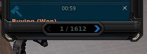
That is showing 1612 pages of available records, 1612 PAGES! There's 20 records per page, which means if I want to go back to find that one time I sold some Manufacture Armor skills last year, I'll have to sift through 32,240 individual records to hopefully get lucky and find it.

Without a search function, keeping this many records in memory is totally pointless as far as I'm concerned.

Ideally, you will add a new section in the message center for shop sales notifications (and fix LAs and Monria so we can actually see who bought the items), add a search function and keep all records going back 1 year like you do for everything else already.

---Shops:
I've made a list of some things I would like to see changed/improved, mostly quality of life improvements for shoppers and shop owners. You can see that list in this post.

But the 2 things I would really like to see asap are:
- Being able to set price as %mu for limited items instead of peds in decimal format, it's a guessing game everytime and takes multiple tries to get it right.
- Being able to move an item from one place to another without losing the set price and having to set it again. If I right-click an item and select "place" in order to move it, why do I lose the retail price I set, it shouldn't.

---Auction:
Well there's a whole list of functions which I've compiled here. The community has been very clear about what features they would like to see added to the Auction House.

---Crafting:
All my crafting functionality/UI improvement suggestions here.

Cheers,
Legends
They could also give us same option in Message center as we have in Main chat and let us save to text file.
 
---Shops:

- Being able to set price as %mu for limited items instead of peds in decimal format, it's a guessing game everytime and takes multiple tries to get it right.

I think it would be great to have both the current TT+notation and the % option available. In the meantime, it's not too hard to calculate the shop fee itself, and if you want to do a little algebra, you can back-calculate in a spreadsheet what you should set for a TT+ amount if you want to target a certain MU % price that the customer sees.
 
Good info, hopeful to see what is coming. Hopefully gets rid of last camera update. Make people actually play the game again.
 
Computers are supposed to make our lives easier. Obviously, unufain8 doesn't need anything like that. Must be nice to live like that.

Again why would you search for a sold item from 3 years ago?
 
Again why would you search for a sold item from 3 years ago?

I never said 3 years, I don't know where you're getting this from...?

Everything in the PED Flow center and Message Center is being saved for 12 months. I don't see any reason for keeping it any longer than that.
 
That is showing 1612 pages of available records, 1612 PAGES! There's 20 records per page, which means if I want to go back to find that one time I sold some Manufacture Armor skills last year, I'll have to sift through 32,240 individual records to hopefully get lucky and find it.

1 year 3 years same thing. Search function should pe implemented elsewhere like sticky notes, inventory or storage.
 
1 year 3 years same thing. Search function should pe implemented elsewhere like sticky notes, inventory or storage.

Sure, there should be a search function for sticky notes as well. There should also be a search function for auction notifications and shop sales notifications. I don't understand why it would have to be one or the other.

When your primary activity in Entropia is managing and stocking shops like me, you'd find it pretty darn essential. I didn't think I'd have to explain this but I guess I will:

1. A guy pm's me and compliments me on my shops and says he is a big customer and wants to negotiate a better price on an item. I have at least 10k peds worth of sales every week, I am not going to be able to remember the names of every single avatar that has bought things from me in the past. But if I had a search function I could just type his name in and see if what he says is true.

2. I have 3 large shops full of armors on the 2nd floor at TP mall, I'd like to see which one has the most sales. I can't know for sure right now unless I track every sale manually (which I don't have time to do). But if I had a search function I could type "shop #11L", pull out a calculator and add up the sales for the last month, do the same for "shop #4L" and "shop #1L"..

3. I can't remember what I priced a specific Armor at since it's been so long since the last time I put one up for sale. If I had a search function, I could enter the name of the Armor and see all of the previous sales for that armor.

4. A guy pm's me and says he bought his Perseus from my shop and wants to know if I'd buy it back from him (believe it or not, this has actually happened). I have no way of knowing if what he says is true or not. But if I had a search function I would.

5. Loyalty programs for repeat customers.

6. etc... there's plenty of reasons to have this, otherwise everything has to be entered manually. Let the computers do the work, like Aloisius said earlier.

Legends
 
Sure, there should be a search function for sticky notes as well. There should also be a search function for auction notifications and shop sales notifications.

deleted some quote cause was too large

Legends

Yeah it makes sence. I never thought like that but tnx for explaining.
 
That is showing 1612 pages of available records, 1612 PAGES! There's 20 records per page, which means if I want to go back to find that one time I sold some Manufacture Armor skills last year, I'll have to sift through 32,240 individual records to hopefully get lucky and find it.

\
^^^^ This I asked for this in the AMA but the response was , maybe in the future
 
Hey, will the new UI come with any analytics for your character?

Like in Codex it might tell you:
- How many total kills you have on that mob
- How much total damage you've done
- How many times you've landed shots
- How many times you've missed
- How many times they've dodged/evaded/jammed
- How much damage the mob has done to you
- How many times the mob has hit you
- A list of loot you've collected from the mob
- A ped total of the loot you've collected
- Etc

Will the new UI also calculate DPS properly on weapons when you add enhancers/amps?

Honestly these are really the only type of things I want to see in the new UI... More analytics and stats. Otherwise it's just really a waste of dev/designer time just to pretty things up. Also, better server/networking code and move to Unreal Engine so we can have big battles with a ton of players like PlanetSide 2.

Cheers and I look forward to giving feedback after the teaser/release!
 
Seems like you are the only one who didnt get bamboozled
We have had some very negative experiences before when they update the UI/UX. The game became unplayable at least twice in the past. That's why there is some apprehension when they casually mention UI Updates are coming... Or course there are are many other negative things they can do as well in a VU :cry:

Sigh :cautious:
 
A good UI should perhaps give info on any tool in game on how much decay it has and how many usages left (instead of using Wiki for such).
 
I also would like to clarify since I notice a lot of you are as worried as you are excited about the UI update:
  1. The video will be published sometime after the VU (and it will be published before the UI update is implemented since we want feedback from you all)
  2. The major change in the UI update will be the appearance of the UI = our aim is to make the appearance more consistent. But there will be a few other changes as well, but please know the most major change will be the appearance.

Please take out the ability for people to abuse the auto target (F), we really need this change to make Entropia game again, it's a bot fest right now, if you didn't know.

Thanks,
Emir
 
I also would like to clarify since I notice a lot of you are as worried as you are excited about the UI update:
  1. The video will be published sometime after the VU (and it will be published before the UI update is implemented since we want feedback from you all)
  2. The major change in the UI update will be the appearance of the UI = our aim is to make the appearance more consistent. But there will be a few other changes as well, but please know the most major change will be the appearance.
Whew, I feel a little better... I know I’m only just one voice/one player, but I basically play via remote exclusively, so I get concerned with functionality of the interface though Splashtop.
Looking forward to the preview, good luck to us all! :)
 
Last edited:
My guess is that the only thing that is going to change is the windows, so they all look the same. So make a screenshot of your loot window with the dead mobs on the corner. because it's going to change into a rectangular shape.

index.php
 
Do the windows, bars etc. remember where we place them or will they as in this VU come at a predefined place even though it is in a unsuitable places like Auction sell Window which is placed on top of the auction window from where you have to drag it away to see other auctions for MU.
Or the health bar of your Sleipnir etc. which in my GUI is always placed over the Radar even though I move it away from it?

Will it be possible as in the GUI before this one to go through all the mobs on radar and not switch between only a part of the visible mobs and suddenly it switches also to other mobs once in like 20 next target clicks while only 5 mobs are on radar and it first cycled only between 3 of the 5.

Will it be possible like in the GUI before the last one to easy change the Viewpoint of your avatar? It was f.x. that while you shot a mob I could click on the mouse wheel and hold it while moving the mouse around and then the viewpoint was where you released the mouse wheel, to go back to view from behind you could use mouse wheel to zoom in/out and where placed again behind your avatar where you started.

Another bug which they, MA, never corrected is that when you create a item set it goes to default(*) Item Set and not to the Set you have currently selected. So to place the Icon of your current armor Set you allways have to first go to edit GUI then switch to the Set, f.x. third, you want to place the icon then click on the icon to make a icon for the armor you wear and then you can write the name and place it on the desktop. Befor you simply could click on the icon name it and place it.

As a software developer I would never ever be allowed to make a feature so much more complicated to use when it was working and was a lot easier to use but here it is the other way around if something is working very well, for example the "select next mob", "select previous mob" keys, they make it less usable as the stripped away the function "select previous mob" and made the cycle trough mobs not even cycling trough all mobs on radar but randomly between a subset of them and suddenly also to others not in that subset you are switched to randomly.

My biggest fear now is that they wiggel around with GUI etc. again and stop halfway trough and we have to adapt again to a GUI which is even worse than the current one to which we adapted during tha last years.
 
Last edited:
Keep it like the old compact UI. It was awesome and I miss it so much. Now its all clutter and too big UI.

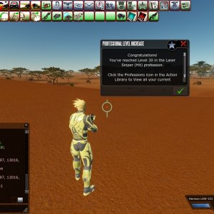
See below this old picture from 2012 that I found on my PC. Shows chat which was best compact chat at the time. Plus the prof level up so much better than the current messy big message center info.


Current chat window has an "auto fade" option that hides the ugly big border, but it should also have an persistent auto fade option so the borders will never show. It would be a lot better then.
 
'My' already said this is more about appearance then changing how the UI works.

Your suggestion to change how targeting works is not a thought out idea and will lead to overall less hunting which equals less income for MindArk. Not to mention there are players that may have a handicap and changing how targeting and playing works can make the game unplayable for them, I myself took a 2 year vacation after the initial camera changes made around 2017.

Right the problem back then was that the new "improved" GUI had a lot of features which do not wotk but where working in the GUI before or several features where removed without any replacement for that feature. So last time we had a GUI change it was several steps in the wrong direction, less usability than the GUI we had, because everyone had to learn a new GUI which had less features than the old one and does not work as intended. Even today several years after introduction. it still dose not remeber from all Bars(Vehicle f.x.) or windows where you place them, it still misses mobs while cycling trough them and so on and so on.
 
  • Like
Reactions: Pi-
The more customization options we have the better. Size, placement and foremost the option to turn something on/off.

If the devs had spare time for ideas, I recommend this one game Diabotical from Epic, its free.
 
Keep it like the old compact UI. It was awesome and I miss it so much. Now its all clutter and too big UI.

See below this old picture from 2012 that I found on my PC. Shows chat which was best compact chat at the time. Plus the prof level up so much better than the current messy big message center info.


Current chat window has an "auto fade" option that hides the ugly big border, but it should also have an persistent auto fade option so the borders will never show. It would be a lot better then.

I miss having voice chat in the game! It was cool being able to stream music out of your avatar :D
 
I also would like to clarify since I notice a lot of you are as worried as you are excited about the UI update:
  1. The video will be published sometime after the VU (and it will be published before the UI update is implemented since we want feedback from you all)
  2. The major change in the UI update will be the appearance of the UI = our aim is to make the appearance more consistent. But there will be a few other changes as well, but please know the most major change will be the appearance.

I mean, honestly, I hope MA is overhauling the UIs for better reasons than just appearance...

I would hope that MA has taken this opportunity to improve the code for how these interact with one another and function. The experience of the player is ultimately more important than the appearance. Sure the Interfaces are not uniform in appearance, e.g. the Auction and HoF UIs seem to match in appearance but are very different than for example the Professions window and Society window, of course that's a bit odd and should be remedied at some point, but ultimately the experience is more important... So function is senior here to looks. I would hope...

Yup. Never in a million years would I complain when I see MA trying to improve the game and experience. Hope it works. Hope even more that it works better!
 
Back
Top