You are using an out of date browser. It may not display this or other websites correctly.
You should upgrade or use an alternative browser.
You should upgrade or use an alternative browser.
Do you consider this armor better looking now?
- Thread starter True Juan
- Start date
ColonelBuckshot
Prowler
- Joined
- Apr 24, 2012
- Posts
- 1,260
- Location
- Australia
- Society
- AO
- Avatar Name
- Wilburforce ColonelBuckshot Buckshot
I got Salamander and I was loving the new design. Was disappointed that more sets weren't included.
Omega Prime
Provider
- Joined
- Jan 11, 2009
- Posts
- 194
- Location
- Mississippi
- Avatar Name
- Omega Dan Prime
I really am a bit pissed on how my shadow's helm now looks. I don't like the pissed off robot look they have turned it in to. the rest are not to bad but why F'ed the shadow helm so much. 
True Juan
Marauder
- Joined
- Oct 6, 2006
- Posts
- 6,183
- Location
- Slovakia
- Society
- Cz-Sk Crows
- Avatar Name
- True TJ Juan
Xen
Mutated
- Joined
- Sep 10, 2005
- Posts
- 10,410
- Society
- AO
- Avatar Name
- Xendar Xen Xal
Hopefully they pay more attention to this than the society suggestions.
ChairmanEdgewise
Elite
- Joined
- Nov 22, 2009
- Posts
- 4,821
- Location
- Sweden
- Society
- Freelancer
- Avatar Name
- Edgewise
*shadow armor*
*Puts LED lights in it*
*Puts LED lights in it*
TeesMaarKhan
Prowler
- Joined
- Aug 19, 2011
- Posts
- 1,088
- Location
- London
- Society
- Shaolin
- Avatar Name
- Tees Maar Khan - Formerly The Crouching Tiger 2006 - 2011
If MA wanted they could literally make this whole thing into a win win situation but why and how they don’t / can’t baffles me.
Make a few designs, make a poll for players to choose which they like better and the one with highest vote gets implemented.
End result
No / less moaning
Players get to feel they are part of something more than just dumping money in.
player rep and credibility towards MA = UP UP UP…..
Win win
Regards
Tees
Sinister
Hatchling
- Joined
- Feb 22, 2024
- Posts
- 9
- Location
- Illinois the butt hole of America....
- Society
- Deus Vult
- Avatar Name
- Stanton Icarus Sinister
I was disappointed after the terrible coding in the UI update to log in and have my cool shiny set of Adjusted Nemesis reconstituted into a reject costume design from Ant Man. The Atrox looks cool but how many times do they really need to redesign Berycled? There are sooo many other things the dev crew should be working on besides freshening up things that were fine before...
Sirhc
Elite
- Joined
- Feb 1, 2005
- Posts
- 4,614
- Location
- Temple of the Dark parts of the Mind
- Society
- Defiance
- Avatar Name
- Sirhc Xerogs Drakcah
Finally got some time to play tonight. At least from my laptop settings the armor is different but I don't mind the looks of my FEN set especially when I wear my horns. My coat also fits nice and doesn't look likes its clipping as much as before. My armor storage pouches just seem to fit. It seems like everything was running a lot better tonight as well so I am getting a sense of the optimization improvements. I still think some armor specific UV maps graphics would be cool, so maybe down the road we will see something like that with UE5. I will really take a look at it this weekend on my desktop.
- Joined
- Jul 30, 2023
- Posts
- 91
- Location
- Calypso
- Avatar Name
- Arthur The Hunter
@Ludvig|MindArkIf MA wanted they could literally make this whole thing into a win win situation but why and how they don’t / can’t baffles me.
Make a few designs, make a poll for players to choose which they like better and the one with highest vote gets implemented.
End result
No / less moaning
Players get to feel they are part of something more than just dumping money in.
player rep and credibility towards MA = UP UP UP…..
Win win
Regards
Tees
What he just said*

ProActive Mango
Stalker
- Joined
- Aug 28, 2014
- Posts
- 1,582
Its not good, too little shine on the armours. It just looks like a thick jacket with a plastic plate glued to the jacket. You can do better MA!
Replace the art workers with AI please.
Replace the art workers with AI please.
Synchronizitat
Provider
- Joined
- Nov 8, 2019
- Posts
- 131
Please return the white color to the Vigi. I've been collecting Vigi armor pieces for a set for a long time. I always dreamed that when I put together a set, I’ll go do daily rippensnappers in it and I’ll look like a graceful snow-white swan. I’ll turn on Lana Del Rey and elegantly hit the fish, but the dream is destroyed now I’ll look like a diver from the time of Jules Verne. But to be serious, it would be great if the white color on the new Vigi prevailed over the gray.
TeesMaarKhan
Prowler
- Joined
- Aug 19, 2011
- Posts
- 1,088
- Location
- London
- Society
- Shaolin
- Avatar Name
- Tees Maar Khan - Formerly The Crouching Tiger 2006 - 2011
I personally think the Armor designs we had previously were near enough perfection.
It just needed to be polished a little to give it some realism. Apart from that it was spot on.
Regards
Tees
It just needed to be polished a little to give it some realism. Apart from that it was spot on.
Regards
Tees
tBANNA
Old Alpha
- Joined
- Feb 4, 2007
- Posts
- 775
- Location
- crossroad of the 1'st No L.O.O.T. & 2'nd N.R.F.
- Society
- CRIMSON DEVILS
- Avatar Name
- Banna tBANNA ARHItARtDES
in my humble opinion,
not as an expert but as an observer
Feedback
Also i would love to see the team exploring these 3 category of protection to be more visible and well defined on the sets
Harness needs to show the proper protection for the vital parts
Helmet supposed to be a mix of high-end portable screen attached to a rigid case for the head, all important communication devices more or less visible but noticeable, headsets , headlights, recording device, microphone ( integrated or not ), the breathable filters for hazardous environments , etc. Atm what pops out is the Mr.T mohawk. The shape on Shadow/PoE helmet has a small eyeglasses integrated that cannot be used in any combat scenario because is not possible to see around, only directional, i dont think a bicker would ware a such helmet.
Thigh gives this a idk how to say it small hips, straight and linear alignment with the shins, it looks disproportionate, and the shape can be adjusted by volume and more coverage
all i can say about armor is that the new direction where the shape tends to go towards is one that i cant wait to see it in future tierings, and i m sure the new look can and will be adjusted
my 2 pecs

not as an expert but as an observer
Feedback
- Title: New Armor look
- Current:
- Suggested:
Also i would love to see the team exploring these 3 category of protection to be more visible and well defined on the sets
- the shell / rigid component ( outer layer : metal alloy or something that reflects rigidity ) for close combat ( what we see first on an armor, where the plating are attached, main colored to reflect the individual version ( eon, angel..etc ). Protection for close combat - Cut Impact Stab
- the core / half flexible ( middle layer : rubberized alloy, light visual impression ). Protection for range Penetration Shrapnel Burn
- soft core / flexible ( inner layer : micro textile allowing comfortable movement neutral visual color ). Protection for Cold Electric Acid
Harness needs to show the proper protection for the vital parts
- front side shape should show the rib cage protected with a bit of extra for safety, as it is now looks more like a mechanic bra
- back side from shoulders to the kidney covered in rigid protection and some extra for the lower back bone
Helmet supposed to be a mix of high-end portable screen attached to a rigid case for the head, all important communication devices more or less visible but noticeable, headsets , headlights, recording device, microphone ( integrated or not ), the breathable filters for hazardous environments , etc. Atm what pops out is the Mr.T mohawk. The shape on Shadow/PoE helmet has a small eyeglasses integrated that cannot be used in any combat scenario because is not possible to see around, only directional, i dont think a bicker would ware a such helmet.
Thigh gives this a idk how to say it small hips, straight and linear alignment with the shins, it looks disproportionate, and the shape can be adjusted by volume and more coverage
- Reason:
all i can say about armor is that the new direction where the shape tends to go towards is one that i cant wait to see it in future tierings, and i m sure the new look can and will be adjusted
my 2 pecs
Sinister
Hatchling
- Joined
- Feb 22, 2024
- Posts
- 9
- Location
- Illinois the butt hole of America....
- Society
- Deus Vult
- Avatar Name
- Stanton Icarus Sinister
Has anyone else noticed that in the genesis visual update preview image on the client loader there is a glow effect on the back of that armor but in game there is no glow effect on any of the new armor mesh. I think this is the main reason I hate this design because the old glowey design looked cooler with my elder god suit.
- Joined
- Jul 30, 2023
- Posts
- 91
- Location
- Calypso
- Avatar Name
- Arthur The Hunter
Is that blade 0.5?
Personally i think looks worse.
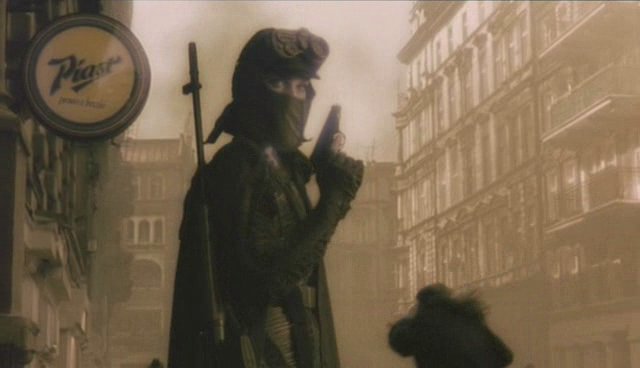
This dude was wearing the thigh piece concept model in the 80's.

Erastothenes
Guardian
- Joined
- May 9, 2009
- Posts
- 304
- Location
- Any killing field
- Society
- Shaolin
- Avatar Name
- John Erastothenes Bluetail
Angel all shining white was VERY nice. "If it works, don't fix it"I also have an angel. It's not great but not terrible. Colors on this are imo not good at all.
Naomi
Elite
- Joined
- Jan 19, 2007
- Posts
- 4,006
- Society
- Rangers
- Avatar Name
- Naomi NP Polder
I don't care that the padding or form of the armors has changed a bit. I don't mind that differnet 'levels' of armor look differently.
For me it is mainly the new way of coloring them, that makes most of these armor look alike too much, harder to differentiate between them. Just my preference...
I'll probably get used to it and adapt to the changes.
For me it is mainly the new way of coloring them, that makes most of these armor look alike too much, harder to differentiate between them. Just my preference...
I'll probably get used to it and adapt to the changes.
Wistrel
Elite
- Joined
- Mar 31, 2005
- Posts
- 3,241
- Location
- The Arctic (GMT)
- Society
- Entropia Pioneers
- Avatar Name
- Wistrel (Wisty) Chianti
I like the changes so far.... sorry that isn't very helpful. I liked the scuffing too... but then again I always wanted stuff to look worn/used/non perfect and shiney. Never liked stuff that looked pretty/shiney.
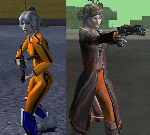
One of the reasons I hated the vu9+ updates to the oranges. The original jump suit had character... felt like it was showing some wear... the new one looked like Captain Kirk fresh from the laundret! At least the new newb suit has some character to it... but still hate that it isn't appropriately split up into sections. Would love to see that fixed.
of ocurse one day I hope to pull off this sort of look in Entropia... I don't hope hard though....
Last edited:
Msturlese
Stalker
- Joined
- Mar 7, 2021
- Posts
- 2,154
- Location
- italy
- Society
- Dirty Dingos
- Avatar Name
- Marco Killy Stur
i dont care much of look but the new one shares almost nothing with the old one.What is your opinion?
game designers should have focused on a "rejuvenation" and not on a total change.