Help: UI Release: Feedback Thread

Status
Feedback
  • Title: Please use contrasting colors
Description:
  • Current: Everything is gray on gray or dark-blue-gray
  • Suggested: Use contrasting colors so that its easier to read and get an overview quick.
  • Reason: My eyes
The left is kinda what we have now and the right is what it should be. I hope this is very obvious when looking at the attached example.
 
Feedback
  • Title: Wave messages extremely delayed
Description:
  • Current: Wave event messages (Papoo and Boar on NI, unsure if it happens on other spots/planets) are very delayed - I got a message "entered ..." in the 4th wave, and they all appear one after the other
  • Suggested: Time it correctly, as it used to be
  • Reason: To know you're in the wave area, or if you left it
 
Feedback
  • Title: Total TT value of all player assets
Description:
  • Current: There is missing total TT value of all player assets, only visible through web site.
  • Suggested: Display that value in inventory near where balance is displayed.
  • Reason: Better overview of current player status.
 
My comments after spent 2 hours yesterday :

1) Extended width of Inventory and Storage : I like !

2) Unified skins on (almost) all windows : I understand the need to unify them. I don't like the fact that visual aspect had received priorty on user-friendly. New icons are white on gray, it looks cool on a screenshot but going from 16 M coulors to 256 grey shades is a loss of information. I'll have to relearn, I accept, but they could have been adapted, not needed to change them totally. Same for Options, Radar and other stuffs where all orders were changed. finally, only the skins were changed, but not the functionalities, and there was room for improvement, like on the Map which is still a pain to use.

3) New mapping system. I think the Action Bars are restricting our customizations. Their management is not intuitive. I miss the keyboard view where we could see what key was still available. Not sure if anyone will use the several Pages, maybe was done to replace the old Sets ? Not sure also if the key combinations with Shift/Ctrl will be used, since we have one hand on the mouse, one on the keyboard, and the range of accessible keys from Shift/Ctrl is limited.

4) I didn't detect any change in performances.

5) There was a little lack of testing.

6) It seems an unfinished work : the HOF window was not reworked, and some old icons remain from PE.
My thoughts as well.


Additional thoughts:

1) Regarding inventory/storage, what was the design decision to have 13 columns of inventory space? For example, its 1 column away from fitting a 2x2 set of armor plates in a single row. Why have it a fixed number of columns anyway?

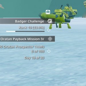
2) I too am struggling with information digestibility of the new interface. Its hard to obtain information due to having to direct the camera a certain way (text background issues), or its hard to read due to color contrast issues or other design issues.
Example issues (not necessarily a finite list)
Text background issues
* mob name plate
* radar coordinates
* tracked mission progress and text (on the hud)
Color contrast issues
* auction
* chat
Other issues
* information cramming in professions window along with inefficient use of screen space in that particular window and also in some others

3) New mapping system now apparently requires all items that we want to hotkey to be visible on the hud in one of the toolbars. Prior to the VU it was enough to have the cooldown items like vehicles, arso chips and resto chips on the hud, so I would say the icon count on the hud has gone up (for me). Also, the armor set icon seems to be gone, at least I could not find a way to place an icon into the toolbars to equip/unequip an armor set.

4) I feel like the reload under the healthbar is stuttering. Other than that I dont see any performance change.

5&6) Yes


Overall, the new UI is not totally terrible, but it needs some additional work to make it better.
 
Feedback
  • There are small frame stutters when multiple action texts are generated
Description:
  • When fighting a mob and multiple action texts go off at the same time, there are small perceptible frame stutters. These weren't present before the update. It makes the gameplay experience slightly choppy.
    Specs: Ryzen 5 3600 / RTX 3060
    Running in windowed mode 1080p
 
Feedback
  • Skill/Profession windows show very little information for the space that they occupy
Description:
  • The skill/profession windows put very little information into a large amount of space and makes you click through pages.
  • It would be way more user-friendly to make a scroll view for these. I don't like having to select tabs, AND browse pages. Too much clicking! I bet that would also be easier to implement (one visual list with a rect mask rather than buttons to control page index and content pagination)
 
Feedback
  • "Left Mouse Button Interacts" not working with mobs
Description:
  • When I have my weapon equipped and auto use tool active I click a mob and nothing happens.. the avatar used to run over to the mob and start shooting that mob, now it starts shooting the air in place, basically the mob doesn't become selected when I click on it.
  • It does work as intended when I click on a dead creature, avatar runs over to the creature and loots it.
  • Thanks for making the buff icons larger, I couldn't tell which is which before unless I hovered the mouse pointer over them and read the descriptive text!
 
Last edited:
Feedback
  • Title: Display exact number of HP in the player status health bar
Description:
  • Current: Only health bar is visible without exact information how much HP is left
  • Suggested: Add number with exact HP left and total HP over the health bar
  • Reason: Better health management and overview
Screenshots: [Attach any relevant screenshots.]
 
Feedback
  • Title: Display health bar over item icons in the action bars
Description:
  • Current: Currently health of the items is visible only through inventory
  • Suggested: Would be great to see it also in action bar over the items
  • Reason: QoL
 
Last edited:
Feedback
  • Title: Emphasise currently selected item in the action bar
Description:
  • Current: Every item in action bar looks the same, impossible to distinguish which one is active
  • Suggested: Emphasise currently selected item by adding something like border or hand icon like it is in inventory window
  • Reason: QoL
 
Last edited:
Feedback
  • Title: Allow moving items to action bar slots without UI edit mode
Description:
  • Current: It is impossible to move items to action bar without switching to UI edit mode
  • Suggested: Add that possibility or at least distinguish more that user is currently in UI edit mode
  • Reason: QoL
 
Feedback

  • Title: Logging display
Description:

  • Current: The current logging screen is moving.
  • Suggested: Being able to stop the animation from logging screen
  • Reason: My computer is getting old and it is very laggy.

Thanks for the update. Great improvements on FPS in game.
 
Last edited:
Feedback
  • Title: Display TT value of selected items in the inventory
Description:
  • Current: Player need to put selected items to TT terminal to lookup their TT value
  • Suggested: Display TT value of selected items in the inventory somewhere in the window
  • Reason: QoL
 
Feedback: here is the transaprency in action


  • Current: it is like being snowblind :)
  • Suggested: we need BLACK SOLID BACKGROUND LIKE BEFORE, with HIGH contrast THICK progressbar, not a 3 pixel one and in contrast color
  • Reason: to be visible
 
Feedback
  • Title: no more looting sound
Description:
  • Current: when a loot is done no sound is produced
  • Suggested: bring a sound again when looting - shall it be the old one or another
  • Reason: having the sound helps the impaired to understand a loot has been gained - also it is very frustrating to have no trigger when we get a loot.
Screenshots: [Attach any relevant screenshots.]
 
Feedback
  • Title: Item Description
Description:
  • Current: Text Contrast / Color / position
  • Suggested: Make it easier to read, no strain on the eyes. Now its white on white. Previously we could even scroll in / out on the item, make it bigger or smaller. We can not do that now.
  • Reason: I want to be able to read what is written about the item
Screenshots: [Attach any relevant screenshots.]


Previously, you could see a dark-tint over the item/background which helped with contrast for the text. This seems to be gone now, and instead a bright background has been added on top of bright text, with bright items this does not look good at all.

Example:


Last edited:
I really, really like this new UI!

thanks for the update, way to go MindArk! Keep it up :)
 
  • Title: Backup links don't work
Description:
  • Current: Links from backups are not clickable
  • Suggested: Links from backups on notes should be clickable
  • Reason: made backups in onedrive on word and after i paste them on new notes they no longer work
 
Feedback
  • Title: Allow for disabling using modifier keys separately for CTRL and SHIFT
Description:
  • Current: Player can disable using modifier keys for action for both or none
  • Suggested: Allow disabling modifier keys separately for CTRL and SHIFT so for example Player can still use SHIFT as modifier, and CTRL as 'go down'.
  • Reason: QoL
 
Last edited:
Feedback
  • Codex Window
Description:
  • Current: From Calipso Codex, my wife can see codex in ALL PLANETS... I am in Next Island and only can see Next Island Codex
  • Suggested: Please, fix this in all planets or only Calipso have this advantage
  • Reason: I want to see Codex in all planets...
OK, it happens if i have the 32Bit client.... with 64Bit client, all Ok and i can see all codex... fix this!!
 
Make the Name of the creature (over it health) and the auctions in auction house with a higher font size, like the chat font size at normal is.
It is so small font size now.
 
Feedback
  • Title: Allow for a keybind to enable closing of the loot window
Description:
  • Current: Player has to use mouse to close the window manually
  • Suggested: By adding a key bindable action in the action library, this can be done with a key press.
  • Reason: QoL
 
Feedback
  • Title: Enable Pet status window to be accessible to other players
Description:
  • Current: A player that is not the owner of a pet cannot see the pet status window
  • Suggested: By adding a this context menu item on pets either spawned or in auction/trade windows, another player can inspect the buffs, this aids sales of pets
  • Reason: QoL
 
Feedback
  • Title: Play a sound when the players health goes into the red
Description:
  • Current: Currently there is no audible cue for when a player is near death
  • Suggested: This can be achieved either with a critical health sound (similar to that of in Doom 2016 maybe) or more of a constant pulsating hum/heartbeat noise (configurable in options of course)
  • Reason: QoL
 
Feedback
  • Title: Item Description
Description:
  • Current: Text Contrast / Color / position
  • Suggested: Make it easier to read, no strain on the eyes. Now its white on white. Previously we could even scroll in / out on the item, make it bigger or smaller. We can not do that now.
  • Reason: I want to be able to read what is written about the item
Screenshots: [Attach any relevant screenshots.]


Previously, you could see a dark-tint over the item/background which helped with contrast for the text. This seems to be gone now, and instead a bright background has been added on top of bright text, with bright items this does not look good at all.

Example:


And be able to zoom out of a picture like in old UI
 
Feedback
  • Title: Play a sound when the players health goes into the red
Description:
  • Current: Currently there is no audible cue for when a player is near death
  • Suggested: This can be achieved either with a critical health sound (similar to that of in Doom 2016 maybe) or more of a constant pulsating hum/heartbeat noise (configurable in options of course)
  • Reason: QoL
You should have to look at the game to know what your health is, I disagree with this one.
 
Feedback
  • Title: Mindforce Cooldown not visible.
Description:
  • Current: We can't see when items like Arsonistic Chips or Resto Chips are cooling down and have to guess when we can use them again.
  • Suggested: Have some kind of visual cue as we had in the old UI.
  • Reason: Restore previous functionality!

That should already be visible over both the action bar icon and the ammo counter. If it's not, try relogging, and if you still can't see it please send a support case.
 
Feedback
  • Title: When locking on to a mob, we get a mob focus additional UI pop up like in other games (see screenshot)
Description:
  • Current: Currently we only have the mob's overhead status bar when locking on
  • Suggested: This can be achieved by having a piece of UI appear, similarly dimensioned to the player's HP and reload bar which we can customize the positioning of, which enlarges the mobs HP bar and name and adds focus to what we're fighting with (configurable in options of course)
  • Reason: QoL
 
Status
Back
Top