(updated)
Feedback
- Lea's feedback ( It looks scary but on the end i wrote down what changes were great ^^ )
Description:
#COLORS
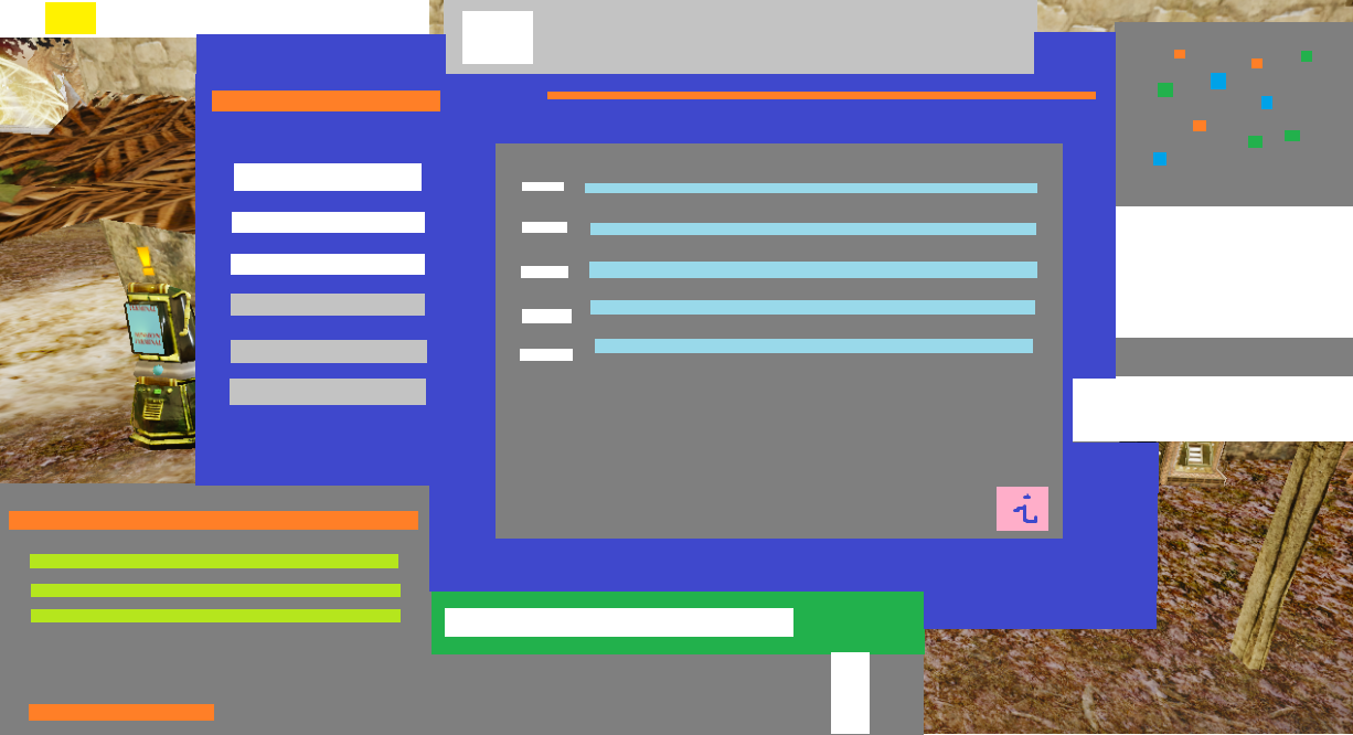
- Current: Too many Color Themes. Screenshot named "Color Themes" shows how our eyes see and simplify colors, when we play now.
- Suggested: Choosing one Color Theme; skills, inventory etc got awesome theme that looks professional. Matching rest to that one Color Theme.
- Icons of upper left corner can have Dark Blue background, with transparency
- Chat instead grey, can have Dark Blue background, also transparent. System messages in chat can be white or grey if really needed (it is risky to use too much grey, that colors works best to make something "less important".
- Weapons menu on bottom instead having: white, light-green, darker-green, yellow, grey colors, can use Dark Blue with transparency as background, White letters and numbers, buffs can be Dark Blue again or Orange, reload bar can be Orange or even White (you will know better than me by testing colors from main theme of Dark Blue, White, Orange and seeing the results). If reload bar will be too boring as White it can have different look for example -------- instead straight line, or something similar. Health bar is in my opinion the only acceptable exception to use green color, so every new players instinctively understand it is health bar. My personal preference is to make health bar a little darker green, like here https://cdn.dribbble.com/users/2002372/screenshots/9758077/game-health-bar.jpg and make it more interesting by maybe showing where each 100hp level is (players like to compare to each other so it add that "omg look how much hp he got!" effect, when u see for example 4 separators indicating he got 400+ HP), but it is a preference so i leave it to you. Imo Entropia is "high technology" and so on so cool health bar... would be cool 
- Radar can use Dark Blue with transparency as background, instead grey again. Rest is probably okay.
- Missions can use Dark Blue with transparency as background.
- Hall of Fame can use Dark Blue as background and Golden frames to show it is about moneyy and richness :3
- Global flicker can use Dark Blue transparent background and Goldenish numbers to indicate it is about money and status :>
- Chat optional colors that we can choose are too similar to each other. There are 4 yellow colors that look pretty much the same, three purple/pink also very similar, and 2 types of blue. They need to be significantly different from each other or our eyes will bleed when we will try to read smth :d
- If golden color is used in Depo sign, imo gold can be reserved only for MONEY/STATUS related stuff. So "protected" sign should be changed, and every money/status related signs should be matched with Gold color. That way when we see Gold color we know it is money and glory \o/ and it can be used as a rare motivating color, that show up when we global on mob or in crafting machine, and so on. Maybe even very expensive items can have price written in gold, to add status to them. Because now depo button is Goldenish and... reload bar xp which doesn't make sense.
- Profession name when we hoover on our avatar is yellow now :/ Imo it should have Dark Blue transparent background and be white. Gold color is for money and glory
- Names of avatars or terminals, when we hoover on them got bad visibility, imo they should have Dark Blue transparent background. It is hard to read names now, especially if we stay in some well lighted area.
- Peds can have Gold color instead light blue, in inventory, to indicate it is about money.
- Items that are close to destruction can have light/transparent red color instead of yellow, and hard red when broken (like now), to keep yellow/gold for money related things
- Dots near message tabs can be White instead Yellow, to keep it in main color theme, and leave yellow/gold for money related stuff
- Near maximum capacity also can have light/transparent red color, to leave yellow/gold for money related stuff
- "Information" and some other icons bring once again another color to the screen, imo those icons need refresh and change, and new ones should match main theme (maybe orange-ish version of them, or just white graphic on dark blue background, you gonna choose good ones i'm sure)
- Quantity bring light-blue-ish color to the table, imo if light-blue is used, it should be reserved to skills etc. Quantity can be just white.
- This is idea, i am not sure if it is good idea: Any Gold signs or numbers can have soft texture on it, similar to that u used on "E" button in inventory near ped balance. Similar but Gold.
- If i missed any tool/indicator etc, imo match it with main theme again, Dark Blue, White, sometimes grey(usually to decrease importance)/orange/gold(when it comes to money, status, motivation)
- Reason: Screenshot named "Color Themes" shows how our eyes simplify and see current colors on screen. It is a a mess unfortunately.
After those changes i believe that there will be no more eye-ache when we stare at screen. Everything will look as good as Skills, Inventory etc. Those are really cool and professional <3
#SCREEN SPACE
- Current: We lose a lot of space on screen.
- Suggested: Adding changes that can save screen space and make it more modern (clean space is now fancy in games)
- Loot in left upper corner should be popping up closer to the edge of the screen, not in the random distance from the edge, it is mildly infuriating for an eye
- Chat should have option to make it even smaller, and font size also should have at least 3-5 options to change (some people like to have big chat and letters, and some like to make it so small that it is unreadable, and then they make it bigger after they end hunt etc)
- Chat should also have option to "hide" and "roll up" so we can make it almost invisible when we want. After hiding it, it can show only tiny square near edge of the screen with some arrow ">" to roll it up again on screen.
- Radar is for some people too big when on MIN size and for some people it is too small when on MAX size, so we should have option to make it really tiny or really huge. It also got some troubles to reach edge of the screen, on many monitors it cannot reach their edge, which create tragic effect for the eye
- Would be nice if Weapon menu also had at least 3 size options; small - normal - big
- Inventory looks AMAZING and i heard everyone like it is bigger <3 but it would be nice if it had option to "roll up" when we hoover our mouse near the edge of our screen. Even i liked to hunt with EQ open, now it is too big (but its good), so to fix it and do not lose advantages of bigger EQ, lets make an option to hide it -> hoover to the edge to check it again -> move cursor back to middle to make it hidden again.
- Crafting got similar problem, we like it bigger but option to minimalize it would be cool. We often craft and repair/check ah/storage/create some sticky notes at the same time
- Reason: Plain and clean screen space is very attractive now. It also fits very well to Entropia being "high tech" and "modern". It is paaaaainfull to play when i got in left down corner chat, left side loot, right upper corner big radar, weapon menu down, global flicker on top, and eq takes 2/3 of screen ;/ Icons new size is very good tho ) Way smaller than they were previous, still visible and cool <3
- Current: [Describe which existing function or system you wish to see changed, if relevant.]
- Suggested: [Describe your suggested change.]
- Reason: [Describe why you want this change.]
#USAGE FIXES / OTHER
- Current: Some stuff is problematic to use. I got questions about some choices.
- Suggested:
- Make chat less sensitive to move it around just when we want to click different tabs there. It is so sensitive that after playing 2h it is repositioned like 20 times which is mildly infuriating
- When i click chat writing space, and then i change my mind and click somewhere on screen, it DO NOT "unclick" writing, so then i press "use tool" key but instead of using it i start spamming on chats "xxxxxxeqeqe" :d
- NeoPsion is showing on the health bar, take it from there please because... why is it there? :d New players will be confused is it health of that item or what?
- Near name of weapon there is icon that looks kinda like a check mark and... is it completely random icon? if yes, then please remove it cause we all wonder will it change when we change weapon etc, what that icon means, basically "what is that" was the topic when we logged in ;d
- Number of shots should have some sign near it to explain what that number means "uses" or smth., and when we equip VSE it shows 1, when in reality we got infinite uses when we use VSE so you can use infinity icon there
- On bottom of the chat, white bar change its color to orange back and forward, imo it is unnecessary but it is also personal preference. To me the less flickers and effects the cleaner and nicer screen is. Flicking it cool when it happens on some occasions like Globals, HOFs, and so on.
- When consctructing, that long list had tiny icons near them that indicated what kind of a blueprint it is - It was helpfull. Current option LOOKS better but some indicator of what kind of a BP is there, will be useful.
- Icons in inventory may have less "pixel" edges. That will look more modern and high-tech.
- Some people struggle to read names of their target, i heard tree names can be somewhere high in the air, or mob names too (tamable monkeys on NI if i remember well). Maybe transparent Dark Blue background would help, but i am not sure if that is the way to go. But yeah it can be hard to read some names.
- Icons near PED BALANCE should be moved somewhere else, cmon it is Money! <3 That area must be pristine clean and gold \o/ That "E" button can be gold please *.* <3
#GREAT CHANGES ! (what worked
)
- new inventory look is awesome!
- bigger size of inventory is great!
- smaller and more modern icons, we all love clean space
- weapon menu to change tools and weapons fast, another great change
- Skills menu is done very well and professional
- Similarly professions menu, Mission logs, and so on
- Tracked missions can be easily and fast hidden
- We can check codexes from all planets! \o/
- New mob health bars are nice
- Indicators of which mob is aggroed are great
- new main menu when we log in is very nice :3
Overall direction of changes was very good, more professional and tech look, cleaner an bigger inventories, also adding useful options for us.
And of course there is a lot to patch but it is usual that after implementing something we realize "oh, this need a fix, that need a fix", this is normal. So i hope you are doing well even tho players can be rough for you now ;P
Overall, very big portion of community is happy with direction you took, and they just demand tweaking this and that, but noone is like "omg what are you doing, go back go back" so imo it was success :]
Good job!
Lea
Screenshots:
Easy and free screenshot and image sharing - upload images online with print screen and paste, or drag and drop.

snipboard.io


 ?
?