UI Release: Feedback Thread Part 2

I do a backup in word with all my notes, speaking about onedrive has nothing to do with it i know, however as you mentioned after you past them in chat window and click inside inventory for example and go again to chat window they will turn plain text, i think both issues are co-related because before this update i could click on links that i had outside game in backup and now i can not
Links went plain text if you copied out of the game even before the update .
See the below message was before update

Ty I've already made a copy) but clickable links to objects or coordinates will just disappear, that's what sucks)
:)
 
Feedback

Description:

  • Can't actually see the number of new messages; (below is 5 for example)
    Wea3j3F.png
  • PMs; Bring back the PM indicator to top left of the chat instead of topright of main chat, a screen is often covering it now
  • PMs; Improve the flashing indiactor in a PM window

Crafting:
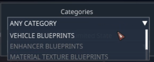
  • Scrolling through the crafting categories doesn't really work well, better to show the complete dropdown list, like auction has, when you try to select a different planet.
    0inBqWY.png
  • Bring back the function to double click to craft a item, instead of having to click on construct

General:
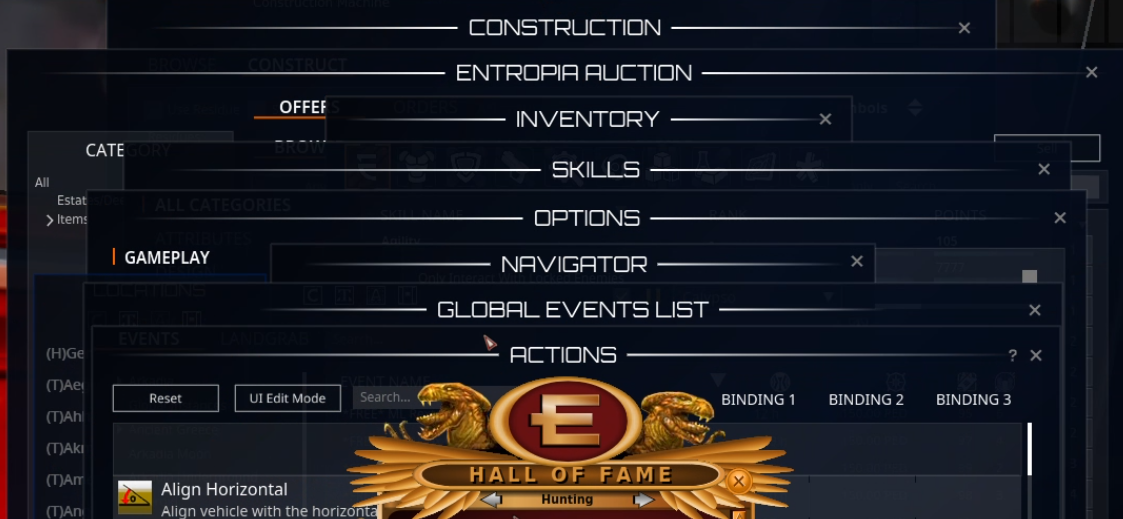
  • Perhaps a Icon in the top left of every "window" to help differentiate. Below does feel "too uniform" as in, it's all the same (except the HoF list).

    guZTH7M.png
 
General:
  • Perhaps a Icon in the top left of every "window" to help differentiate. Below does feel "too uniform" as in, it's all the same (except the HoF list).

    guZTH7M.png
I agree, and well showcased with this screenshot. Some slick use of icons could go a long way in well-needed differentiation of windows.
 
Ok, how long has it been, a week? Today I tried my first new vu mining and crafting. I wonder how it feels to have a phobia and your therapist gently ups the game to an "Are you ready to face the next step?". Well, I faced it, and the feeling of Fremdschämen (embarassment resulting from witnessing somebody else screw up massively: closely related to facepalm moments I guess) was almost overwhelming.
The impression that so much poor and sloppy implementation must give to anybody new is surely immense. AND we've had several fixes and patches go through as well.
I understand that real functionality issues have a necessary priority. Maybe we are at a limbo stage where most stuff does kind of work close to the way it should, but is visually still at a level of OMG, you can't be serious!

Trying my utmost to be fair, it seems to me that the world rendering has been changed without comment, such that far away mountains no longer appear and disappear depending on viewing angles. It could be part of UE5 stuff that is not being publicised, but is a positive change literally in the background. However, it also looks as if the ground grid may have been changed, in that fruit and stones appear only at a closer distance now compared to my avatar height, and in the newish Cyrene arret instance, autoloot distances also appear to be less than they visually should be. Those examples are very much foreground nerfs, in my perception at any rate.

Thus, even a few rare positives come with a shitty lining.
I guess the TLDR is something like: this is so very embarassing I can't even stand it sitting here alone in my jimjams in the late morning. I have standards ...
 
Feedback
  • Title: Target's HP bar float too much to the top of the screen when close
Description:
  • Current: when a target closes in on you, it's hp bar moves too much to the top of the screen.
  • Suggested: Change how much the hp bar moves to the top of the screen when a target closes in on the players viewpoint.
  • Reason: The way this worked used to be different, and worked better pre-vu.
    The proportion of change of location of the HP bar when a mob is close to you instead of far away is different then before.
    Now I have problems seeing the target's HP bar often, because I like to have my action bars in the top of my screen. Only with moving around my avatar and camera, I can find a "free spot" for the HP bar to be shown.
    When multiple mobs are in view, some close, some far, it's sometimes confusing to find the matching hp bar.
Screenshots:

Pre-VU, the HP bar of the Letomie Mature would be about where you now see the HP bar of the Letomie Old.
But in the screenshot taken this VU, I'm attacking the Letomie Mature, which HP bar is hidden behind the Action bar on top.
index.php


Target's HP bar is just way too high up the screen, also when fully zoomed out and low camera tilt (only when the camera tilt is on it's lowest point, the HP bar comes back from the top).
index.php
 
Last edited:
Feedback
  • Title: Ticket Event Toplist readability & scrolling very poor
Description:
  • Current: The font of the participant names is too small for easy readability. The scroll box only displays 2.5 participant names and when you scroll down 1 wheel click, it scrolls to halfway through the 4th participant name (see screenshots for image at top of list and at 1 wheel click down). None of the participant names are easily readable (due to small font size) and the partially displayed names are sometimes completely unreadable.
  • Suggested: Increase the font size slightly and decrease the line spacing to counteract the increased text height. The scroll box should fully display at least 3 participant names, and a wheel click should scroll by an integral number of names, where 1<=number<=3
  • Reason: To make the Toplist more readable and make mouse wheel scrolling a viable choice


As I've been on so many trees this week, I have experienced the 'info too high' problem, similar to sahel with the mob hp bars. I'd been wondering if it was me because of now needing to quickly peek at new trees without drawing the target away from the tree actually being cut, but I see it's on mob hp bars too.
On the ticket event menu name scroll, that may take a new first place in OMG, although I thought not directly getting the total crafting amount shown in the crafting info if more than just a couple of mats are returned was also pretty 'untested' by anything sentient.

It really is absolutely everywhere. It beggars belief. The question of whether anything at all was flagged up between the programming and the rollout must surely be answerable by a resounding no. If MA were to run the storyline of computer senility and add a few screen glitches, then at least it might immerse this pos into the gameplay somehow. I don't know if it would help to have it sold like that, but hey... ?
 
Feedback
  • Title: Ticket Event Window won't close after event
Description:
  • Current: The button at the top right of the Ticket Event Window does not close the window (even though the Tooltip says 'Close') after the Event is complete (I had to re-log to get rid of it). Instead it toggles back and forth between Minimized state and Maximized state (see images).
  • Suggested: When you set the Tooltip to Close, also change the action of the button to close
  • Reason: To fix the problem of having to re-log to get rid of the window
 
Feedback
  • Title: Ticket Event Participants Window list overflows the list box
Description:
  • Current: The Ticket Event Participants Window list overflows the list box (see image).
  • Suggested: Only select/display as much data as will fit in the list box
  • Reason: To fix the botched/unprofessional look of the window
  • host image online
 
Feedback

  • Title: Updated actual item info, when exceeding 100 attacks per min.
Description:

  • Current: When your weapon due to buffs, exceed 100 attacks per min it will be capped at 100 attacks per min and your weapon damage is increased and the cost in ammo is increased (not sure if decay of weapon is also increased).
  • Suggested: Make so that the item info will have the actual current damage interval, and the ammo burn, by hovering your mouse over the durability it should provide a tooltip of default decay, and current decay (or add a new "Decay:" in the description.
  • Reason: It's important to have actual accurate data for tracking purposes and for testing out different gear.
  • Currently we can only hover the mouse over the ammo count, which then displays the current ammo burn. See pic. But we cannot see the current damage interval, or the current decay of the weapon.
  • This makes it so that tracking in this way will give wrong information, since I can't tell if the weapon decay is higher as well, not just the ammo burn while using pills that make it exceed 100 attacks per min.
Screenshots:
 
Feedback

  • Title: Coloring of Loot or People entering/exiting EU
Description:

  • Current: The Color of looted Items is barely readable against the background because of color, shading etc.
  • Suggested: Do not use shading and make the color one that is readable against the background
  • Reason: See screenshots, it is a shame that this passed quality control.

Default location of chat Window is where the ground of the planet is and in many places the red, shaded text is barley readable.
The font, shape and color of the other text is 100% better readable than the information what you looted. Because of the color, the added shade etc.
index.php


I then tried out another location and, altough text of looted items is a bit better it is still a lot worse than the other text in green or white but then when someone on your friendlist enters or exits EU it is not readable at all. Or can anyone read it who left EU without zooming and even then it is more guessing than seeing the letters.
index.php
 
Last edited:
Feedback
  • Title: Staggering Game after UI update
Description:
  • Current: When playing, standing in a town, out in the wild, while hunting, crafting or anything, game freezes every 10-15 seconds for about 0.2 seconds, staggering FPS. It is mostly noticeable when moving while performing an activity, such as hunting, shooting and moving at the same time.
  • Suggested: smooth gameplay
  • Reason: i can't stand playing the game any more, i can't figure out what is causing the staggering.
Screenshots:


edit; all graphic settings were set to high, and always has been.

set them to low to see if it makesa ny difference to try to filter out what is causing the staggering


edit #2, still happening on lowest graphic settings....


edit #3, removed all chat logs, reset all settings in client loader, run game as administrator.

restarting the game, on loading into the game it staggers like crazy for a while (even with all settings on low) before it catches up, and then its smooth for a while but starts staggering after 15 seconds
 
Last edited:
Since the UI update, there might be an issue with Nvidia Geforce Experience / Shadowplay / record feature.

Using Shadowplay drops my 99% BPS to 2 FPS every 10-15 seconds, when it is shut off, the game runs at 100 fps and with 99% bps at about 90 FPS, with sudden drops every now and then down to about 30 instead of 2.

Entropia also can't be added or recognized as a game in Geforce Experience.... ?
 
Feedback

Title: pastels, windows, and load outs

Description: UI needs more chat colors in chat, inventory and loot windows should have adjustable transparency, and load outs should be able to be added to hot bars.

Current: 1. A.The chat colors are all very pastel.
B.There seems to only be 14 colors and 15 if you include the one solid violet color that you cannot choose but appears to be leftover from the old UI.
2. Inventory window is large and loot windows is tiny, both do not have adjustable size or opacity.
3. I can make load outs and assign them a key however I cannot transfer them to the hotbar.

Suggested: 1. A chat color wheel if possible. At the very least primary and secondary colors and a black for users that use a fully opaque chat. Option to change background color of the chat.
2. Adjustable loot windows. An opacity adjustment in options for both the loot window and inventory.
3. When you assign a load out to a key, if that key is assigned to a hotbar, add the option to keep the hot bar key and put the load out there. Currently it just asks if you want to remove that bind from the hot bar.

Reason: 1. We live in an age of billions of colors and RGB. The current color options are very limiting and could also prevent color blind people from playing.
2. The UI is nice and adjustable, but allowing resizing and opacity of these key components would really complete the look and feel.
3. Loadouts are usable, however you need to keep your inventory open to access them. If your keyboard is out this is ok. But having them on a hotbar will make tablets, controllers, VR, and mouse only users able to use this function more easily.
 
Feedback

  • Title: Coloring of Loot or People entering/exiting EU
Description:

  • Current: The Color of looted Items is barely readable against the background because of color, shading etc.
  • Suggested: Do not use shading and make the color one that is readable against the background
  • Reason: See screenshots, it is a shame that this passed quality control.

Default location of chat Window is where the ground of the planet is and in many places the red, shaded text is barley readable.
The font, shape and color of the other text is 100% better readable than the information what you looted. Because of the color, the added shade etc.
index.php


I then tried out another location and, altough text of looted items is a bit better it is still a lot worse than the other text in green or white but then when someone on your friendlist enters or exits EU it is not readable at all. Or can anyone read it who left EU without zooming and even then it is more guessing than seeing the letters.
index.php
Former UI chat colors were much better.

Color theme wise they were enough separated from each other.

Current chat has too many same tone yellow and i assume green colours mixes up wich makes it really difficult to read for colorblind people.

Example skill gains were easier to notice.

Hope MA will do something to this. 🙏
 
Feedback
  • Title: Crafting Interface
Description:
  • Current: Clicking filter, unclicking filter, clicking construct
  • Suggested: Remove filter and just put it on the front. Also add QR filter (10+ 20+ 30+ etc), and double clicking BP automaticly goes to construct
    Also automatically FILTER BPS from their BEST QR to WORST.
  • Reason: Quality of Life.
Screenshots:

index.php
 
Last edited:
I have noticed that the new ped flow balance texts are now posted in gray. My vision is NOT the best. this text color makes it VERY hard for me to see my balance. Could the balance and activity texts be updated to a brighter color? PLEASE!!!! Can you change ALL the gray text where ever it appears??? I can t be the only person with this issue.
 
Feedback
  • Title: Filter Globals
Description:
  • Current: If I activate the Globals in a chat tab, I see all of them
  • Suggested: To be able to select which Global we want to see :
    • Globals from me
    • Globals from Friends
    • Globals from SocMates
  • Reason: The log moves too fast when hunting with Globals activated, so we miss Globals of our Soc/Friends and don't GZ them :(
 
Feedback
  • Title: Loot window
Description:

  • Current: loot window is way too small
  • Suggested: allow us to change the size but only spawn loot icons in something like the size we have now.
  • Reason: we can then set a size we prefer and also move any nice loots we notice to an area that stays clean for later screenshots etc.
 
Feedback
  • Title: The Enigma of how to walk/interact in game. (usually i am calm but sorry i am frustrated ;(( plz halp )
Description:
  • Current: I am doing in game sticky notes, and we are studying with friends how to walk/interact with something in game. It should be intuitive and i literally spent 20-40mins just reading notes, to know how to stop walking, or i just smack anything and everything to fight my avatar from walking on his own journey somewhere far far away in the galaxy.

    Here are my notes all together and sorted out: (i got X binded as "use tool)

    - RIGHT mouse click interact
    - if you are in EQ it is actually LEFT mouse click that interacts
    - if you cut trees it can be RIGHT click or DOUBLE LEFT click, same goes with vehicles
    - if you are mining then NONE of those keys works tho, and you must use "USE TOOL" KEY
    - in action bars it is again LEFT key that interacts instead RIGHT click as usual
    - RIGHT click HOLD move camera
    - However when you use RIGHT click HOLD and then add LEFT click NOT HOLD avatar will autorun, why? no idea
    - SINGLE LEFT key do not interact, but DOUBLE LEFT key actually interact, work in eq too
    - actually LEFT click hold can move camera too
    - USE TOOL works only on screen
    - USE TOOL HOLD will activate autouse, but only if you freeze yourself and hold mouse on the target
    - however if you hunt you can actually RIGHT CLICK and it will AUTOUSE weapon untill mob dies and won't retarget to another mob automatically, on trees it will
    - If you want to repair vehicle you cannot use RIGHTCLICK as usual, it need to be USE TOOL, USE TOOL HOLD to make it autouse, but if you want to sweat, hunt etc it will be actually okay to use again RIGHT CLICK as usual to make it autouse
    - if you LEFT CLICK HOLD and then RIGH CLICK it will make avatar autorun similarly to using RIGHT CLICK HOLD and then LEFT CLICK lol
    - however if you hunt/sweat, LEFT CLICK on screen will work as a cancelation of action xdd but it wont cancel action if u walk umm
    - You cannot use chat if you AUTOUSE, don't u dare (but actually when u hunt, then sure, just remember about this exception)

    - "CANCEL USE" key literally do not exist o_O (or i failed to find it). But you can use "USE TOOL" KEY in the air, hopefully not hitting anything else to stop walking towards something, some people use ESC to stop walking but on my account it is not working. Aaand sometimes left click stop action! Personally i actually use LEFT + RIGHT MOUSE CLICKS at the same time to cancel action, and no idea why it works, but it works 80% times, in some situations mouse is catching far away objects on whole screen and then USE TOOL KEY make me run somewhere far far away, if it comboes with LEFT + RIGHT MOUSE CLICKS not working, then i fight 45s-2mins to just stop my avatar, i can hold avatar for a moment but when i released it immediately ran on its own journey in Entropia world xP
    - RIGHT CLICK and LEFT CLICK are permament and you cannot change those settings, however you can use other mouse keys to bind something else in action list, however not all options are there, some are in interface options only so pls remember this too lol


  • Suggested: Just like with color themes, CHOOSE ONE SYSTEM PLS OMG. There are like 20 systems to interact/walk and each got its own number of exceptions, take 13y old child and if it cant make all simple actions = it is badly designed, and here 20-30y old ppl struggle ;////

    Usually we need to do those actions, VERY EASILY, not by frustration and smashing keyboards:

    - Interact with smth
    - Autouse with smth

    - Drag smth from one place to another (as far as i know this is fine in EU)
    - Move camera easily (that works fine in EU)

    - Run (this is okay in EU)
    - Autorun (this is also okay in EU)
    - Open something. Like car storage or chest

    - CANCEL ANY ACTION (usually by right clicking anywhere on screen, and it can't be also use to interact cause some objects catch hit boxes and we are trapped between 20 usable objects and cannot cancel anything without hiting/using another, or something very far is somehow clickable and avatar just go own its own journey when we smash keybaords, this happened to me at camp icarus near sea, took me like 2 mins to just put ship there and fly away)
    - As low number of exceptions as possible

    - Intuitive key uses - if right click is interact, but then it is left click that interact, and then it is double left click, and then it is totally different key that u must bind, it create a mess. Sometimes we intuitively fix our problems by thinking like this -> "okay autorun autorun how i autorun in other games... shift propably... oh nice its working. Space is probably jump yeah. Right click anywhere to cancel actions yee. Oky i got most figured out lest go."

    So usually: ctrl crouch/slow walk, shirft run, spacebar jump, I inventory, right click anywhere on screen cancels any action, double left tap to open something (it would be nice to open vehicle inventories like this). "E" "X" is usually to single use something, in games with action bars its usually X to leave E for some weapon/tool.

    That way we right click target(tree/mob/etc) to autohunt autocut it, X to make single cut/swing/whatever when we need. Rightclick anywhere on screen cancels action (even if we are clicking different target it just stops action, then when we click that second target again it starts walking towards it, this is to avoid being trapped between usable objects). To open smth we double left click. Space to jump, shift to run.
    Eeasy peasy, lemon squeezy, Esc to quit or see options.

    - As low number of exceptions as possible

  • Reason: Imagine being new player and you cannot check what is this game about, because you don't know how to mine/cut/stop interacting and you are new to those systems, so you become angry and leave :/

    There are like 5 ways to walk up to something, and 0 ways to stop it with 100% success rate xp (look: i can walk up to something by right click, left hold + right click, right hold + left click, shift, double tap left click, and 0 options stop me with 100% success rate and no risk of hitting another target. So i'm not exaggerating)

    Sorry for emotions but i struggle to cut trees, i use different keys to walk, different to hunt, different to sweat and i forget which i should use now, i struggle to stop my avatar... save me \o/
 
Note that in old PE time we could even double-click on some place on the ground and our avatar would run to it.
They removed it, but I guess nobody misses it.

I agree there are too many options for interactions, but let's be frank : old players deposit, new players sweat.
So MA has a difficult task here : not loose old players, but attract new ones. Not easy.

Recent screenshots of players with 80 icons look too complicated, MA wanted to make it "more beatutiful".

With this new UI, I feel they wnated to do it "minimalist" (modern flat), but they took examples from some recent FPS games.
EU is not a FPS, we don't have 10 actions, but 50-80 !!!

Thus I hope they'll reconsider the limitation to 5 Bars, not adequate at all for such a MMO, with so many actions / items.
And I only hunt + heal, if I were Miner / Crafter, I'll need a lot more.
Well, actually as many as old UI allowed : unfinite icons on screen, and as many keys as our keyboard have.

Now it's less practical for old player, and I can't imagine for new players. :(

But they worked hard to implement this new system of Bars, I doubt they'll accept to put back the better system we had.
 
Wrong thread... was a bug report... :)
 
Feedback
  • Title: Animation around cool down progress bar while tool is active (like in old UI)
Description:
  • Current: Nothing indicates that anything is happening "Is my VSE dead?"
  • Suggested: Add animation as in old UI
  • Reason: Good to see that the tool is busy
Same thing while crafting. The spinning wheel that tells you it's doing stuff is gone.
 
Note that in old PE time we could even double-click on some place on the ground and our avatar would run to it.
They removed it, but I guess nobody misses it.

*I* miss it. would rather that than the thing where clicking and holding left mouse controls camera. I have middle mouse button mapped for camera control... don't need it on the left mouse button too...
 
[again going a bit left field from current UI here - apologies]

Feedback
  • Title: Modify the "teleport to revive terminal" action to have two modes: short press = Teleport 5 metres away, long press = teleport to revive terminal
Description:
  • Current: We have an action to teleport to a revive terminal. Legitimately, this only exists because ghosts can no longer move, and there is an option to cancel the auto teleport to revive when you die - so you need a way to TP to revive when you are ready [or to provide a lazy way to get "home"]
  • Suggested:Modify the behaviour of the Teleport to Revival Terminal Action as follows:
    • Single press: (no timer) Teleports you 5 meters away from your current location in a random direction. Hopefully this will serve as an easy way to dislodge yourself from the landscape without having to either:-
      • a) deploy and try and enter a vehicle
      • b) use your own TP chips to TP a short distance (waste of PED)
      • c) teleport all the way back to a revive terminal (that could be miles away) and take ages to get back from.
    • Long press: Teleport to revive terminal as usual (including the cancelable timer).
  • Reason: The reality reason why this action is used, nine times out of ten I'd imagine (or more), is simply because someone got stuck on the landscape. While I'm not generally one to suggest you put a sticking plaster on a bug, and instead feel sorting the bug is better, realistically MA should accept that they'll NEVER fix all the landscape stuck bugs that exist in the game. They should instead admit defeat and instead give us the in-game equivalent of "nudging a pinball machine to shift a stuck ball"

Let he who has never go stuck on the landscape, cast the first opposition to this idea... and that includes MA ,-)

Wistrel
 
[another old one relating to the control update but suggestion relates to a UI update idea - while we are doing them]

Feedback
  • Title: Add option to settings to toggle, when running, the rotation/turn around to on or off.
Description:
  • Current (essentially, when running, it's always on):
    • If we are walking:
      • left: side steps to the left
      • right: side steps to the right
      • reverse: walks backwards
    • If we are running:
      • left: rotates ava 90 degrees to the left and runs in that direction
      • right: rotates ava 90 degrees to the right and runs in that direction
      • reverse: rotates ava 180 degrees (turns around) and runs in that direction
  • Suggested:
    • When "rotation while running" option is on (same as above/current)
    • When "rotation while running" option is off
      • Walking: Same as above
      • Running:
        • left: quickly side steps to the left
        • right: quickly side steps to the right
        • reverse: quickly walks backwards
  • Reason: So we have the option to avoid having to remember the last direction we faced our avatar via the mouse, and can therefore avoid the weird situations where pressing backwards runs our avatar forwards (for example) and a million other control annoyances. Also, to avoid (or to allow the avoidance of) two control paradigms being mixed together (which is poor UI design lesson 1 - thing that you shouldn't do).

Yes, in essence I'm asking for an option to turn on the old control system again... i.e. the good/non-confusing one
 
Feedback
  • Title: Auction Message Too short
Description:
  • Current: Message of item sold is too short and I dont know what exactly I sold
  • Suggested: Expand the box size to show full string
  • Reason: Quality of Life. I always need to find out what I sold by checking in my OFFERS. Its annoying.
Screenshots:

index.php
 
few quick thoughts.

i think since we're doing the UI there's one big obvious thing you are going to want to add to bring the interface up to expectations for most regular gamers.

this is the "paper doll", or the "character equipment screen". right now this is just a little white hand icon on the item to show it's equipped. but it's not clear at a glance what slots a player has available, what slots even exist on each player, and it's just a lot more intuitive to be able to look at a character sheet and see everything that is equipped, in what slots, and what slots remain open. this is also where loadouts should be made and swapped. the current loadout system took a weird system and just made it a little harder to use. you need the paper doll. almost every game that has equippable/swappable gear has this.

the other, and this may just be my mistake for overlooking, but is there a way to change "themes" on my UI? maybe i want a brighter color or something?

i did really enjoy being able to place item actions arbitrarily on my UI. there's no way to beat the accessibility and convenience of single-click equipping. it would be great if this came back.
 
Back
Top