Info: Update regarding new armor designs

Ludvig|MindArk

MindArk Official
Staff member
Admin
MindArk Official
Moderator
Joined
Feb 10, 2006
Posts
16,060
Location
Sweden
Avatar Name
Formerly "Foeburner Nighthawk Delta"
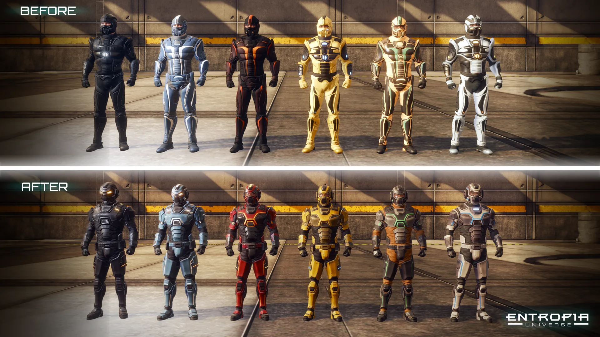
Your discussions and suggestions about our new armor designs are invaluable to us. We've carefully considered your feedback on the color schemes and the desire for them to stay true to the original designs. We're now focusing on adjusting specific colors, adding PBR textures, and giving the different Tier levels more distinguishable characteristics.

While we're eager to adapt where feasible, we hold steadfast to our game's vision. Some design elements will remain as envisioned, not disregarding your feedback but ensuring Entropia Universe stays true to modern industry quality standards.

Unless unforeseen circumstances or additional development needs occur, our current plan is to implement these improvements before the end of Q2, and we will describe all the armor visual enhancements in the relevant release notes.

We're committed to transparency and value your continued input. Thank you for playing Entropia Universe!
 
Thanks for this feedback, it is much appreciated.
My 2 pecs is that the design of the helmets is what I like least - it's too blocky and looks like what amounts to ear muffs.
The old design was more like space helmet and I think that is more appropriate.

remove the ear muffs please
 
Thanks for this feedback, it is much appreciated.
My 2 pecs is that the design of the helmets is what I like least - it's too blocky and looks like what amounts to ear muffs.
The old design was more like space helmet and I think that is more appropriate.

remove the ear muffs please
My main issue is also with the helmet design. Needs some TLC.
 
Amazing. Thanks for listening and the communication recently! Has been a big step change and much appreciated!!
 
Good move, I not really impacted by the changes, but i understand some were quite upset by changes thus far.
Thankyou for the update :)
 
Last edited:
Last edited:
Thanks for this feedback, it is much appreciated.
My 2 pecs is that the design of the helmets is what I like least - it's too blocky and looks like what amounts to ear muffs.
The old design was more like space helmet and I think that is more appropriate.

remove the ear muffs please
Same 👍
 
VU-2023_before_16-9_armor_comparative.webp


I can distinguish the Tier 3 from the LEDs in the eyes.
But what is visual difference between Tier 2 and 1 ?
Maybe to post pictures of one single set in the 3 Tiers ?
 
VU-2023_before_16-9_armor_comparative.webp


I can distinguish the Tier 3 from the LEDs in the eyes.
But what is visual difference between Tier 2 and 1 ?
Maybe to post pictures of one single set in the 3 Tiers ?

It’s not always consistent. Regular Jaguar (tier 1) has LED eyes while tier 2 Adjusted has the visor. Maybe an oversight?

Edit: looking back on it and I think what I saw was classic PoTE which just shows how hard it is to distinguish them lol

Also can we expect to get new upgrades, I’m craving Jag improved, and I think having Caly armor missions to work towards would be great.
 
I think MA should do whatever they want, as they know best. Like the ability to convert L1 tamed pets into tokens (which MA considered ages ago). Nudge nudge, wink wink 😜

No one wanted tesla 'cyber truck' style amour helmets then. It's all the rage apparently. 🤣🤣
 
Thanks for this feedback, it is much appreciated.
My 2 pecs is that the design of the helmets is what I like least - it's too blocky and looks like what amounts to ear muffs.
The old design was more like space helmet and I think that is more appropriate.

remove the ear muffs please
so well said
 
@Ludvig|MindArk will the Planet partners have to update their armor designs? Or will they be permitted to keep their current look and feel if they choose to?

Thank you
 
Nice going, keen to see these! But I'd love to see many more armor sets get the same treatment. Particularly Lotus and mod viceroy, perhaps mod viceroy could be visually different from the other 'tiers' like the newer armors..or is this planet partner responsibility? Are they confirmed to be working on this?
 
PLEEEEEEEEEEASE MA! Don't change the appearance of the standard armor used in Pixie, CDF, Kobold, Rascal, Ghost and many other.
IMHO they are perfect and for me part of the spirit of Entropia Universe.
(Psst! Slim females look gorgeous in these armors! :love:)
 
Out of interest.... how do people feel about the light front and back on say Vigilante? I was never keen on it, on the old version or the new... I wouldn't mind if it was just a dim glow though rather than a bright light. Happy to lose it altogether though. Not sure what purpose it solves other than to give position away ;)
 
PLEEEEEEEEEEASE MA! Don't change the appearance of the standard armor used in Pixie, CDF, Kobold, Rascal, Ghost and many other.
IMHO they are perfect and for me part of the spirit of Entropia Universe.
(Psst! Slim females look gorgeous in these armors! :love:)

So I actually felt the new armour was a tad too bulky for females for the harness compared to the old...

As for the standard armour sets (pixie etc) I'd welcome a return to something based more on the ORIGINAL versions of these armours (not the vu9+ versions). I remember when Rascal looked Cool... I remember when kobold had better arm guards compared to the other armours.... I remember when shogun had a nice colour scheme....


As for vigi... again, how about a return to more the original colour scheme (again pre vu 9+)

here's a few

index.php


index.php


index.php


index.php


index.php
 
1. the ear protection sticks out too far on new armors - reduce that by 50%
2. and yes colors that resemble old armors would be a PLUS
3. less of the rubber or cloth, more protection on gloves, and inside of arm guards to give it more of an armor feel..

the front of TWEN protector of the empire looks ok ( except ears protection sticking out ) but the posterior view could use some work, less rubber/cloth more armor and color to match the armor.

my :twocents:
 
PLEEEEEEEEEEASE MA! Don't change the appearance of the standard armor used in Pixie, CDF, Kobold, Rascal, Ghost and many other.
IMHO they are perfect and for me part of the spirit of Entropia Universe.
(Psst! Slim females look gorgeous in these armors! :love:)
I forgot to mention one thing. The standard armor is perfect except for the face mask which looks horrible! If you change the mask into a nice looking helmet I believe everyone would be happy. At least I would :)
(The new Vigilante type helmet but with thinner ear muffs would look great)
 
One thing I'm certain, it will be impossible to please everyone.

Can't wait to see how my Gnome will look like! :D
 
It is clear that the ventilation grille is a tribute to the concept art of old school armor design.
But could you make her a little less expressive and more closed as in the photo.
We still breathe normally under water, and the respiratory part of the armor is more protected, well, from various spitting mobs, plus a more aesthetic design of both the headphones and the respiratory support system. And probably the stiffening rib on top of the helmet is a tribute to the good old Spanish morion helmet. But since halberds are not often seen in the game, it would be great to remove it or reduce it a little.


index.php
 
Last edited:
The new armor design is just terrible! It doesn't look modern or futuristic. Why can't the female version be made more feminine? I have already realized that many Men like to put on tons of bulky square things to look more intimidating, but on a female avatar it looks ugly. Judging by the figure in the new armor, my avatar has aged 30 years, all its "attractive body parts" have sagged and her looks fat and has short legs. And this plate in the groin area makes the female avatar look like a male one!
How the shape of the armor looked before can be seen in the example - Adj nemesis (which they probably forgot to disfigure improve) and how the armor looks now can be seen in the example - Adj vigi

index.php
I guess all the females are wearing their hair like Princess Leia !
 
Back
Top