Entropia Universe Unreal - Preview of HUD UI

Status
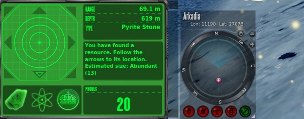
I quite like the transparent text to background. Can usually rely on MA to focus on graphics. Radar looks interesting, even though not sure what's going on.

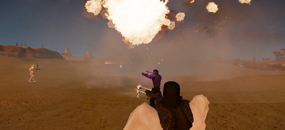
You know what, build what you want to build. Throw it out there, give it a chance to be accepted. I think if you have a new engine with enhanced capabilites you might as well embrace what the system has to offer.

Rick
 
Looks like a game i used to play when i was a kid, it was called Renegade. Please retain the entropian features we all fell in love with and try not to make it in to a new, completely different game. I bet that would put a lot of people off it. Cheers. 🤙
 
I remember the change switching to Cryengine and heard a lot of the same concerns then as well. I'm hopefull that the engine invigorates the development team to take chances, to be creative, this gives them a great oppurtunity to improve the look and feel of the game and the unreal toolkit is very flexible and user friendly to do that. Maybe they can surprise us with some major overhauls of systems down the road as well.

I'll be the first to admit I had my challenges with the current UI and it took me a while to adjust but I'm excited to have a world that may seem somewhat familar but totally new to explore and re-learn. I had spent so many hours in Project Entropia that I still get nostaligic for specific areas and sounds even the quirky music. The development team need to be respectful of the history and lore that has been created and understand what the playerbase wants. It wouldn't be the end if the UI wasn't fully customizable but it would be a downgrade from what we currently have.
 
Greetings all,

I support the idea of single "look" UI format, but keeping its PE character where possible.
So a player can focus on in-game world, and not on environment settings.
In the game in the foreground are the in-game world, effects, tools with which the player carries out his activities (gun, finder, navigator, VSE Mk 1 whatever)
You will see what I mean
many players use a high resolution monitor or TV, and leave only radar and navigator on the screens switching control using shortcuts (as well as
- Toggle Interface Visibility
- Camera Freelook
- Screenshot)
And that's really a new level for this project.

ggMLd6y.jpg


I'm used to tracking radar in pvp4. I swear 4 turned on at the same time red pvp indicators affect me more than anaglyph.
Turn off red and green RGB color channels and shift the layers to get an anaglyph in the image. I would really like to ask the developers to stop adding anaglyph. I like dark gray and dark blue in the Entropia theme now.

hhyVo0b.jpg


You're going for simplification in the wrong place. Why not go back to Roman numerals for Deposit Sizes.

VEllbvb.jpg
 
You're going for simplification in the wrong place. Why not go back to Roman numerals for Deposit Sizes.
I preferred roman numerals, but there's a shocking number of people that simply don't understand how they work. And software development these days often means catering to what the lowest common denominator can understand lol.

That's why interfaces continue to lose functionality over design with minimal controls. And entire games are being reduced to just pressing the F key repeatedly. Can't think of an example game that does that at the moment though....
 
Yeah, true story. I remember watching a streamer on Twitch and he kept saying "xiv" (yes, as a word) and for a while I didn't understand what he meant.
Like he was saying “Ziv”? Lmfao
 
Like he was saying “Ziv”? Lmfao
Something like that, yes :)

I mean he seemed excited when I tuned in as he kept talking about that he "found a xiv". So I interpreted that as he looted a "Xiv". From then on I was interested what that "Xiv" was. New item maybe? An abbreviation or nick name for something? I mean from the whole context of the stream that could have made sense.
 
Yeah, true story. I remember watching a streamer on Twitch and he kept saying "xiv" (yes, as a word) and for a while I didn't understand what he meant.
please dont tell me this is one of the main reasons they changed the numbering....... i hope is just a joke, would be pity from MA to change it so a few stumbled can read the finder, really now
 
I believe the reason that they changed from roman numerals was for easy search on auction. If I remember right mining amps used to be in roman numerals also and as you all know, auction search suck balls in this current system.
Hope they can bring it back with Unreal Engine, at least the deposit sizes in roman numerals, I kind of enjoyed it.

VU 16.2.0
  • Standardized many item names and naming conventions. To increase readability, most instances of roman numerals have been replaced by arabic numbers.
 
I prefer arabic numbers, it was a great change. I get that people got used to romans but not everyone has a latin keyboard, almost everyone has numbers.
Latin keyboard? What you mean? Isn't it capital letters? lol
 
I prefer arabic numbers, it was a great change. I get that people got used to romans but not everyone has a latin keyboard, almost everyone has numbers.
Si senor, no hablas espanol.

They're just capital letters. ivxlcdm
I= 1
V=5
X=10
L=50
C=100
D=500
M=1000

I tought everyone would atleast know 1, 5 and 10? The ones used in Entropia
 
I had a watch with roman numerals that I loved a lot. it was funny to find that there was a similar thing in Entropia :)
 
Last edited:
I believe the reason that they changed from roman numerals was for easy search on auction. If I remember right mining amps used to be in roman numerals also and as you all know, auction search suck balls in this current system.
Hope they can bring it back with Unreal Engine, at least the deposit sizes in roman numerals, I kind of enjoyed it.

VU 16.2.0
  • Standardized many item names and naming conventions. To increase readability, most instances of roman numerals have been replaced by arabic numbers.
Amps didn't have roman numerals, but many components did. Sockets components, tier comps and a bunch of blueprints too like the explosive projectile series

I do agree that it was a better move for that case, but mining claims was a different story.
 
I meant cyrillic, chinese, japanese, etc... keyboards.

Should have said qwerty instead of latin maybe, but in any case... why make things complicated?
They have to switch to QWERTY-layout anyway, otherwise how would they search for letters? I mean if you enter something Cyrillic I doubt the auction house will return something.

i hope is just a joke
No joke... I said "true story" ;)
 
We intend the combat will be a bit more reactive yes. Timing of abilities, avoiding certain enemy attacks, positioning etc is some of the things that we plan to test to give combat a bit more life. Today you are very limited that also reduces the possibilities to create fun second to second encounters. Worth mentioning is that we are aware that we cannot take this too far so it alienates our current playerbase
Keep in mind that we are often killing hundreds if not thousands of mobs in a single hunting day, "combat will be a bit more reactive yes" can turn into a lot of work if we have to stay moving or active the entire time to loot. With the loot cycles now you about have to kill a lot and staying active throughout could turn a lot of players away; too much like work is not good.
 
I miss the look, feel, and sounds of this...
index.php
I quite like the new look, if it’s fully customizable, with text that I can read, and useful information on display, as it is currently, then I am all for it. For me there is no doubt that entropia needs updating with modern graphics etc etc but I do worry about how much of the game that we play now, will remain in the future, I hope mostly it will remain unchanged but LOOK much better.
This pic above shows what, for me, has been lost in recent years, the excitement that I/we feel when that loot window opens up and fills with INTERESTING stuff like the armour pieces in the pic. Not boring oils, but armour, weapons, cool things! Yes I know we can still see that to some degree but generally loot is dull and if I were a new player now then I don’t think I would stick around for very long, regardless of how the game looks. I have been playing PE/EU since 2004 off and on, but it has never been about how it looks, for me it is about the buzz of finding something cool in that loot window.
Loot composition is largely, the only thing that I would like see changed but hey, if the game is going to look a lot nicer while I dream of a full loot window, then I have to take it, but please MA don’t lose that Entropianess that keeps me/us coming back for more.
 
I like the game as it is now, with the current engine. Not sure if my PC can run UE5. I don't have any problems with the current HUD UI.

UE5 will be less demanding on computing resources than CryEngine. Not sure about OS support though but should be quite comparable seeing as Unreal as an engine has existed just as long as CryEngine and is not new.
 
I love new ideas, but this is my opinion.

- The look is ok, new but ok.
- But it's hard to see, and where did the colors go?
color health bar, Colors of the type of ammunition you use. colors on chat colors on icons.

No visible colors make it all look very monotonous. Generally even harder to see or use.
Entropia is an MMO game. Check out other MMO games. I don't think any of them have one pure color on HUD.

Even more important. We need to be able to edit icons, element shortcuts and key layout. These icons need colors!
A very nice and important feature in Entropia is the ability to drag and drop elements / icons. To create your own HUD.

Again just like other MMOs. You can add or create your own toolbar and they have and need colors and element photo ect. !!
 
I just want to say I like the font, especially the 77 (on ammo?) it looks a little bit like it is written in runes, which I think is suitable and I started imagining what English alphabet will look like in year 3000. Which I think will regress into something that looks more like runes again. I cannot find the words to express exactly what I am thinking but this I think will help immerse the players and I like this stuff where you are predicting the future here or maybe even writing it in some way. This looks cool and I like that it's not just same UI as now (even though I very much like current)

My 2 pecs

Eq
 
It looks cool. However you do it, I'd love it if there was an option to turn off the extra effects you do... for me personally, they tend to get in the way in the game.
Very much this. My daughter developed epilepsy and really wants an option to turn weapon graphics off. We avoid shared loot mobs because of it. Epilepsy may be rare, but I'm sure people who suffer migraines have a similar issue with some of the bright flashes.
 
I like the game as it is now, with the current engine. Not sure if my PC can run UE5. I don't have any problems with the current HUD UI.
me too and i like that i cAN RUN EU ON MY OLDER COMPUTERS
 
Hi all!

I wanted to share the early work in progress for our Entropia Universe Unreal HUD UI. The important thing for us in this stage is to define a style, how easy it is to read and placement. You will also see some bonus elements in this image the Setesh Moon test environments early stages, a creature in action plus more ;).

Would love to hear what you think about this!

index.php


Disclaimer: Pre-Alpha Development, Not final
Has noone asked what the mission 'Rescue Colons' is all about?
 
Seriously, I am a woman irl but the beauty profession and new hairdos are seriously underated in this game.

RT long vampire pets have long haired ones so the code is there............

I have long blonde hair and would love that.

Just saying the neglect of beauty profession is LONG over due.

Just my 2 pecs :twocents:
 
Status
Back
Top