Evey
Marauder
- Joined
- Oct 7, 2006
- Posts
- 5,009
- Society
- Hardcore
- Avatar Name
- Eve Everglades
The before contains 3 panels with 3 different design types and I'm pretty sure you can find 10 more different design types across the various types of panels which for new players doesn't make any sense at all and it's really confusing. The fact that we got used to it doesn't mean it's OK. I'm sure no one at MA can answer why every new window came with a new designBEFORE
AFTER
(For future reference / comment)

The after image contains some common sense, some normal consistency and even if needs more work, if it brings performance benefits, it should be implemented tomorrow and I'm pretty sure around 0 people will quit over it.
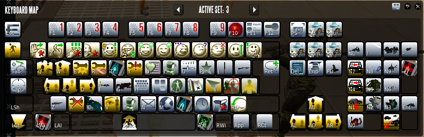
What I would like to point out however, a secondary action bar would be needed, maybe on the right side because we have too many tools, armor sets, pills and ofc healing tools and weapons to fit in the action bar at the bottom.
A sidebar like on the image below (from a successful generic MMO
) would be ideal, maybe collapsible from a toggler?
 .
.
