UI Release: Feedback Thread Part 2

Suggested Improvement: Add a Minimize Button (roll-up blind) and Allow Windows to Move Off-Screen

Feedback Summary:
The inability to minimize windows or move them partially off-screen leads to a cluttered workspace, particularly noticeable on laptop and during activities like scanning. This restriction forces windows to remain fully visible or requires manual closure after each action, hindering efficiency.

Recommendation:
Introduce a minimize button to reduce windows to their title bars, and enable windows to be partially moved off-screen for better workspace management. These enhancements will streamline workflows and improve user experience by allowing for a more organized and customizable screen layout.
 
Feedback: Mining finders not working properly when dropping probes.

Description: Current: After a claim is found, you can't continue mining for additional finds. You need to mine up a found claim first and then continue.

Suggested: Allow finders to continue mining after a claim is found.

Reason: Advanced miners, depending on location, will do mining runs and mining runs can't happen with finders operating this way.
Dropping 500+ bombs a day and all working fine. Being it by clicking on the finder icon or using key to "use tool". No problem at all to keep dropping without extracting first.

Maybe provide more details?
 
Last edited:
Feedback: Mining finders not working properly when dropping probes.

Description: Current: After a claim is found, you can't continue mining for additional finds. You need to mine up a found claim first and then continue.

Suggested: Allow finders to continue mining after a claim is found.

Reason: Advanced miners, depending on location, will do mining runs and mining runs can't happen with finders operating this way.
Using LBML I always extract claims right away. Its much more efficient than running about dropping probes then going back and extracting all the claims afterwards. It does not stop me from doing long runs.
 
Feedback
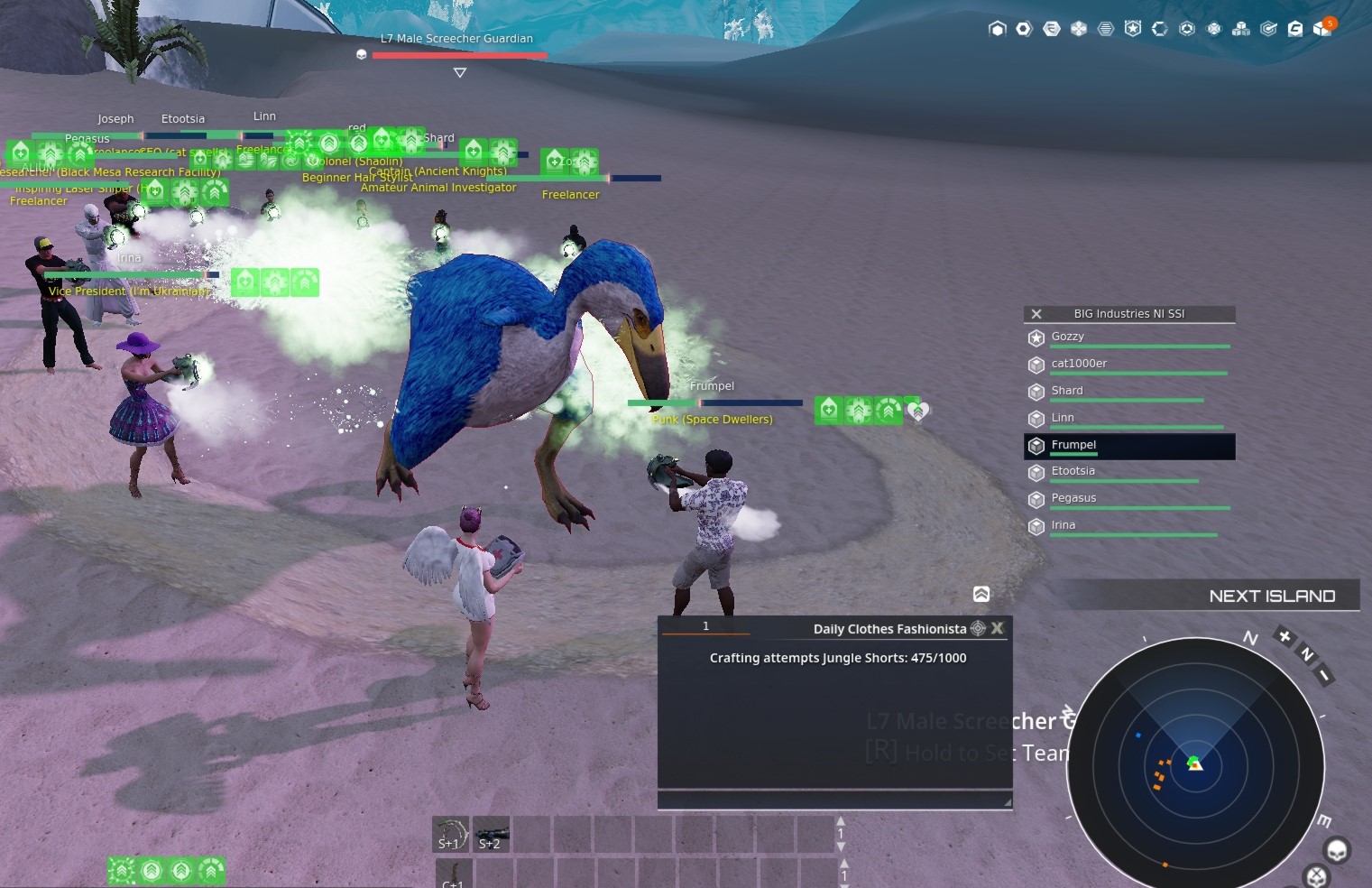
  • Title: buffs hiding health bars
Description:
  • Current: When you toggle all health bars you see every buff everyone has
  • Suggested: Make it so you can toggle which buffs you can see, for healing I would like to still see the healing timer so I don't waste heals
  • Reason: At the moment it becomes a sea of green at ssi circles making it very difficult to see health bars, I have to angle it in a certain way to see everyone's health. I like that I can toggle all the health bars on but its still hard to see them in a big group. I want to still being able to see when the timer runs out but I don't need to see every ring or buff a person has. This would also help while running races as again the buffs get in the way of seeing names.
Screenshots:
health.jpg
 
Feedback
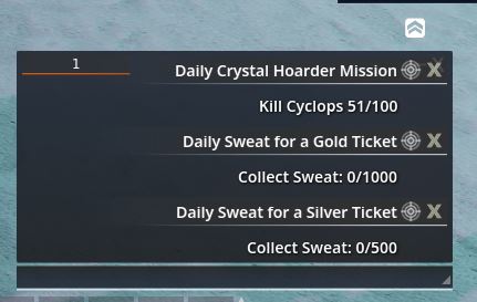
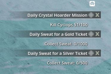
  • Title: Missions tracker and log
Description:
  • Current: Mission tracker is transparent and no search function in the log. Grab point for the tracker isn't obvious
  • Suggested: Make it so you can toggle whether its transparent or not, also add a search feature in the mission log to make it easier to find the mission your looking for. Also make an indication where you can grab the mission tracker as a lot of the times I end up grabbing it from the arrow to move it as its the only visible point
  • Reason: At the moment I'm using a chat box so I can read the mission log, I find it very hard to see the white text while the box is transparent. Search feature in the log would be so handy to quickly jump to the mission I need as at the moment when you look for a mission but are, says sweating and its completing another mission, it jumps back to the top and you have to start again. Also its hard to know where to grab and move the tracker from
Screenshots
:
mission-log-chat.jpg
mission-log.jpg
 
Feedback
  • Title: Chat box and pms
Description:
  • Current: instantly closes when you miss click on the x, pms in chat windows show will a small dot
  • Suggested: either make it so I can create a secondary and third chat windows, like the main chat that has no x, or add a warning before it instantly closes. Make pms that are in the chat box more indicated so that its easier to see if you got a message by making the whole pm tab light up and making the arrow button darker when there's a message
  • Reason: while hunting I use my mouse to click on mobs and I keep accidently hitting the x on my chat windows, I use my main chat window for local/soc/groups and the second window for all the planet chats. third one I use for pms. (I need them separated as otherwise I get confused) I keep missing private messages and people keep thinking I'm ignoring them but its simply that if I don't have my headphones on and a pm comes through I miss it completely. even with my headphones on its becomes a game of chase the sound
 
Feedback
  • Title: Keyboard-view as we had with F10
Description:
  • Current: No visual display of the key setup, only a list of actions with keys assigned to them
  • Suggested: Provide that keyboard-view from the previous UI
  • Reason: it helps to see the set up keys in one view and understand if the keys (in organised groups) make sense. Right now I have to guess the name of the icon (there are some more and less obvious ones)

Agreed.
Please MA ! :)
 
It took me few months to notice, but you can literally move the tracked missions and you can literally track 6 missions now. Good job! :thumbup:
 
Feedback
  • Title: Make up Zoom
Description:
  • Current: Can't zoom in enough
  • Suggested: let us zoom in more like we could 2013
  • Reason: Love the makeup system
 
Feedback
  • Title: Improve the Mining Finder window
Description:
  • Current: The color is drab, the fonts are small and uninspiring and not anything like sci-fi feeling
  • Suggested: Improve color scheme and layout, BIGGER fonts with DIFFERENT colors for different claim size/deposits.
  • Reason: I like mining. THe mining window looks like MA hates mining. Please, please give it some love!
 
Just my feedback as a very newbie player after something a little funny happened this morning.

I was watching this video of someone getting a nice Hall of Fame loot:


I thought the health bars looked really cool so I spent a solid half-hour looking online for mods or addons, only to learn the health bars from the video are actually the original old ones, while the UI update changed the health bars from very colorful to a single red band.

Food for thought.
Old UI was in many regards superior compared to the new one. 😗
 
When a new player sees a good thing in the UI, tries to find a mod and discovers it was MA's own discontinued and replaced UI!!! ^^
Yes, there are still things to like, but - all the steps backwards are so unnecessary.
Oh, and there are also new things to like, but all the steps backwards are so unnecessary.
 
Feedback
  • Title: Item points on stall/estates unclear
Description:
  • Current: You can only currently see items points that have been used
  • Suggested: Make it so you can see how many item points a shop/estate has like (used)/(overall item points) for example 3/70
  • Reason: I cannot tell how many items points I have left. I believe my stall has 70 items points but there is no indications anywhere to confirm that. Also when you go to buy a shop or estate I always want to check the item points at the terminal before purchasing so that I know exactly what I'm getting for my ped value. If the seller were to say 'oh yes it has 70 items points' and it turns out to only have 20 because you cannot do your own research into it you are out of luck and ped
 
dear AI president, here's mAI feedback: :LOL:

  • The Entropia Universe GUI is so bad, it made the tutorial NPCs quit.
  • The Entropia Universe GUI is so bad, players are using their imagination instead.
  • The Entropia Universe GUI is so bad, even the login screen sighed in disappointment.
  • The Entropia Universe GUI is so bad, people are taking up knitting during loading screens.
  • The Entropia Universe GUI is so bad, it got lost trying to find the settings menu.
  • The Entropia Universe GUI is so bad, players are sending smoke signals to communicate.
  • The Entropia Universe GUI is so bad, the quest markers started protesting.
  • The Entropia Universe GUI is so bad, players are writing down their inventory on paper.
  • The Entropia Universe GUI is so bad, even the bugs are avoiding it.
  • The Entropia Universe GUI is so bad, players are using carrier pigeons to send messages.
  • The Entropia Universe GUI is so bad, even Clippy from Microsoft Word feels sorry for it.
  • The Entropia Universe GUI is so bad, the options menu needs its own user manual.
  • The Entropia Universe GUI is so bad, players are organizing virtual rescue missions to find the missing buttons.
  • The Entropia Universe GUI is so bad, it makes Windows 95 look cutting-edge.
  • The Entropia Universe GUI is so bad, the game’s AI went on strike.
  • The Entropia Universe GUI is so bad, even the loading bar gave up halfway.
  • The Entropia Universe GUI is so bad, players are practicing telepathy instead.
  • The Entropia Universe GUI is so bad, it’s being used as a case study for what not to do.
  • The Entropia Universe GUI is so bad, the help desk set up a support group.
  • The Entropia Universe GUI is so bad, it made players nostalgic for text-based adventures.
  • The Entropia Universe GUI is so bad, it scared off the pixels.
  • The Entropia Universe GUI is so bad, players are using Morse code to navigate menus.
  • The Entropia Universe GUI is so bad, even the achievements are locked behind frustration.
  • The Entropia Universe GUI is so bad, the map needs its own map.
  • The Entropia Universe GUI is so bad, even the in-game characters are facepalming.
 
Too lazy to read through the past commets so Ill just add this. When you are pressing a movement key and at the same time open something like the action library key N for me. You get stuck into moving this direction. Its annoying to deal with everytime I have to mash my keyboard to try and get unstuck. Please fix ty
 
Too lazy to read through the past commets so Ill just add this. When you are pressing a movement key and at the same time open something like the action library key N for me. You get stuck into moving this direction. Its annoying to deal with everytime I have to mash my keyboard to try and get unstuck. Please fix ty
Same thing happens when you move items in inventory or loot window while you keep any movement key pressed.
 
Dear dev team,

Do you think we could have some darker background over all of these shiny white icons? I know there's probably nobody at the office right now, you like to take your 4 months summer vacation but... maybe the janitor can push some changes real quick?

index.php


The UI is not done, this is a disaster, there's a ton of bugs to fix and improvements to be made... but it seems you have already given up.

Cheers.
I really wish we could remove those icons. -_-
 
During login, when entering one's Password and GC Security Code, the characters are hidden. This was the case for the Password before the update, but not the GC. It would be nice to have a lightweight button which toggles the visibility of these characters to prevent mistyped Passwords and GC desyncing.
I hope it wasn't my suggestion (and MindArk's resulting attempt to edit the functionality) that killed the entire Gold Card Security System! :eek:
 
The new UI is not a finished product it's full of bugs.
To make it full working UI they should invite some players to their office to play the game and show them all the bugs as they play .
 
Back
Top