You are using an out of date browser. It may not display this or other websites correctly.
You should upgrade or use an alternative browser.
You should upgrade or use an alternative browser.
Help: UI Release: Feedback Thread
- Thread starter Ludvig|MindArk
- Start date
- Status
John.B.Cena
Mature
- Joined
- Mar 24, 2015
- Posts
- 26
My notes have disappeared because probably there is a bug, since now we can not have more than 1 pagePlease fix this for Mail, Auction AND Notes.
Embarrassing.
- Joined
- Feb 10, 2006
- Posts
- 16,079
- Location
- Sweden
- Avatar Name
- Formerly "Foeburner Nighthawk Delta"
Please fix this for Mail, Auction AND Notes.
It is a known issue, and we are working on it.
Please remove the PED indicator.
Toggles for showing PED or Avatar name in the HUD will be added in a patch.
Sub-Zero
Elite
- Joined
- Aug 8, 2007
- Posts
- 3,999
- Location
- Sweden
- Society
- Classified
- Avatar Name
- Sub-Zero The Killer
Yes, I agree, and I lost all my mail. This is likely a bug. There's a link in the first post for bugs.. Please people fking read the first post is not that hard. FOLLOW simple instructions and maybe they fix it!It seems we can have only 1 page of notes now!!!
I had 16 pages before the update and have all gone
This thread is for providing any UI-related feedback after the release.
To report bugs and crashes, please go to:
Help: - UI Release: Bug/Crash Report Thread
This thread is for reporting any UI-related bugs and crashes experienced after the release. To provide feedback, please go to: https://www.planetcalypsoforum.com/forum/index.php?threads/ui-release-feedback-thread.298589/ While we of course strive to provide smooth and problem-free releases...www.planetcalypsoforum.com
Please use the template below to provide any feedback you have regarding the UI release. All information in this thread will be compiled and forwarded to the UI team, so please make sure to provide detailed suggestions explaining what your suggestion is and (if applicable) the reason for it.
Thank you for your assistance!
EDIT:
PLEASE MAKE SURE TO ACTUALLY USE THE TEMPLATE!
Baldurn
Stalker
- Joined
- Mar 9, 2005
- Posts
- 1,822
- Location
- Gothenburg, Sweden
- Society
- Rangers
- Avatar Name
- Archaon Baldurn Zantetsuken
Until then there is option in "Gameplay" to hide outlines that would make it a little bit easeir to see as well (since outline and crosshair seem to be same colour?)Feedback
Description:
- Crosshair
- Current: even with crosshair opacity on max, sometimes is hard to see it
- Suggested: Stronger/brigther colors
- Reason: for better view
maniake kovine eglute
Hatchling
- Joined
- Sep 20, 2023
- Posts
- 5
just make option, to use old interface.... coz new one, who have "new featurer" is like 1998 yers style.... and it have MUCH LESS functionality.... in one word - square world, and u can place icon only in predefined square, and we have LOST possibility to place icons where we want... just do option - old and new interface....This thread is for providing any UI-related feedback after the release.
To report bugs and crashes, please go to:
Help: - UI Release: Bug/Crash Report Thread
This thread is for reporting any UI-related bugs and crashes experienced after the release. To provide feedback, please go to: https://www.planetcalypsoforum.com/forum/index.php?threads/ui-release-feedback-thread.298589/ While we of course strive to provide smooth and problem-free releases...
Please use the template below to provide any feedback you have regarding the UI release. All information in this thread will be compiled and forwarded to the UI team, so please make sure to provide detailed suggestions explaining what your suggestion is and (if applicable) the reason for it.
Thank you for your assistance!
EDIT:
PLEASE MAKE SURE TO ACTUALLY USE THE TEMPLATE!
Feedback
Maybe I am new to the forums but still I am not new to the game as a long term miner I am hope my suggestion would be consider.
- Title: My personal problem whit the new UI.
- Current: The the map, inventory, and all other things (except for the hotbar, chat, mission tracker and radar) look kind of worse then the old once.
- Suggested: It would be better to revert some thing to the way it was before this UI update or to have a setting to revert some things to the old state.
- Reason: The old once looked better then the new once and seemed more professional and more practical. I think this update was made more for the hunters audience then for the miners cause this changes don't hurt the hunters as much or at all like the miners.
| Screenshots: | 
| 
|

| 
| |

| 
|
Maybe I am new to the forums but still I am not new to the game as a long term miner I am hope my suggestion would be consider.
Tei
Provider
- Joined
- Feb 1, 2023
- Posts
- 125
- Society
- Rangers
- Avatar Name
- Teiwaz Storm Ing
I'm gonna start with saying that this is nice effort, feels clean and crisp, however implementation of many elements is far from good.
Here are my first thoughts (actually my first thought was "where do i start with feedback, there is so much"):
Login Screen
- please add option to obfuscate email/username, since we have 'remember username' option, this can be hidden, i know streamers would love this
All windows "waste" too much screen estate by having unnecessarily wide margins, that is really quite prominent on 1080p resolution (I guess still probably most common standard). Overall UI elements are enlarged, I suspect with mind of higher resolution, however this is a big nerf to 1080p and lower resolution (yes, people still use tyhose!), resulting in about 50% less content visible in bigger space used
Contacts Window is very bad because of wide margins and relatively low height, now on single page there are visible only around 50% of contacts compared to previous Contacts window (20 per page previously, 11 now)
Professions and Skills Windows are disconnected in terms of layout:
- in Skills, Rank is not so much important as actual skill Points, and as such IMO Rank progress bar should be shortened and Pionts progress bar should be longer
- it would be awesome if in Skills window, Points were showing percentage of progress, just like it is with Rank in Porfessions window (which is a great improvement over prevoisly needing to mouseover to see percentage)
- Skills have good "density" of lines, but in Professions window, Profession Names are in bigger font and with bigger linespacing, resulting in much more vertical space used for few professions
- in Professions window, Title, Achieved Professions and Unachieved Professions should be moved to left side column, under Professions' Cathegories as there is enough space to display that information, that could expand Professions list vertically or decrease height of whole window
- in Skills window, Total (Skills): XXXXXX text could be a bit bigger and in more prominent place
I kinda like that some Professions cathegories got collated, however there are some inconsistencies, for example Biotropic and Jammer are same kind of Combat like Paramedic, Evader and Dodger, same with Gunner Hit and Dmg. I think those should be moved to Combat and remaining 3 Minforce (Translocator, Telepath, Sweat Gatherer) moved to Misc.
On top of that, I think it would be great if we could have Combat split into three subcategories
- Ranged
- Melee
- Mindforce
Message Center
- have no options to hide messages from certain cathegories as we could do in previous UI
- it could be definitelly much slimmer
- also, if one of big reasons of UI change was performance, what is the point of receiving each and every Global in Message Center?
Item Information window is terrible compared to old one. There is so much wasted screen estate with this one, at the same time making it less useable than before because not all details fit in window
- definitelly could be narrower and taller
- instead huge waste of space for OVERVIEW window title, just display there item's name
- missing buttons to hide image - that makes some items impossible to read, see example image
Inventory...
- wider than before is better, (my professional curiosity peaks here: why 13 slots wide? Was it side effect of moving cathegories from vertically being on left to horizontally top?) but honestly probably 10 slots wide would be more than enough, consider this should be resizeable within some range, say 6-14 slots wide, and also resizeable to desired height
- bottom of screen could be managed much better, saving some vertical space
- I personally miss grid of old inventory - please add button to show/hide grid
- icons are misleading, especially Clothes icon, that looks like armor harness as already often mentioned in last couple weeks - consider using this icon for Armor, and use something else, for example hat for Clothes
Trade Terminal - what a waste of space... why does it need to be so huge?
- please redesign it to be small and slim or even better resizeable - as of now it takes 25% of screen estate on 1080p, that is not a joke... or is it?
Repair Terminal, much better that TT
- missing Clear button (to remove items from window without need to manually drag them back to inventory or closing Repair Terminal)
HP bar UI
- Universal ammo, BLP ammo, Synthetic Mind Essence icons are very unintuitive, I guess laser ammo could be bit better as well but it is not nearly as bad as forementioned
- as I already mentioned previously, Avatar Name should be there always visible, PED balance optionally visible
Mission Tracker have great visibility, tested on all sorts of background, great job guys!
Avatars (other players)
- if avatar have selected Profession to show publicly, then only Profession shows under their HP bar - no Society name / Freelancer status
- if no public Profession selected, then Soc name shows correctly under hp bar (shows freelancer if no soc)
- Vehicles with pilot/driver do not display Avatar name - this needs to be changed the way it was before
Team
- no easy way to leave or disband team, have to go to Team creator window
Radar
- please add more zoom granularity - in previous UI it was much easier to find a zoom that was useful, for example my current weapon have 85m range and i was able easily to look at radar to know what direction are mobs that are within range. In current UI maximum zoom-out is a bit too close to radar centre and one click on zoom-in makes it way too far, rendering radar much less useful that previously. Please adjust each zoom in/out step to be similar how we got used to play with for so many years.
- radar have some invisible margins on left, bottom and right, making it impossible to neatly align it to left/bottom/right side of screen. It is ok at the top.
Quick Actions (the icons that default top left of screen) have margin on right side, making it impossible to snap it close to right side of screen
Map
- why renamed to Navigator?
- Locations' list on left side:
-- have no space between type and name eg now it is (T)Ashi instead (T) Ashi
-- vertical spacing between locations on the list is too big, resulting with fewer locations fitting in the same space than before and needing more scrolling
- map could use higher zoom in to be able to more precisely teleport or add waypoint
Chat
- renaming tabs have no effect during session, and is only visible after relog
- there are 'hidden' Interface Settings, visible only when right mouse clicking Main chat tab - those need to go to Options > Interface for easier access
- when Chat is set to Auto Fade, there is no point having Enable Tab Highlight on as notification will not be visible until chat is selected
- this is the same as it was, but please consider changing it - currently System > Loot messages can only be visible on System chat tab, would be nice to be feely used in any other tabs like the rest of chat system
- please give us an option to disable Rookie chat, I mean leave this chat completely and do not receive any messages that only bloat chat.log file. I'm sure that 90% of players do not want to have anything to do with Rookie channel, and it is really shame that place that should be helpful for new players became sucjh a cesspool of profanities, hate, spam and trolling.
Global Ticker
- need option to disable
- move both options for Ticker next to eachother
Options (and maybe fsome other interfaces)
- If I remember correctly in previous UI there was tooltip help on mouseover option in settings, this is missing now and probably is still useful to both new and old players
Hall of Fame
- please leave it as it is... seems it's the last remaining UI... keep it that way for nostalgia
Some mics issues
- when in UI edit mode, you can drag UI element and press ESC to stop edit mode, but dragged element is still draggable until mouse button is released, pressing ESC again opens/closes Main Menu indefinitely, and element can be moved until mouse button is released - expected behaviour is to stop edit mode and revert UI element to position where it was before being dragged
- when resizing radar, pressing ESC disables UI edit mode but radar can still be resized till mouse button is released, pressing ESC again opens/closes Main Menu indefinitely, and resizing continues unless mouse button is released - expected behaviour is to revert radar to size before initializing resize
- sound volume is low relative to expected when maxed volume in EU Options and in Windows Mixer - it is effectively muted when Options volume slider is ~10%
That's it for today, I'm too tired to even try hunting somore feedback might come at later date.
Sub-Zero
Elite
- Joined
- Aug 8, 2007
- Posts
- 3,999
- Location
- Sweden
- Society
- Classified
- Avatar Name
- Sub-Zero The Killer
Feedback
- Title: Radar UI
- Current: Coordinates are hard to see at different backgrounds.
- Suggested: Make it how it was before. The Place name then below it:
- The Lon: XXXXXX Lat: XXXXXX
- You guys can just add dark background where the coords are just like you have for "Place" name.
- Further improvements in the future:
- Ability to see displayed range for each circle. More zoom options.
- Ability to increase dot size a bit.
- Ability to filter dots, like displaying only green dots, or only red dots, or only purple dots and red dots etc, hiding npc dots etc. So many options the more the merrier!
- Reason:
- For OCR software like LBML where it requires good view of the text. And generally for better clarity.
- In the past we could put sticky notes below the coordinates in order to increase the accuracy level. Now we cannot, the stickynotes are above the coordinates. And for general QoL improvements.
hrchak
Old
- Joined
- Feb 26, 2020
- Posts
- 73
- Avatar Name
- Meister hrchak Nix
Feedback
- Title: Auto tool stops randomly either by chatting or focusing on other ui elements
- Current: Turning auto tool, then right clicking on ship station to repair, when in mouse mode and focusing chat, repair tool stops consuming welding wire and tool is not working
- Suggested: Turning auto tool, and right clicking on station to repair, should keep it repairing, changing focus should not stop the tool
- Reason: Not sure about other activities but repairing ships is one that you either chat or look at other things while it is being done, and this breaks the old behavior
Sub-Zero
Elite
- Joined
- Aug 8, 2007
- Posts
- 3,999
- Location
- Sweden
- Society
- Classified
- Avatar Name
- Sub-Zero The Killer
Feedback
Can you guess what my 4th vehicle is? Again, the image makes it look larger than in-game..
- Title: Map UI, general icons for message center, professions, missions, certain item icons in action bar.
- Current:
- Certain item icons on action bar: Hard to see what items you have for certain items like your vehicles it looks very dark (haven't tried in higher settings, but on low settings looks very dark).
- General icons: too small, hard to see on certain light backgrounds.
- Map: Coordinates text is too small. Zoom options still not enough (old UI was too limited too)
- Suggested:
- There should be an option to add a background for certain inventory icons or improve them so its easy to know what it is at a glance.
- General icons etc:
- Ability to increase icon size, a darker background below them as an option to increase clarity.
- Map:
- Ability to zoom more.
- Ability to increase waypoints/death waypoints icon size or just better zoom so you could see it better.
- Ability to increase the text size, in particular the lon and lat coordinates.
- Reason:
- Self explanatory. QoL improvements. As you can see from my screenshot, this is full zoom. This doesn't feel very modern UI.
- I can barely make out where I'm going and the mission waypoints are all cluttered up. Note that the image may make it seem larger than it is, because in the full client window it looks significantly smaller.
Can you guess what my 4th vehicle is? Again, the image makes it look larger than in-game..
Last edited:
Finnigan
Guardian
- Joined
- Dec 23, 2006
- Posts
- 325
- Location
- Belgium
- Society
- Kaos
- Avatar Name
- Danny Finnigan Fitzpatrick
Feedback
Description:
- Title: Keybindings do not save if changed
- Current: if you change a keybinding to something else it is saved but not if cleared
- Suggested: save as is on exit or add save/cancel
- Reason: It is really anoying
ColonelBuckshot
Prowler
- Joined
- Apr 24, 2012
- Posts
- 1,282
- Location
- Australia
- Society
- AO
- Avatar Name
- Wilburforce ColonelBuckshot Buckshot
-login screen doesn't scale to 3440x1440 monitor
-none of the movement keys work when clicked on with the mouse to move your character in game.
-using the item icon when locked onto a mob but out of range causes the item to use rather than moving to a range where it can hit.
-mindforce chip icons don't reflect true cooldown.
-sometimes even when locked on with red reticle, the weapons completly miss the mob with no message.
Msturlese
Stalker
- Joined
- Mar 7, 2021
- Posts
- 2,173
- Location
- italy
- Society
- Dirty Dingos
- Avatar Name
- Marco Killy Stur
Feedback
> Title:
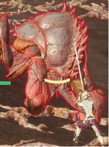
MONSTER AND RESOURCE NODES NAMEPLATES
Description:
> Current:
THEY ARE TOTALLY UNREADABLE, CANT READ NEITHER MATURITY NOR NAME OF MONSTER
> Suggested:
PUT A SOLID BLACK NAMEPLATE WITH WHITE MONSTER NAME
> Reason:
Just your programmers like transparency we need to have REAADABLE text
> Title:
MONSTER AND RESOURCE NODES NAMEPLATES
Description:
> Current:
THEY ARE TOTALLY UNREADABLE, CANT READ NEITHER MATURITY NOR NAME OF MONSTER
> Suggested:
PUT A SOLID BLACK NAMEPLATE WITH WHITE MONSTER NAME
> Reason:
Just your programmers like transparency we need to have REAADABLE text
Sub-Zero
Elite
- Joined
- Aug 8, 2007
- Posts
- 3,999
- Location
- Sweden
- Society
- Classified
- Avatar Name
- Sub-Zero The Killer
Feedback
Also, the channel tabs text is very bad to read... The text is too gray not clear enough and the text size doesn't update to the text size of the text size you chose on options. Also the text size in the input field is small (does not resize based on your current text size option).
Screenshots:
- Title: [Chat interface and stickynotes]
- Current: Chat interface, currently the text colors are very limited and many colors quite similar
- Stickynotes currently are stuck to the window, in previous VU we could make the stickynotes large, then just put it at bottom of the screen just showing the draggable window part, to save screen space, then just drag it out when we wanted to see the whole window.
- Suggested:
- Re-add previous ability to stickynote, also add more color options, ability to bold text, also search options so u can search for keywords against all your stickynote then it will show up.
- The previous UI, we had the waypoints and item links in a very readable color.
- We could very easily see in a massive amount of chat what what was what.
- We should have option to change the color of avatar names, item links, waypoints, ideally anything. But in order to make it really customizable there needs to either be a color picker for a specific channel (you should be able to do for each channel or msg type) or add more ranges of color to pick from. The color for avatar name and link/waypoints needs to be changed for sure lol.
- Reason: General QoL improvements! Now the avatar name is currently the same text color as item links and waypoints text.
Also, the channel tabs text is very bad to read... The text is too gray not clear enough and the text size doesn't update to the text size of the text size you chose on options. Also the text size in the input field is small (does not resize based on your current text size option).
Screenshots:
Finnigan
Guardian
- Joined
- Dec 23, 2006
- Posts
- 325
- Location
- Belgium
- Society
- Kaos
- Avatar Name
- Danny Finnigan Fitzpatrick
Feedback
- Title: Keybindings do not save if changed
- Current: if you change a keybinding to something else it is saved but not if cleared
- Suggested: save as is on exit or add save/cancel
- Reason: It is really anoying
Slamdance
Mature
- Joined
- Mar 5, 2015
- Posts
- 32
- Avatar Name
- Kat Slamdance Sawyer
Feedback
- Professions window progress bar detail
- Current: Font is too small and no detail is shown when hovering over a progress bar.
- Suggested: Increase font size and contrast. Show more detail (similar to Progress window). The old UI gave rank plus four decimal places.
- Reason: Hard to read! Percentage to next rank is okay but please restore the hard data previously provided.
Last edited:
melissa.fleur
Provider
- Joined
- Jan 16, 2022
- Posts
- 103
I dont know if it was already said but:
Inside the message center. It's not possible to look more than the first page of notification, note, mail, etc...
Something I keep of winning auction notification to keep track of the price paid. But since I put a lot of thing in auction house, that notification is lost in second or third page, which I cant access (like before).
Please add switch page option for all section of the message center window.
Also, before the VU it was possible to put a portion of the inventory window outside of the screen. Is it possible to do the same. With that option we can lower the ''footprint'' of that window in our screen. Right now, the inventory window that too much space.
Regards,
Last edited:
SoberPhil
Old Alpha
- Joined
- Dec 20, 2019
- Posts
- 761
- Location
- Long ago and far away
- Society
- Victory
- Avatar Name
- Philippus SoberPhil Maximus
Feedback
- Title: No way to see item MU from within the crafting interface
- Current: you can only see the MU of the BP, check for mats on auction, but no way to see the MU of the item like it was possible before
- Suggested: add check MU and sales history buttons for items in the crafting interface
- Reason: well it's kinda useful to check the MU of an item you want to craft from within the crafting window
Feedback
- Title: Copy Item Link
- Current: Copy Item Link button in item details still not working.
- Suggested: Button should work as indicated
- Reason: Only way to copy an item link from AH Order / Available section
Feedback
- Title: Sticky Notes
- Current: Basic text editor options not available. Most notably - Undo
- Suggested:
- Offer some text edit options (Bold / Italic)
- Add an Undo feature PLZ
- Allow longer message per note
- Allow a note to have a Name. Display this instead of the Date it was last edited and a preview of the contents.
- Reason:
- Easy to accidently erase an entire note.
- More general functionality
- Better organization
Last edited:
Feedback
- Title: Action Bars functionality in hidden mode.
- Current: Right now it seems that the action bars keyboard shortcuts do not work, once we choose to hide an Action Bar.
- Suggested: I would like to be able to add items to Action Bar, choose to have the Action Bar hidden in options, and still have its keyboard shortcut keys working.
- Reason: It seems like a good idea to me, to not have to have all action bars visible on screen but still being able to use them for their keyboard shortcuts.
My feedback, which you will have to take in a bullet point format:
- The mining finder interface is not visually appealing at all. The old green icons are still there, which don't fit the style at all, and the circle/octagon thing looks like this is something someone put together in MS Paint. You can do much better.
- I may be wrong on this one, but it feels like the chat font got slightly larger. Either way I would love an option to reduce the size of it. I can't select anything smaller than "Normal".
- Text such as loot and missions is white with very little drop shadow. On bright backgrounds these are way too hard to read. The same goes for the icons in the top left.
- I would love a way to always display my own nameplate or just healthbar above my character. The new health bar feels somehow harder to focus on.
- For some reason I can't choose the original color for chat channels (dark purple) once I've switched to a different color.
- The maximum allowed size for radar is way too small. I want to be able to make it bigger
- When teleporter is out of range of the radar, it is still within the radar circle. It used to slightly overlap the edge so that it was clear that the teleporter was further away than your range. It is now ambiguous whether it is in range or not.
Dalas
Prowler
- Joined
- Apr 13, 2006
- Posts
- 1,040
- Location
- Haugesund, Norway
- Society
- Death Unlimited
- Avatar Name
- Luke Dalas Cambridge
Feedback
- Title: Mindforce Cooldown not visible.
- Current: We can't see when items like Arsonistic Chips or Resto Chips are cooling down and have to guess when we can use them again.
- Suggested: Have some kind of visual cue as we had in the old UI.
- Reason: Restore previous functionality!
filibert
Guardian
- Joined
- Feb 15, 2010
- Posts
- 205
- Location
- Switzerland
- Society
- freelancer
- Avatar Name
- filibert bébert Artig
Save time and only read yellow!
First, I really like that you're making changes before UE5, it's wise and motivates me to not log off and wait launch
I like: the total value in the open loot window, and the repair cost thing!!
I dislike: not beeing able to place my icons where I want. This is a major stepback btw
For everything else, I just see downgrades: big gross squares, big non resizeable windows. Even the progress bar has become a fat square.
You did not "rework" interface, you occupied some guy changing rectangles into squares, and textures into nothing.
If only you were allowing it (yes, how comes you aren't!), I would keep the change for loot window and put everything else back to 20.02. No offence, but you provided the exact predictable quality I was waiting. Something bad I don't have choice to go without
cosmetic solution (what you asked for): work better, or hire me as Solution Finder, i swear I'll do the job of speaking to graph designer(s)
real solution 1: (having dev playing their game and others, to compare.) Link below is the UI of Eve Online in 2004..yes 2004. I never really played, but just watching that screen I largely understand what the icons mean and where the infos are (maybe because they use symbols that fit to purpose, not random figures...)
The E of Entropia icon is what every other icon should look like. Icon for message center is a cube...c'mon. The two mountains and flag, figuring exploration travel and map, are for....mission log. Of course!
real solution 2: stop moderating, start working, check suggestion threads, rinse and repeat. Never in 13 years have I thought about a new UI in that game. Please consider the concept of : "it's about what they want, not what we are conviced they need". Suggestions threads have dozens of years-old ideas to -at least and finally- investigate.
First, I really like that you're making changes before UE5, it's wise and motivates me to not log off and wait launch
I like: the total value in the open loot window, and the repair cost thing!!
I dislike: not beeing able to place my icons where I want. This is a major stepback btw
For everything else, I just see downgrades: big gross squares, big non resizeable windows. Even the progress bar has become a fat square.
You did not "rework" interface, you occupied some guy changing rectangles into squares, and textures into nothing.
If only you were allowing it (yes, how comes you aren't!), I would keep the change for loot window and put everything else back to 20.02. No offence, but you provided the exact predictable quality I was waiting. Something bad I don't have choice to go without
real solution 1: (having dev playing their game and others, to compare.) Link below is the UI of Eve Online in 2004..yes 2004. I never really played, but just watching that screen I largely understand what the icons mean and where the infos are (maybe because they use symbols that fit to purpose, not random figures...)
The E of Entropia icon is what every other icon should look like. Icon for message center is a cube...c'mon. The two mountains and flag, figuring exploration travel and map, are for....mission log. Of course!
real solution 2: stop moderating, start working, check suggestion threads, rinse and repeat. Never in 13 years have I thought about a new UI in that game. Please consider the concept of : "it's about what they want, not what we are conviced they need". Suggestions threads have dozens of years-old ideas to -at least and finally- investigate.
Last edited:
AkiranBlade
Slayer
- Joined
- Nov 9, 2005
- Posts
- 9,431
- Location
- UK
- Society
- Shaolin
- Avatar Name
- Akira AkiranBlade Kurusowa
- Status