Do you consider this armor better looking now?

Does this armor look better now?

  • Yes

    Votes: 38 32.8%
  • No

    Votes: 78 67.2%

  • Total voters
    116

True Juan

Marauder
Joined
Oct 6, 2006
Posts
6,183
Location
Slovakia
Society
Cz-Sk Crows
Avatar Name
True TJ Juan
Hi guys,

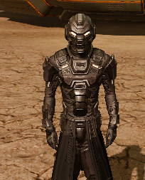
I have a Salamander SGA, and I dont know if its just me, but I think the new color-scheme is just BAD.
Nothing like the previous design.

Before - After

index.php


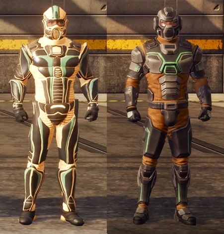
What is your opinion?


True
:bandit:
 
It looks more realistic but they need to improve the coloring paint for many remodelled armors. They also should not have identical models. More than color should distinguish between different armors and the glowing eyes should be toggle on or off imo.
 
Would be nice to see them implement a system that allows players to skill and re-color ALL armor and clothing pieces, not just specially crafted (C). Would allow players to be unique and customize their whole kit for their own enjoyment and experience.
 
They meseed up my Tiger too, just bought a Tiger Set, really loved the colors and the look.

I have to admit, part of the reason of buying it was looks and it's jut hideous now :(

But, nothing i can do
Tiger actually doesn't look so bad (Looks similar). Didn't change too much in color scheme. At least if I compare it to Sala SGA.
 
Have to check adj jag out after work but looks boxy
 
personally i like the new looks better.

i don`t know but the old ones just feel like a single piece of armor with details painted on it

the new version looks more complex with different moving parts that dont just look painted on the armor but actually stick out, its neat
 
guess adj jag not bad least got a visor
 
i dont care to be honest but ya they could make some of them look better
 
I like some elements like the greaves, boots, arms, and gloves. I think the new armor looks more science fiction but less Entropia if that make sense. The only thing I can't get around is the helmet. Maybe its the shape of the eye shield or the helmet itself with the larger ear pieces and plate on top. Something just seems a bit off but the helmets have been "off" for me for quite some time.

In my opinion, if I were going to make changes to the armor then I would have revamped the whole design scheme to something outside of "Scuba Steve". Make each armor representative of its name and protections. The glowing eyes is interesting but really get to the core of each armor and add some defining characteristics even if its just a different UV map or some label like graphics added into the UV. Make it really unique to Entropia and this might mean going back to the roots of Project Entropia designs in some way. It would be interesting to see something like Bear armor being somewhat bear-like in terms of appearance or Shadow armor having a darker edge and Angel more towards the light.

Ahhh well its and interesting take and my thoughts might change when I can get to the update.
 
After being in a mood all day about this and having to stare at my ugly ass armour..

I think they really just need to work on the colours a bit.. Make some stand out more.
 
The capacity of that team to downgrade, ruin and destroy things we've never ask to change, will allways impress me
This!
Why on Earth would they change things we like. why on Earth would they change the things we came for, and stayed for???
And as said above, why on Earth would they change things we never asked for? It feels like they have their own plans and the players opinion doesn`t mean s**t for them!
On topic: new armors look like s**t, my Tiger is still bearable, but others have been massacred.
 
Honestly i really like the new armor looks, if anything i would say maybe change back the color schemes (on some) but keep the new desgin
 
Thank lootius I didn't sell my Supremacy set! At least it hasn't been F***ed with.
 
Love the models, colors need some adjusting..
 
Back
Top