(updated)
Feedback
- Lea's feedback ( It looks scary but on the end i wrote down what changes were great ^^ )
Description:
#COLORS
- Current: Too many Color Themes. Screenshot named "Color Themes" shows how our eyes see and simplify colors, when we play now.
- Suggested: Choosing one Color Theme; skills, inventory etc got awesome theme that looks professional. Matching rest to that one Color Theme.
Screenshots:
Easy and free screenshot and image sharing - upload images online with print screen and paste, or drag and drop.

snipboard.io
I agree with many aspects of the update, especially its positive direction. However, besides addressing bugs, the main issue lies in visibility. Although I've read your post, I'm not sure about your gameplay style. When I run the game at resolutions like 2560 x 1440 (2k) or even 3840x2160 (4k), which many gaming monitors support, the result is too much screen space and very tiny, poor-quality icons.
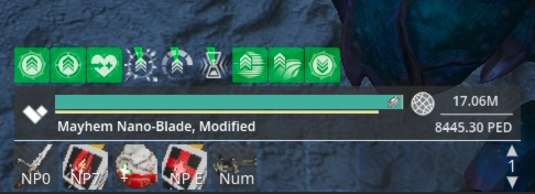
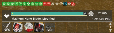
- The action bar icons are too small, making it impossible to discern what item they represent, and there's insufficient background color.
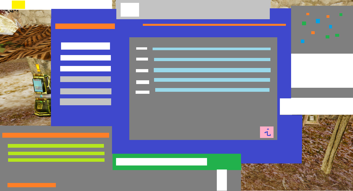
- The auction and other windows appear small in comparison to the available screen space, resulting in an overload of information within a confined area.
- The names, health bars, and information bars of other players suffer from poor color quality, making them difficult to see clearly. All colors within the UI appear faded and too soft, further complicating visibility.
Check out how hard it is to spot the items on the action bar – their visibility is seriously lacking. They're practically invisible. The chat set to maximum size in X and larger text so you see how much spave its left on screen. While the overall new design is decent, it definitely needs more background color. Just take a look at the quest menu; sometimes it's just impossible to read. Nevertheless, I'm sure they'll make plenty of fixes over time, though it'll take some time.
This is only in 2560 x 1440 (2k)'
PS - So funny they add the small implant in the HP bar! SEE HOW tiny that thing is.. just why?? xD
PHOTO