News: NEW UI: A CLOSER LOOK

Bertha Bot

Entropia News Fetcher
Joined
Jul 26, 2006
Posts
3,315

THE NEW HUD, ACTION BAR, UI EDIT MODE, AND ICON MANAGEMENT​


Let's take a look at the most significant UI changes we plan to release in the UI update in February 2024. Here, you will find an image of the new HUD and a step-by-step guide to easily navigate the improved Action bar, UI Edit Mode, and Icon Management!

The updated Heads-up Display (HUD)​

Fullscreen_UI2.webp


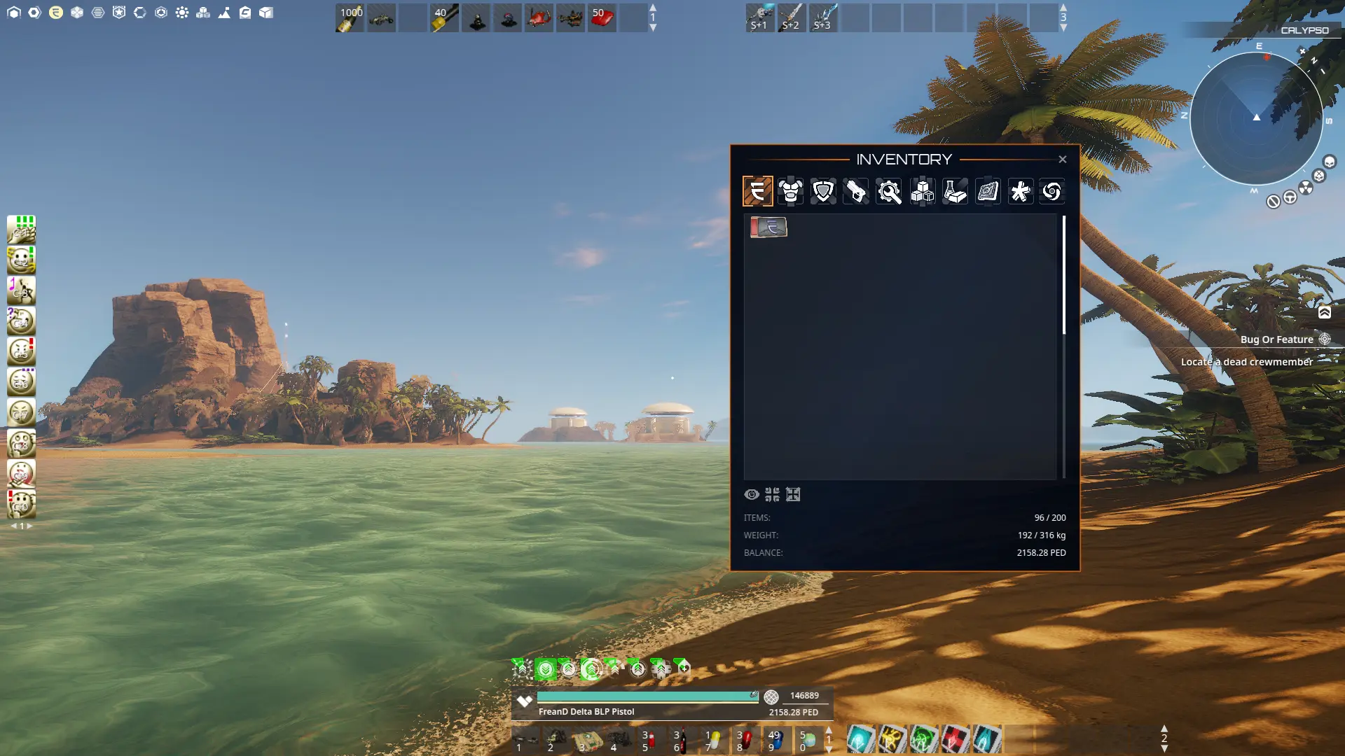
We kept an updated look and functionality in mind when updating and designing the new HUD for Entropia Universe. We decluttered the HUD for easier readability, made it a more attractive and clean design, and increased performance with added functionality and flexibility. In the image above, you can see the updated Radar, The Quick Bar to access the often-used windows, the Mission tracker, and a glimpse of the Inventory redesign together with one of the most significant changes, the Action Bars.

We will now guide you through some changes you, as a user, will encounter upon the first login after the update!


Actions​


The previous Action Library has been revamped into Actions. Actions let players customize controls by assigning bindings to every in-game action and action bar. Using modifiers* (CTRL or SHIFT) for your bindings, you can trigger any action in the blink of an eye! The Actions fast search bar system and good overview make finding what you are looking for easy.

UI Edit-mode​


To move or personalize your HUD UI elements and Action Bars, you need to enable UI Edit-mode. You can reset your settings by pressing the [Reset] button if the interface isn't functioning correctly or if you wish to revert to the original default settings.

How to access UI Edit-mode:

1. Press N on your keyboard to open [Actions].

...


2. Click the [UI Edit-mode] button to activate the edit mode.

...


3. Customize your action bar assignments and the positioning of the heads-up display layout.

4. Close the UI Edit-mode panel by clicking the [UI Edit-mode] button again.

5. Done! Your changes are now saved.


Keybinding​


Keybinding is split up into two parts. Keybinding immediately activates an in-game action or a slot in an Action Bar. Below, we will show an example of how to add a keybind to the Inventory and how to remove it.


How to set a specific key binding to an in-game action:

1. Press N on your keyboard to open [Actions].

...


Type “inventory” in the [Actions] search menu.

...


3. To add a keybinding, click on the desired row and binding column. In this example, we set F1 as a second keybind for the Inventory. (Please note that you cannot assign a single key to multiple actions.)


...


4. Done! Your keybinding is now saved.


How to clear in-game action keybindings:

  1. Press N on your keyboard to open [Actions].
  2. Type “Inventory” in the [Actions] search menu.
  3. Click on the keybinding you wish to clear.
  4. Press the [Clear] button.
  5. Done! Your keybinding is cleared


Action Bars​


You can have up to five Action Bars active in your window, with ten slots and three pages each. By default, two Action Bars are enabled. With vast customization options, Action Bars has a dedicated category in the Actions UI where you can set binding per bar and slot.


How to access, edit keybindings, and edit your action bars:

1. Press N on your keyboard [Actions].

...


2. Type “action bar” in the [Actions] search menu. All action bars and their corresponding keybindings are now visible.

...


3. To add a keybinding, simply select the desired action bar row and binding column. Change the keybindings by pressing any key of your liking. (Please note that when you assign a key to an Action bar slot, the same key remains bound to that Action bar slot across all the three Action bar pages.)

...


To add a new action bar, press O [Options] and go to [Interface]. For example, click on the dropdown list for Action Bar 3 and choose if you want the bar to be positioned horizontally or vertically.

...


Click [Apply] to confirm the changes. The new action bar will be visible in your window. If you wish to hide your action bar, choose the “HIDDEN” option in the dropdown list.

*In response to community feedback, we’ve introduced an option to disable CTRL and SHIFT modifiers in the new UI. When disabled, modifiers serve as keybinding keys.


We hope these guidelines enhance your experience with the new UI! Join us on the Planet Calypso forum to discuss the new UI and share any questions you might have!

Originally Posted Here
 
I like the new inventory, looks like much more space available, less scrolling. I like!

It will take some of the community a lot of effort to adjust to these new cool changes, I am certain... But I do think this looks better than the old system, even if it's very different from what we are used to.

A fresh, much welcome change for sure!

gamers be like

 
Does the setting"Private message action (others/friends)"

Will that option prevent new Private messages to pop up in the center of the games screen?
This is a problem when making videos/streaming as most people don't like their private messages to be shown to public eyes.

Thanks in advance for answering the question <3


Great work, it looks like the UI was made by 1 cohesive team instead of for 13 different games. Well done.
 
I like it overall, it's somewhat familiar to change assignments as it resembles to Adobe keybindings settings :D
It looks nice and I'm sure it will look even better in the future but I really hope you change the ugly arrows until it goes live!

I would like to see containers remembering last position, like storage and inventory are now.

Players shuld take screenshots of the current config so it's easier to edit so that it's still familiar.

Good job!
 
Does the setting"Private message action (others/friends)"

Will that option prevent new Private messages to pop up in the center of the games screen?
This is a problem when making videos/streaming as most people don't like their private messages to be shown to public eyes.

This has not been changed, so it should be working as before the update.

I would like to see containers remembering last position, like storage and inventory are now.

We are working on this.
 
Well, thanks for the preview, but my initial thought was uggh!, followed by another uggh!
That first screenie makes the inventory look like it's sort of stuck on, like someone sticking a sticker on a lamppost.
Plus, I seriously dislike the font for the titles.
Also, I dislike the icons for the inventory and the icons' transparency as seen on the bottom bar.
The size of the up/down arrows looks to be a pain too.
Hopefully, after this initial response I will find some things I actually like.

I don't see offhand how I tie a weapon or similar to a position, but it's hopefully easy.
When you write "(Please note that when you assign a key to an Action bar slot, the same key remains bound to that Action bar slot across all the three Action bar pages.)", do you mean that three things can be activated by the same key by having the things on different pages? Confused!!!

That's what I see spontaneously.
Oh, how do I most quickly activate an action I haven't set anywhere? Must I set it, or can I click it on the actions page once I find it, for example open up the mentor register in the example screen with no binding set for it at the moment?

Oh, I can say thank you for "option to disable CTRL and SHIFT modifiers in the new UI" :) - phew
 
Last edited:
Looks like an improvement overall.

I have some questions
  1. Regarding the hp bar. My understanding is that it will be some kind of gradiant between red-yellow-cyan depending on how much hp you have left. In a big fight, it could look like a constant color flashing on the screen. Will there be any way to choose the colors? For example if I preferred just a single color or some other color palette than red-yellow-cyan.
  2. Armors. Are icons for armor sets still a thing after the update? Or will we have to equip/unequip each part individually now?
  3. Where is the avatar name displayed now?
 
Please tell me this is all explained in the question mark in the top right of the UI. Otherwise, if you don't read the forums, you wouldnt have a clue how to use the action bars, or edit them. Or how to bind keys and restrictions ...
Rgds
Ace
 
Looks really nice!

Very pleased that the modifier keys can be toggled off and the unused Action Bars can be hidden.

Definitely wondering about these as well:
  1. Armors. Are icons for armor sets still a thing after the update? Or will we have to equip/unequip each part individually now?
  2. Where is the avatar name displayed now?
 
Last edited:
J to Synthetic Chatgpt: Please provide one other example of where the titles font from the new EU UI is used.
Synthetic Chatgpt: It is also used in the series Stargate.
J: Great, another UI I cannot understand the symbols to. Love the series - still doesn't mean I like the font, ty.
 
Where is the avatar name displayed now?

It will be above your health bar if you select yourself.

Please tell me this is all explained in the question mark in the top right of the UI. Otherwise, if you don't read the forums, you wouldnt have a clue how to use the action bars, or edit them. Or how to bind keys and restrictions ...
Rgds
Ace

This guide is also available on the website, and it will also be added to the client loader.

Also, when you first log in after the release there will be a screen with a link to instructions. The question mark will also have some simpler instructions.
 
I have a question, and a bit of a worry. I do not know if this has been asked before, but from all the pictures I have seen of action bars.... "all" of the little squares are visible at all times,

For example.. If I am hunting, I might only be using 3 different keys on the screen:


With the new UI, do I *have* to keep the squares on the screen at all times, as this picture shows?


The left action bar has an "empty" space between the vehicle and the champagne, or empty squares to the right of all the melee weapons, and since many different action bars are in use i feel this might actually cause more clutter on the screen, than actually remove clutter...


Thanks for reading
 
sry if some1 else already asked...is it possible to put item icons on screen anywhere again ? or do they now need to go into bars ?
 
Looks really nice.... are we able to adjust the transparity of the inventory screen?
 
I find one MAJOR issue with this picture. WHY?!?!? do you have a picture with an equipped 1.0 weapon and nothing new and cool! Frean Delta... its from 2004... we have more 2.0 gear.... Get good MA!
 
Looks interesting. :) I guess that no matter what I feel about it now, if anyone ask me in six months I have probably
(almost) forgot old GUI and got used to the new one. ;)
 
I have a question, and a bit of a worry. I do not know if this has been asked before, but from all the pictures I have seen of action bars.... "all" of the little squares are visible at all times,
[...]
The left action bar has an "empty" space between the vehicle and the champagne, or empty squares to the right of all the melee weapons, and since many different action bars are in use i feel this might actually cause more clutter on the screen, than actually remove clutter...

This was answered in the first thread:

Unused slots are not hidden, though they are transparent. We may also add an option to have unused buttons fade fully in a future patch.

sry if some1 else already asked...is it possible to put item icons on screen anywhere again ? or do they now need to go into bars ?

You can only put icons in the action bars.
 
The inventory has no "soul" it takes more screen real estate than current one because you will have to scroll a lot more.
I like the square between each item in current inventory..
Please allow us to resize that inventory window and all Windows for that matter and the window will automatically fit everything based on how we resized it although have a minimum size too for compatibility issues.
I feel like the current inventory UI is a lot more clearer in text.
You also didn't show any icons for loot or gear.. it was completely useless to show the ped card. One thing that our current UI inventory needs is ability resize the icons and most importantly the text size that shows the count for readability...
I hope that all windows and action bars will have full opacity customization. For example if u can make the opacity high enough it would effectively hide the unused slots in the action bars.

What is that yellow bar below hp bar?
I can only assume it's for your weapon reload time?
Why have the equipped mindforce chip inside the hp bar, it looks really bad. We only need to equip our mindforce chip once for when we upgrade our chip lvl. Why do we even need it to display at all? We can currently see what items we have equipped anyway.. this is a remnant from old PE that serves no real purpose tbh.
I do appreciate that you guys are trying so I hope my bluntness won't deter you guys from continuing to improve it.
There are more points I could give but I don't want to write a whole paper about why this UI update needs some serious work still. But I may post some more points later on.
 
Last edited:
I really like the UI. Looks much more unified and focused, more modern. Thanks very much for this preview! It's definitely a big change that's clearly had a lot of time put into it and I feel it's the right thing to do in the transition to unreal engine 5.
 
You also didn't show any icons for loot or gear.. it was completely useless to show the ped card.
Indeed (edit: not completely useless to be fair though, just poor). You have a chance with any screenshot to show us a multitude of info. Do we really have to find out so much more you could easily have shown? I didn't see any boxes for inventory either, just that the ped card was top left. I don't recall any comments on lines within inventory, only about radar radius lines I think where we can choose on or off.
I can see 3 icons below the window, maybe those are for viewing options. The middle one might be boxes = separation of items, but why not show or tell us with screenies that inform us better?

Further edit: I felt compelled to rewatch the seven red lines video (officially called The Expert), which has now had 30 million views, just to remind myself of how things often get done these days. Maybe it puts things into some form of perspective - (just not perpendicular, though)! :p
 
Last edited:
Indeed (edit: not completely useless to be fair though, just poor). You have a chance with any screenshot to show us a multitude of info.
You are right, I was a bit frustrated while trying to give my two pecs and didn't manage to be completely fair there.. you said better and fairly.
 
Will our current coordinates will be able to be displayed on the Radar or someplace else on the screen?

Currently it appears that our avatar's name is not persistently on screen and Lat/Lon may not be persistent.
 
Will our current coordinates will be able to be displayed on the Radar or someplace else on the screen?

Currently it appears that our avatar's name is not persistently on screen and Lat/Lon may not be persistent.
Forced First Person Perspective from now on. Camera only zooms out if you get a Global/HOF.
 
I like the new ui.

however.

you might consider that some people are not going to be happy with change. if it's not TOO difficult, it's probably a good idea to allow users to toggle between these ui styles.
 
I hope that all these boxes can be hidden.
 
Back
Top