Help: UI Release: Feedback Thread Part 3

Ludvig|MindArk

MindArk Official
Staff member
Admin
MindArk Official
Moderator
Joined
Feb 10, 2006
Posts
16,143
Location
Sweden
Avatar Name
Formerly "Foeburner Nighthawk Delta"
This thread is for providing any UI-related feedback after the September 10th release 18.5.0.

To report bugs and crashes, please click HERE


UI updates in the 18.5.0 release

Changes
  • The Mission tracker now has a grab area visualization visible in UI edit mode
  • The Mentoring UI has new elements
  • Polished Halloween Mayhem instance lighting and fog
  • Mayhem Survival Capture points now have a visual effect denoting their exact borders when active
Fixes
  • Message Center no longer blocks input
  • Message Center gains focus upon opening
  • Message Center can now be closed by pressing ESC
  • Navigator now displays up to 8 digits
  • Estate item points now display the maximum points available for all three area types
  • Fixed the issue where the guest list disappeared behind a black rectangle
  • Reimplemented the ability to kick disciples in Mentoring UI


Please use the template below to provide any feedback you have regarding the UI release. All information in this thread will be compiled and forwarded to the UI team, so please make sure to provide detailed suggestions explaining what your suggestion is and (if applicable) the reason for it.

Thank you for your assistance!


Last edited:
Feedback
  • Title: [Short description]
Description:
  • Current: [Describe which existing function or system you wish to see changed, if relevant.]
  • Suggested: [Describe your suggested change.]
  • Reason: [Describe why you want this change.]
Screenshots: [Attach any relevant screenshots.]
 
Any previous suggestions that was made in previous UI threads does not need to be made again? If there's stuff from those suggestions that still looks the same, does this mean that it was denied i.e won't be changed/improved?

Ideally if you guys can be specific about what types of things you guys can change for the UI so we can not waste our time giving ideas with no chance of being implemented before UE5 update I think this would help both us players and you devs.
 
Current:
1. The locked target reticule still disappears regularly.
2. Weapons equip right-handed only.

Suggested:
1. Add actions to enable and disable armed and unarmed reticules.
2. Add action to change which hand the weapon is equipped.

Reason:
1. To give players the ability to recover lost reticules while in combat.
2. Quality-Of-Life improvement for left-handed and left-eye dominant players.
 
Feedback
  • Title: item icons in inventory showing as red exes
Description:
  • Current: item icons failed to load or something, they show up as red exes, this happened before when new items were added on NI, I've seen this issue a couple years ago, but now it's affecting all my items in inventory.
  • Suggested: fix it?
  • Reason: no idea.
 
Mind essence, Cocktail (RT planet) and both "notes" from cyrene/NI missions. they all show up an X instead of actual icon on inventory.

EDIT: This is fixed today.
 
Last edited:
Feedback
  • Title: Notes pushed to foreground
Description:
  • Current: When going to the message centre my notes which I keep behind chat are pushed to the foreground.
  • Suggested: When going to the message centre any notes on screen should stay where they are. Like they used to before the new UI was introduced.
  • Reason: This change would reduce incidents of "EU rage". Soon there is no doubt there will be millions of cases of "EU rage" caused by this unwanted annoyance!
Screenshots:
Before going to message centre (notice notes are behind chat):
index.php


After going to message centre (notice notes do not stay behind chat):
index.php
 
Feedback
  • Title: Hovering over player name does not show full player name
Description:
  • Current: When hovering cursor over player name e.g. on contacts does not show the full player name as it used to before the new UI.
  • Suggested: When hovering over a player name in all contexts e.g. contacts the system should show the full player name.
  • Reason: If you know multiple people with the same short name displayed it's not possible to tell who that is.

I could not find a way of the system cursor from appearing in screenshot but when I point over the player in this case Prism the system does not show full player name.
index.php
 
Feedback

  • Title: [Improving stickynotes]
Description:

  • Current: Stickynotes system, in past UI we could hide the stickynotes so like only the top part of it would show on desktop, can't search for stickynotes
  • Suggested: I would like to be able to hide the stickynotes like in the past but also in any direction on screen like left or right or bottom part of the screen (not top because that would make it so you can't drag it back). Search function for stickynotes for us who have 20+ pages of stickynotes.
  • Would be awesome as well if we can have a color picker for the stickynotes or add more colors, five colors is very limited. Ability to set a stickynote to bold text and change text color too, in past it was green for waypoints for example
  • Reason: I like to have most of my common used stickynotes easily accessible at a moments notice, currently if I want that I have to hide them behind chat windows, and that's not optimal because with opacity it makes the chat text harder to read. Search function would be huge QoL improvement
Screenshots: Not needed
 
Feedback
  • Title: Icon mouseover information for weapons does not update immediately
Description:
  • Current: This has been the case already before the current VU. E.g. if you repair and slap on an amp the icon mouseover information will only update after the first active use of the weapon.
  • Suggested: Mouseover info should be updated at once to show the actual, current status.
  • Reason: Obvious.
 
Feedback
  • Title: Auction winner's name cut off if too long
Description:
  • Current: Names that are too long get cut off, requiring unneeded extra work to see who it is
  • Suggested: Allow showing of full name at all times
  • Reason: You know the max name size and there's plenty of room in current format to accommodate that
index.php
 
Feedback
  • Title: Crafting summary window to small to show full results for any run
Description:
  • Current: The crafting summary is not able to show the full results, requiring unneeded scrolling
  • Suggested: Increase height of window to accommodate
  • Reason: There's no reason to have such a small window that requires us to scroll through to see the full info when there's plenty of space for the crafting terminal itself
Screenshots:

index.php
 
Feedback
  • Title: Televator input is messy & not intuitive
Description:
  • Current: Televator interface is hard to deal with, requiring a messy combo of keyboard and mouse
  • Suggested:
    1. Use up/down arrows, not left/right
    2. Allow both input of number and confirm with either mouse or keyboard
  • Reason: I'm betting there is no player, new or experienced that likes the current format.
Screenshots:
index.php
 
Feedback
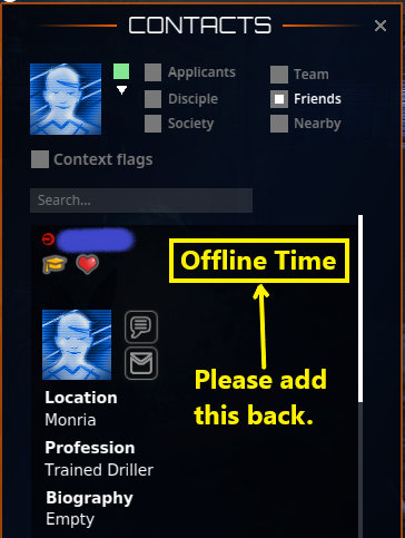
  • Title: Offline Time no longer shows on Contact List
Description:
  • Current: Offline Time no longer shows for any offline friends
  • Suggested: Should be able to see how long a friend has been offline in contact list if they have this shared.
  • Reason: Adding this function will increase accessibility to social systems for old and new players alike. It was also present in the old UI.
Screenshots:
This screenshot shows a location where Offline Time could be re-added to the Contact's info:

ap8zk9m.png
 
Feedback
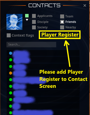
  • Title: Player Register not accessible via Contact Window
Description:
  • Current: Player Register is missing from the Contact Window.
  • Suggested: Player Register should be available via the Contact Window (it was accessible there in the old UI).
  • Reason: Adding this function will increase accessibility to social systems for old and new players alike. It was also present in the old UI.
Screenshots:
This screenshot shows one way the Player Register could be added to the Contact Window:

4DtGXYa.png
 
Feedback
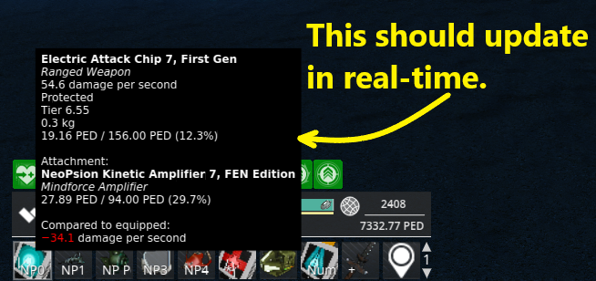
  • Title: Mouseover of Action Bar Tool does not update in real-time.
Description:
  • Current: Mouseover Action Bar Icons does not update the TT value, etc.. in real-time like it did in the old UI.
  • Suggested: Hovering the mouse over the equipped tool/weapon should update the TT value, etc. in real-time.
  • Reason: This was in the old UI and it allow players to stay better informed while playing. It leads to smoother gameplay.
Screenshots:
This screenshot shows which information should update in real-time as an item is used and decays, etc.

CvuoXri.png
 
Feedback
  • Title: Map and Contact Icons missing from Main Menu Bar.
Description:
  • Current: Map and Contact Icons missing from Main Menu Bar.
  • Suggested: Add Map and Contact Icons on Main Menu Bar.
  • Reason: adding these icons to the Main Menu Bar will increase accessibility for new users and restore access as it was in the old UI.
Screenshots:
This Screenshot shows both the Old UI and the New UI and the missing Icons on the New UI.

LTJFclH.png
 
Feedback
  • Title: Teleporter interface is hard to use. Specifically the scroll bar is hard to click on
Description:
  • Current: The scroll bar next to the tp names is hard to click. It's faster to click in the middle/bottom and have the tp you want show (or at least be closer if you miss your mark)
    This is a common problem for al interfaces that have a scroll bar. They are simply to thin to interface with easily.
  • Suggested: widen the scrollbar to make click on it easier
  • Reason: It used to be this way and removing it does not improve the interface, it makes it worse
Screenshots:
index.php
 
Feedback
  • Title: Storage/inventory is 13 columns wide, should be 14
Description:
  • Current: storage/inventory is 13 columns wide, making it hard to "fill" with most common icons. Specifically, the uneven number of columns causes issues
  • Suggested: Make them 14 columns wide. That'll fit many common icons (I.E. armor plate sets) perfectly
  • Reason: icons of 1, 2 or 3 width are much easier to fit into even numbered columns
 
Feedback
  • Title: Sell to TT summary too small
Description:
  • Current: Sell to TT summary is too small, requiring unneeded scrolling to confirm multiple items
  • Suggested: Make the summary almost as tall as the trade terminal interface
  • Reason: Unneeded scrolling is unneeded
Screenshots:

index.php
 
Feedback
  • Title: Storage/inventory is 13 columns wide, should be 14
Description:
  • Current: storage/inventory is 13 columns wide, making it hard to "fill" with most common icons. Specifically, the uneven number of columns causes issues
  • Suggested: Make them 14 columns wide. That'll fit many common icons (I.E. armor plate sets) perfectly
  • Reason: icons of 1, 2 or 3 width are much easier to fit into even numbered columns
This! X1000 👍👍👍
 
Feedback
  • Title: Teleporter interface is hard to use. Specifically the scroll bar is hard to click on
Description:
  • Current: The scroll bar next to the tp names is hard to click. It's faster to click in the middle/bottom and have the tp you want show (or at least be closer if you miss your mark)
    This is a common problem for al interfaces that have a scroll bar. They are simply to thin to interface with easily.
  • Suggested: widen the scrollbar to make click on it easier
  • Reason: It used to be this way and removing it does not improve the interface, it makes it worse
Screenshots:
index.php
Also make the window stick to the last position it was used at.

Vehicle bar got that fix too!
 
Feedback
  • Title: Map and Contact Icons missing from Main Menu Bar.
Description:
  • Current: Map and Contact Icons missing from Main Menu Bar.
  • Suggested: Add Map and Contact Icons on Main Menu Bar.
  • Reason: adding these icons to the Main Menu Bar will increase accessibility for new users and restore access as it was in the old UI.
Screenshots:
This Screenshot shows both the Old UI and the New UI and the missing Icons on the New UI.

LTJFclH.png
Allow us to modify these icons, maybe not the amount but what is in it. 🤞
 
At least my inventory is at least 1/3 of (full)screen width.
 
Thanks for the work you have done so far on the Message Center but it is still buggy af and a nightmare to work with.

My #1 complaint is that it does not correctly register the number of notifications. Upon login, sure, but as the notifications are coming in, they are not being counted accurately. For example, I may get some new auction notifications while online, these are often not counted properly. And when I go to look at them, the number of notifications is lowered for each auction notification I click on, but then when I close the message center, I end up with a lower total then the actual number of system notifications (shop sales), which makes no sense.

Sometimes new auction notifications come in and are not registered which means the total number of notifications hasn't changed and I have missed auctions in this way because it expired and I hadn't even been alerted that I had been outbid 5 minutes before the auction ended; very frustrating.

Not to mention, when new auction notifications come in, they are not placed at the top and I often find myself having to scroll through 10 pages of auction notifications to find the new ones.

I hope that stuff can be fixed soon. It wasn't like this before you started messing around with UIs about 4 years ago...
 
An example of what I mean:

index.php


The Message Center icon at the top says I have 79 notifications. When I open the Message Center, I see I actually have 84 System notifications. How does this happen.

So then the next 5 Auction notifications that come in won't actually change the number 79 at all, making me miss a whole bunch of auctions because I never even saw I had been outbid. And this is especially true when combined with the fact that new auction notifications are not received at the top anymore, they could be several pages away; so I often find myself having to go through almost 10 pages of auction notifications before I can find the new ones (with orange number, meaning it's a new notification).

Please fix this crappy message center.

And for god's sake, add a ledger so we the players can audit all of the entries changing our PED card balance, it is ludicrous we don't have this yet.
 
Back
Top