Help: UI Release: Feedback Thread

Status
Agree to disagree, other games have it, why can't this one.
Other games have no stakes and don't matter from an economical point of view. I also don't agree that should be a thing in ANY MMO/MOBA, etc.
 
Other games have no stakes and don't matter from an economical point of view. I also don't agree that should be a thing in ANY MMO/MOBA, etc.
What have stakes got to do with it? It's a QoL thing. I can be looking at my screen and still not notice I'm dying, because I'm reading an info window, or a PM or something.
 
Feedback
  • There are small frame stutters when multiple action texts are generated
Description:
  • When fighting a mob and multiple action texts go off at the same time, there are small perceptible frame stutters. These weren't present before the update. It makes the gameplay experience slightly choppy.
    Specs: Ryzen 5 3600 / RTX 3060
    Running in windowed mode 1080p

We are currently investigating this issue.
 
Feedback
  • Title: Weapon activation does not work unless you press "F"
Description:
  • Current: When you switch target (TAB) and click the mapped key for a weapon (e.g. "1") the shots deal no damage, you have to press "F" to start damaging the creature. The weapon activates, there's an animation, but no damage is dealt and no ammo is consumed.
  • Suggested: action bar mappings should work when hunting, this is specially bad when using taggers.
  • Reason: common sense
This seems to work fine for me?

EDIT - If I'm out of range, I do not move to target, however, if in-range, I can damage mobs by pressing 1.

Are you sure you didn't put your weapons in the Shift + 1 action bar (you probably haven't but just double checking)
 
Last edited:
We are currently investigating this issue.

If it helps - I experience this and this frame stutter while lots of loot is being generated (like from mobs on next island). Relog works but after almost an hour problem is back again
 
Feedback
  • "Left Mouse Button Interacts" not working with mobs
Description:
  • When I have my weapon equipped and auto use tool active I click a mob and nothing happens.. the avatar used to run over to the mob and start shooting that mob, now it starts shooting the air in place, basically the mob doesn't become selected when I click on it.
  • It does work as intended when I click on a dead creature, avatar runs over to the creature and loots it.
  • Thanks for making the buff icons larger, I couldn't tell which is which before unless I hovered the mouse pointer over them and read the descriptive text!
Hope they fix/add point and click on mob targeting. 👍
 
Feedback

- short lists in different tabs in UI

Description
- Current: right now lists like professions, skills, contact list etc, are displayed in short lists in multiple tabs.
- Suggested: a list that can be scrolled
- Reason: works faster, less cumbersome
 
Last edited:
Well I have few bad opinions about this new UI.
1. It is quite unreadable, colors merge together, on my PC its not to awful, but on my laptop its very hard to read the UI.
2. I cant split items by PED count, I can only split em by number, So if I have 71230 items. How am I supposed to know how many PEDs that is ???
3. It would be awesome if they would bring back old UI.
4. Radar is small
5. Buttons are small and they merge with the background sometimes.
6. Why did they even change all this, when old UI was ok ?? Instead they could fix bugs that are for years.
 
Feedback
  • "Left Mouse Button Interacts" not working with mobs
Description:
  • When I have my weapon equipped and auto use tool active I click a mob and nothing happens.. the avatar used to run over to the mob and start shooting that mob, now it starts shooting the air in place, basically the mob doesn't become selected when I click on it.

Do you have the "Left Mouse Button Interacts" under Options > Gameplay toggled on or off?
 
Feedback:
There is no longer an option to create an ''Armor set icon'' to place onto the action bar/ Screen.

Description:
With the old interface i was able to have multiple different armor sets as icons to enable easy and seamless switching between armor sets/ clothing sets.

Now the only way i am able to switch/equip/unequip clothing and armor sets is by opening the inventory and selecting these though the loadout icon at the bottom left of the inventory panel. This is bulky and takes longer than pressing one icon to equip the armor set and opening the inventory takes up a lot of critical space on my screen when i only have a 15'' monitor and low resolution mode.

Remedy:

Please re-enable the drag and drop out armor set icons so i can attach them onto my action bar.
 
Feedback
  • Title: claim deeds waypoints
Description:
  • Current: need to add waypoint 1 by 1
  • Suggested: allow to select severall claim deeds and create waypoints with one click
  • Reason: So that only need to click once to mark all the claims on map, saves time and effort.
 
index.php
 
Hi, Lea here o/

My opinion and some questions and comments about new UI. Negative notes may look scary long but it is just because if something is good or great i say it is awesome and thats it :p but if it is problematic i try explain 'why' i think that, and i provide many details.

What i found nice or even great:
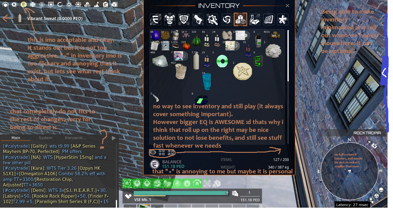
- Bigger inventory is really nice and it look professional
- Those little icons that must be on screen are actually little now so this is awesome to me ^ ^ more free space on screen
- Skills, professions, mission logs, looks cool and professional
- We can check codexes from other planets now! \o/ wohoo!
- being able to bind weapons and tools under 123456 so easily is nice
- Dark blueish color theme :3 (however there are like 5 themes at once but about it lator :p)
- More professional look
- Less aggressive globals flicker
- Triangles that show if mob is aggroed or not

What i find problematic or weird:
- RESIZING. Radar can be resized however it is still in my opinion BIG even when on minimal settings, if someone do not use it often it is problematic as hell because it takes a lot of space, would be nice to have option to make it small. Also when on full screen radar cannot be draged to the bottom and it again hang a little bit higher than the end of the screen
- ESTHETIC DETAILS.. Loot we earn is not showing on maximum left side but around middle of second icon, which is mildly infuriating :p we lose space again
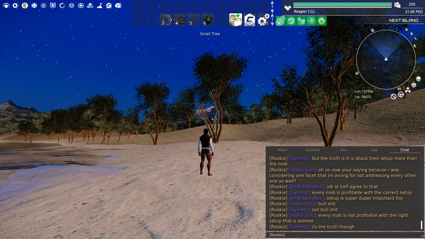
- CHAT. Chat is... weird... It do not fit rest of the UI completely in my opinion, and colors are also kinda not fitting. This is tough to figure out but maybe letting players edit literally every color there: nicks, background of chat, rest of the letters, will be good? It just looks like its done in a hurry and that orange bar that is showing only when we write is also meh in my opinion :/ And again being able to make it smaller and more compacted will be nice, but tabs are not changing size when we make it smaller so im not sure what is good solution here. I just see it is... poo poo :d. Bold fonts are nice option tho. I know colors are very personal thing, some will like different colors some will not, but current chat look like its bugged or smth or in old version that do not fit rest of the changes :/ many will also want to make it tiny, or even hide it behing screen and then roll it out. It maybe good idea to just add option to all those systems (radar, chat, inventory etc) to 1. see it all the time 2. see it only when you hoover mouse near there 3. keep it hidden unless you click small key icon somewhere near that hidden bar.
When i use chat and click ENTER i need to again click chat to write another message. So if i send 20 messages i must click chat 20x times which is crazy ;d we want to respond and we open 20 tabs and teleport to base xd
- COLOR THEMES. maybe those small icons will be nicer with a little blueish background behind them? thats tiny thing but would make everything fit to new inventory. Similarly maybe weapons and so on will improove with some blue accents. Blue color is nice :> And if it is a theme which i believe it is, there are a lllot of different themes out there... pure white, or grey with orange, or grey with white. Inventory menu looks cool and proffesional so making everything more similar to it (it doesnt need to be 1:1, but just some accents) imo gonna improove situation by a lot and add consistency. Cause now many cool stuff like inventory skills item descriptions got that dark blueish tint in it and for some reason radar chat etc is comepletely grey, or something is just full white etc. Too many themes at once or not well accented one theme.
- PLACING OF NAMES ETC. My friend sent me pictures that some names are displayed high in the air, names of trees can be debatable if it is better when they are on the middle or so high (i think they're too high but it may be personal thingy) but mob names flying up high in the air when those monkey are tiny, this need a little fix there.
- UNIDENTIFIED ICON. What means that icon near health bar? If it dont have any purpose i think it may be distracting and make people wonder what is this, will it change? what that means? i forget to mark it in paint but it is next to health bar, on the left. Kinda check mark but im not sure.
- PED BALANCE VISIBILITY. near ped balance are some icons and it looks messy, we like looking at our balance so lets move them somewhere else so it is clear and nice there.
- MOVEABLE PANELS. Would be nice to move "tracked" missions and or challenges more easily on the screen. And they are grey + white this time. Too many color themes :(( Dark blueish + white (like in inventory) imo is the best option, so adding everywhere those accents may provide better consistency in colors. Sometimes orange is okay too but on the bottom of chat it is mildly infuriating i dunno why, maybe because it changes non stop when we hunt or chat, i know it want to show that we got chat clicked but still its infuriating. That flickering line near place where we write is enough to show we got chat clicked.
- ICON PLACEMENT. Psion icon is on my health bar even tho it is not connected to my health, and i am not even using it. new people will wonder if that health is avatar health or item health.
- DETAILS. above ped amount i see "1" i think it means number of shots i can make but i am using sweat tool tho so infinity icon will be better. And maybe some small info for new players what that number means actually "uses" or smth, or maybe just when we hoover on this to show "uses" on black background, just like it shows VSE when i hoover on that hand icon. ... Now that i think about it VSE tool shouldn't be a fist icon :p

- INTUITIVE INTERACTING, SIMILAR TO MOST GAMES. Friends also say they got problems with canceling interactions, they click npc and struggle to cancel it, i also find it now hard to define how to use something ONCE how to use it non stop, and how to cancel it, but maybe it can be changed in options somehow, at least auto use is there, dunno about canceling actions. Usually we left click to INTERACT and righclick to CANCEL it, in other games.

Overall, to me this patch is a POSITIVE CHANGE, esspecially icons, menu and inventory, and codex, and weapon choice, but i also hear opinions that it is bad, i believe chat is the worst part for sure to MANY, so fixing it plus some other stuff will result in happy customers. Imo direction is great but we need those fixes. Ability to hide some bars or make them roll up when needed etc.

I hope this helps to manage that update because at least i liked the overall direction of changes. They are not perfect but it is kinda usual that after implementing something we figure out "oh this is too much on the right" "this is kinda big" and so on. But i didn't saw so far any change that would be like... Horrible DIRECTION of changes; huuuuge depo icon on the top of screen that flicker like crazy and so on xPP

Pictures:


All the best for workers, and players too. \o/
Lea
 
Feedback
  • Coords in Radar
Description:
  • Current: No Coords in Radar
  • Suggested: Show Coords in Radar like in the past
  • Reason: Do our life more easy...
You can turn this on in options UI
 
Feedback
  • Title: Item sets
Description:
  • Current: You can only edit and wear item sets through the inventory, mouse to item sets and find the damn item set then equip.
  • Suggested: Put item sets back on gui buttons
  • Reason: When hunting and during pvp I need a one button option for swapping gear. Nobody has time for all the mousing around when there's an Atrox Stalker or skilled player trying to murder them.....
 
Feedback
  • Radar Grid Lines
Description:
  • Current: Missing grid lines on the new radar
  • Suggested: Re-add the old grid lines back to the radar, even better would be the ability to click on N,S,E,W on the radar to automatically set your direction, so your avatar doesn't stray off course.
  • Reason: They were very useful when mining for setting your heading ie: N,S,E,W etc.
 
Feedback
  • The radar center is an equilateral triangle, which is confusing
Description:
  • Since the sides of the triangle in the center of the radar are all equal in size, it is confusing to look at and determining which direction it's pointing. The highlight cone is there and does help, but it triggers something in me every time I look at it. Make the triangle slightly longer in the direction it's pointing to fix this.
 
Feedback
  • I don't like the radar
Description:
  • Radar should have a crosshair. When hunting in the dark it's hard to find the mob when using long range weapon. When flying in space/running and i wanna go in a straight direction a crosshair would be nice. Also remove the sector formed highlight, it's disturbing and no good. Also make it possible to have a solid background, sometimes it's hard to see stuff.
 
give the opportunity to use notebooks and fix the window to go outside the screen and stay there
 
Hello found 1 bug i think is important with new VU item Limit not show up
That happen when click estate terminal it only show how much placed but not The limit
on Apartments and shop
 
Looks nice, but no clue how to get my setting back ... This action bar thing is number 1-9 ... I like to use keys like

F1-F4
^

... am I still able to do that, just tried 10 minutes, could not find it, am not patient enough and dissapointed that MA has not kept my settings or at least given a tutorial ... Can anyone help?
 
am I still able to do that, just tried 10 minutes, could not find it, am not patient enough and dissapointed that MA has not kept my settings or at least given a tutorial ... Can anyone help?
They have multiple tutorials. If you don’t have patience with setting up keybinds, I’m terrified to see your ped card
 
Looks nice, but no clue how to get my setting back ... This action bar thing is number 1-9 ... I like to use keys like

F1-F4
^

... am I still able to do that, just tried 10 minutes, could not find it, am not patient enough and dissapointed that MA has not kept my settings or at least given a tutorial ... Can anyone help?

Here is a tutorial:

 
Status
Back
Top