Xen
Mutated
- Joined
- Sep 10, 2005
- Posts
- 10,689
- Location
- Omegaton δ Complex, 12A
- Society
- AO
- Avatar Name
- Xendar Xen Xal
Yes, in case we forget who we are.The name display should not be an option but permanently displayed all the time.
Yes, in case we forget who we are.The name display should not be an option but permanently displayed all the time.
")
The name display should not be an option but permanently displayed all the time.


On behalf of the Uber players - I will say we do like this function so that we can look at our massive pedcards while hunting. The rest of you will be able to visually track your failure in real time.
On a side note - It's better to have options over permanently having a fixed thing, so don't understand your logic - If permanently showing pedcard I would be with you, but here you will have an option - Celebrate it
Yes, in case we forget who we are.
Simply don't accept any screenshots where they haven't elected to show their name.Ped balance should be optional.
Not giving an option to remove name is about not giving any opportunities to bad actors.
The argument for non-optional visible avatar names is about exposing shady or EULA breaking behavior in general, and actually have some kind of ”proof” who did it. The argument is not about event screenshots.Simply don't accept any screenshots where they haven't elected to show their name.
The argument for non-optional visible avatar names is about exposing shady or EULA breaking behavior in general, and actually have some kind of ”proof” who did it. The argument is not about event screenshots.
It’s not even my argument, I was pointing out where Xen and George seemed to misunderstand each other.You do understand that this is only on your own screen right ?
Everyone else will be able to see your name.
Could not have said it betterI have a real issue with the transparency of the chat box. The scenery bleeds through so much that the contrast between text and chat box background is almost lost, making the text almost unreadable in many environments. Bleed through was already a problem with seeing dots on radar and is not better/worse with this UI.
I am also finding that weapons/tools/vehicles in action bars are much harder to distinguish. The item images tend to use a lot of medium to dark shades, and unlike the old desktop icons which used a light shade background, the new action bars use a darker background that does not contrast well with the item images.
The radar and action bar readability are irritating but I can live with them. Not being able to easily read the chat may be a game killer for me.

Agreed. Seems kind of important to be able to communicate in an MMORPGI have a real issue with the transparency of the chat box. The scenery bleeds through so much that the contrast between text and chat box background is almost lost, making the text almost unreadable in many environments. Bleed through was already a problem with seeing dots on radar and is not better/worse with this UI.
I am also finding that weapons/tools/vehicles in action bars are much harder to distinguish. The item images tend to use a lot of medium to dark shades, and unlike the old desktop icons which used a light shade background, the new action bars use a darker background that does not contrast well with the item images.
The radar and action bar readability are irritating but I can live with them. Not being able to easily read the chat may be a game killer for me.
It works fine for meCan you no longer activate an item by clicking on it In the action bar? I used to be able to change weapons and change and use a fap by just clicking on the icon
 , added a few things.
Not sure if mentioned yet, but the few things i found:
"Bugs"
- No minimap coords.
I heard several people having problems with that. I wonder if it is in specific settings that becomes an issue. For me avatar moves to mob when outside range before shooting just like earlierBug
Weapons activate when mob is out of range instead of running till mob in range to shoot?
This is especially annoying for arson chip as it causes a 20 second cooldown. Can we please stop the 20 second cooldown if you shoot the chip without hitting a target?
Please also fix the weapon activate before mob in range.
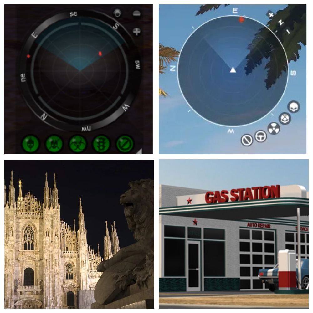
All this shows is how crap and dated the old one was.That’s how you run, run, fuss and don’t notice the beauty that’s nearby.
Today I stopped and looked around and realized how beautiful the radar was before, it’s like a Milan Gothic cathedral opposite a gas station.
Does it stop shooting after its dead? This is how it worked for me before a few weeks ago, now it just continues firing. so when i mouseover over a mob it shoots it.I heard several people having problems with that. I wonder if it is in specific settings that becomes an issue. For me avatar moves to mob when outside range before shooting just like earlier
It works exactly like before for me so I speculate that it is related to a specific setting in options. And for your question - no it stops firing after mob is dead until I press interact again.Does it stop shooting after its dead? This is how it worked for me before a few weeks ago, now it just continues firing. so when i mouseover over a mob it shoots it.
I heard several people having problems with that. I wonder if it is in specific settings that becomes an issue. For me avatar moves to mob when outside range before shooting just like earlier
Well, now the minimalism of the digital landscape is trending, and this is a matter of taste.All this shows is how crap and dated the old one was.
New one looks slick much more design behind it..
Feel it’s more what is right for the future and move to UE5. Which is the new.Well, now the minimalism of the digital landscape is trending, and this is a matter of taste.
You like the new radar design, I like the old radar design.
You scared me so much that I’m already imagining avatars on the UE5Feel it’s more what is right for the future and move to UE5. Which is the new.
Keep moving forward or die