NevadaJake
Elite
- Joined
- Nov 14, 2007
- Posts
- 2,859
- Location
- Nevada, USA
- Avatar Name
- Drake Slade Corbett
Is there a setting to keep the chat background from going transparent? It's hard to read when it's transparent
cmon, there is removed possibility to add as u wish icons, there is limit items what u can add, and position is restricted... well for 1999 year UI is good, but not for 2024... imagine blizzard would restrict wow to this ui...THE NEW HUD, ACTION BAR, UI EDIT MODE, AND ICON MANAGEMENT
Let's take a look at the most significant UI changes we plan to release in the UI update in February 2024. Here, you will find an image of the new HUD and a step-by-step guide to easily navigate the improved Action bar, UI Edit Mode, and Icon Management!
The updated Heads-up Display (HUD)
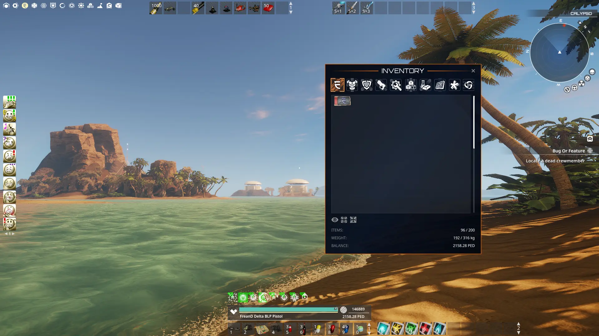
We kept an updated look and functionality in mind when updating and designing the new HUD for Entropia Universe. We decluttered the HUD for easier readability, made it a more attractive and clean design, and increased performance with added functionality and flexibility. In the image above, you can see the updated Radar, The Quick Bar to access the often-used windows, the Mission tracker, and a glimpse of the Inventory redesign together with one of the most significant changes, the Action Bars.
We will now guide you through some changes you, as a user, will encounter upon the first login after the update!
Actions
The previous Action Library has been revamped into Actions. Actions let players customize controls by assigning bindings to every in-game action and action bar. Using modifiers* (CTRL or SHIFT) for your bindings, you can trigger any action in the blink of an eye! The Actions fast search bar system and good overview make finding what you are looking for easy.
UI Edit-mode
To move or personalize your HUD UI elements and Action Bars, you need to enable UI Edit-mode. You can reset your settings by pressing the [Reset] button if the interface isn't functioning correctly or if you wish to revert to the original default settings.
How to access UI Edit-mode:
1. Press N on your keyboard to open [Actions].
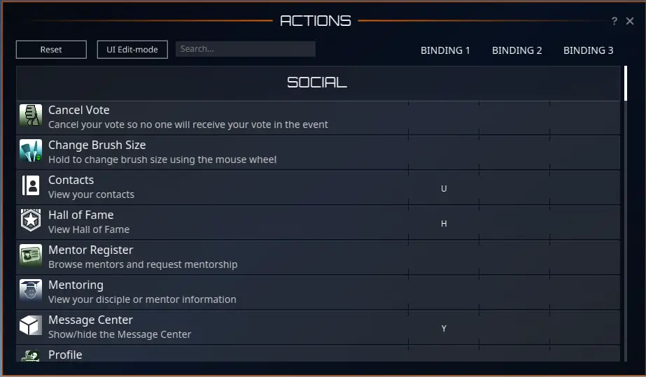
2. Click the [UI Edit-mode] button to activate the edit mode.
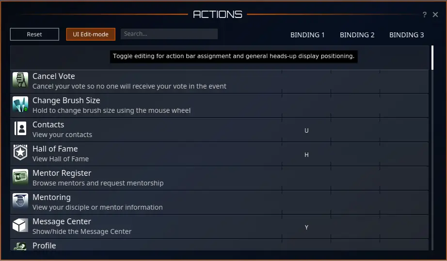
3. Customize your action bar assignments and the positioning of the heads-up display layout.
4. Close the UI Edit-mode panel by clicking the [UI Edit-mode] button again.
5. Done! Your changes are now saved.
Keybinding
Keybinding is split up into two parts. Keybinding immediately activates an in-game action or a slot in an Action Bar. Below, we will show an example of how to add a keybind to the Inventory and how to remove it.
How to set a specific key binding to an in-game action:
1. Press N on your keyboard to open [Actions].

Type “inventory” in the [Actions] search menu.
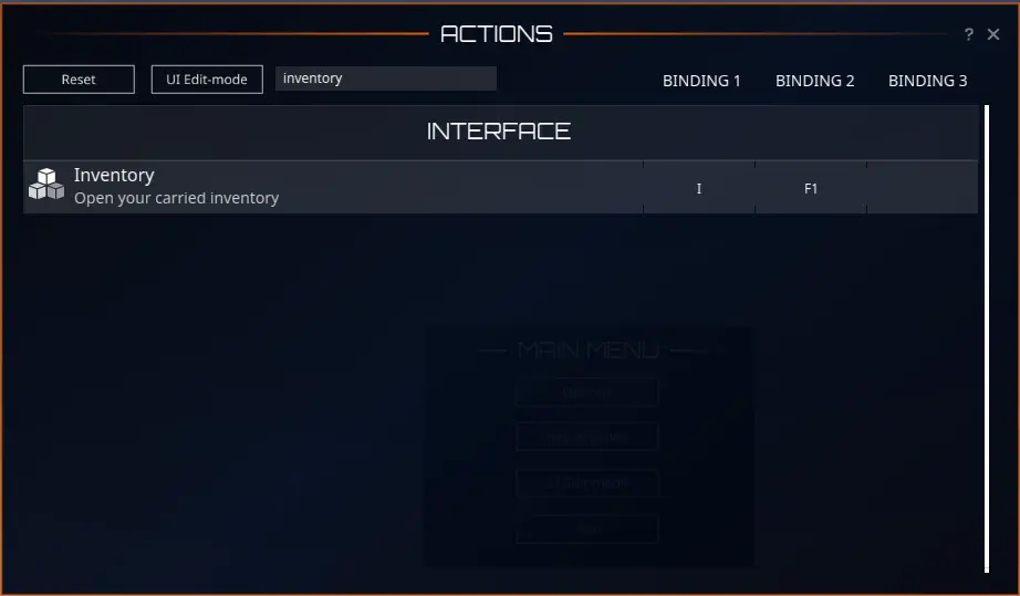
3. To add a keybinding, click on the desired row and binding column. In this example, we set F1 as a second keybind for the Inventory. (Please note that you cannot assign a single key to multiple actions.)

4. Done! Your keybinding is now saved.
How to clear in-game action keybindings:
- Press N on your keyboard to open [Actions].
- Type “Inventory” in the [Actions] search menu.
- Click on the keybinding you wish to clear.
- Press the [Clear] button.
- Done! Your keybinding is cleared
Action Bars
You can have up to five Action Bars active in your window, with ten slots and three pages each. By default, two Action Bars are enabled. With vast customization options, Action Bars has a dedicated category in the Actions UI where you can set binding per bar and slot.
How to access, edit keybindings, and edit your action bars:
1. Press N on your keyboard [Actions].

2. Type “action bar” in the [Actions] search menu. All action bars and their corresponding keybindings are now visible.
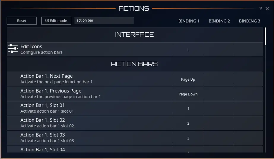
3. To add a keybinding, simply select the desired action bar row and binding column. Change the keybindings by pressing any key of your liking. (Please note that when you assign a key to an Action bar slot, the same key remains bound to that Action bar slot across all the three Action bar pages.)

To add a new action bar, press O [Options] and go to [Interface]. For example, click on the dropdown list for Action Bar 3 and choose if you want the bar to be positioned horizontally or vertically.
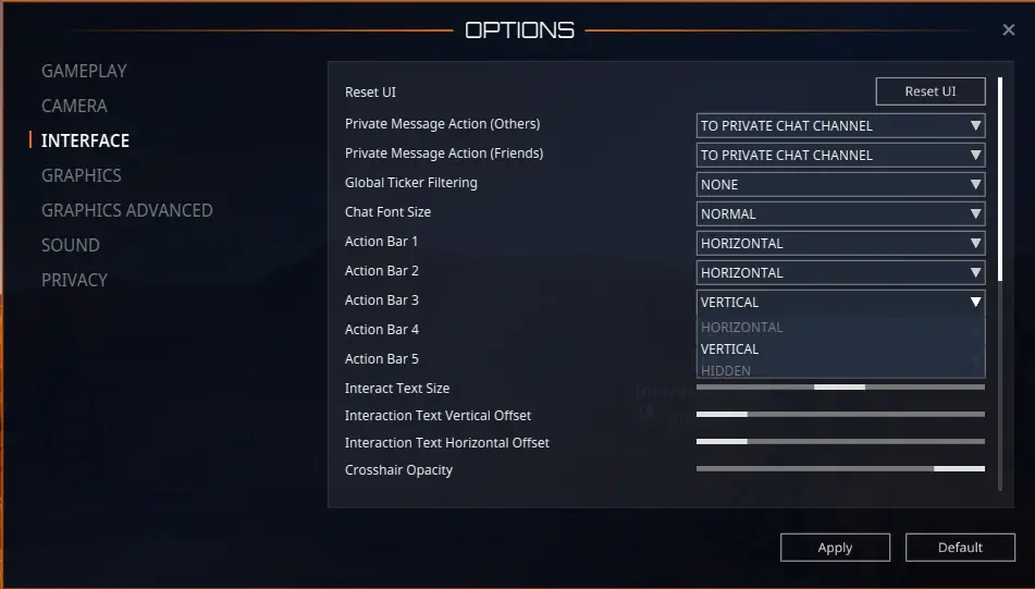
Click [Apply] to confirm the changes. The new action bar will be visible in your window. If you wish to hide your action bar, choose the “HIDDEN” option in the dropdown list.
*In response to community feedback, we’ve introduced an option to disable CTRL and SHIFT modifiers in the new UI. When disabled, modifiers serve as keybinding keys.
We hope these guidelines enhance your experience with the new UI! Join us on the Planet Calypso forum to discuss the new UI and share any questions you might have!
Originally Posted Here
its featureIs there a setting to keep the chat background from going transparent? It's hard to read when it's transparent
I hope it will be BIG one, this UI feels like we downgraded to Project Entropia from 1999.I wonder what the expected cycle loss is from MA due to this update...
1 button press settings and engagements have turning into 3/4.I hope it will be BIG one, this UI feels like we downgraded to Project Entropia from 1999.
Transparency is awefull, lack of screen customisation like we have is a big no for me.
In options meny, under interface there's only action bar 1 visible at first when logging in i think. The other bars are hidden. So just change action bar 2 or 3, 4 and 5 if you like to horizontal or what you prefer, then they appear on the screen and you can drag icons to their slots. I figured that out way late lol. I could almost make it look like my old setup now. LovelyHow do you set and display several action bars on the screen just as in the first screenshot of Bertha?
I can't seem to do that.
Thanks for the help.
Many thanks!!! That was driving me loopy
Way right of the buffs you see a little gray rectangle with a few white stripes in, hit L and pull on those.I've noticed the place to move the bars during edit is to the right of it, but how do you move the buffs? I've moved the lower bar so my health bar can be lower, but my buffs stay where they are a bit higher up ...
That auto deactivates is perhaps my biggest gripe so far on actual functions, but I dislike loads about the visual stuff and then some ...
It is blatantly obvious that the entire QC is outsourced to the playerbase, which is already known practice here. I did say that my first impression was positive and welcome the initiative at all, but once you discover the 1000 details which worked before that are now broken, and the amount of OBVIOUS issues which wouldn't pass for release anywhere I worked before in development, you know it simply cannot be unintentional. That there is irritation when ways we all got used to are changed is natural, but these parts are not meant by that.Amidst my unhappiness, I'm 'happy' to see people who are speaking their minds on this, as well as, I think, angry, about what an absolutely **** poor update this has been.
The previews really did not do justice to the scale of the awfulness, even though we had plenty to comment on from the little we were shown.
Not only are the visuals botched, but we also have features that have been changed for the worse in many places. It's not only going to be about bug fixing but the really really really sloppy implementations all over the place.
Even psychologically that the reload indicator is now on screen twice, once on the lower bar and also centre screen as a smile that disappears over and over again, drains me. That the word PROGRESS is writ large on what I want to one of the smallest windows and is by far the biggest text I have anywhere on screen, totally defeats any plus I might get from actually making progress. And I've set the globals to show max only because I dislike that too. AND that the icons are often totally stupid as I knew they would be, such as my 'scavenger' flying vehicle.
Size, transparency, colours, positioning, windows not even positionable right to the edge, let alone beyond to hide some of what we don't want... I'm seriously considering my position too... UE5, hahahahahaaaa, good luck with that folks! The best we can hope for is never!
No way. PE in 2004 was way more badass than what we got here !I hope it will be BIG one, this UI feels like we downgraded to Project Entropia from 1999.
Transparency is awefull, lack of screen customisation like we have is a big no for me.
hehe i don't wanna be Mr PinkWhy does the HP bar have to be TEAL? This has to be able to change. I cant stand the teal color and now im forced to have it. hmmm... please give players options on colours!
This could have been done without screwing everything else up.do like being able to see all codex from other planets,
The health bar looks like a damn turquoise schlagbaum on the monitor. I read that In color psychology turquoise controls and heals the emotions creating emotional balance and stability. It is not true. this is a vile lie, this is a damn conspiracy of psychologistsI've been taking things almost literally step by step.
Dear diary: today I looked at my first mob. Is the hp bar ALWAYS going that sickening colour? Am I never going to kill a mob again in protest?
I also looked at my map for the first time this vu. Why is the small map so bloated around the edges now? It makes a mockery of having the damn thing small in the first place. Enough for now again - taking another digestion break!
I don't think its possible anymore.With the old action book. I had some functions that I used but rarely, so if I did want them, I'd just open the action book, use the categories tabs to jump to the correct page and activate the action by clicking it. A classic example would be a rarely used emote.
It wouldn't be worth me binding it to the keyboard or even a quick bar or screen icon.
Anyone know if it's still possible to do this sort of thing? i.e, activate a rarely used action without binding/placing it?
Cheers for advice
Wistrel
With the old action book. I had some functions that I used but rarely, so if I did want them, I'd just open the action book, use the categories tabs to jump to the correct page and activate the action by clicking it. A classic example would be a rarely used emote.
It wouldn't be worth me binding it to the keyboard or even a quick bar or screen icon.
Anyone know if it's still possible to do this sort of thing? i.e, activate a rarely used action without binding/placing it?
Cheers for advice
Wistrel
just logged in first time with new UI and i have to give feedback:
no list view where we can sort by PED value is really sad imo
