UI Release: Feedback Thread Part 2

Feedback
  • Title: Dynamic repair state info in status display
Description:
  • Current: As the PED balance is no longer permanently displayed on screen, its space in the equipped item status display is now free for more useful information. (Very grateful for this change! 👍 )
  • Suggested: Put the equipped item's repair status in % there instead.
  • Reason: This would enable keeping track of repair status dynamically without interrupting activity flow. This might supersede previous suggestions of indicating the current two low-tt thresholds which inform the traditional chat warnings as text colours on the item name. Though ideal would be both, resources and motivation permitting.
 
Feedback: Remove brackets from item links posted in Auctionhouse textfield automaticly.

Current: Have to manually remove them each time you copy item links to auctionhouse. This is issue when you use auctionhouse alot!

Suggested: Make auctionhouse textfield remove any brackets in textfield.

Reason: quality of life and it is smoother to traders and all players who use auctionhouse alot!
 
Feedback
  • Title: Loadout administration
Description:
  • Current: The drop-down list of loadouts gives a better overview than the previous icon-only solution, where it was easy to forget and lose track of created setups. However, their easy accessibility has suffered a setback.
  • Suggested: 1. Enable tying loadouts to action bar slots.
  • 2. Include attachments into loadouts (most often desired with armour platings).
  • 3. In the drop-down list, indicate by highlighting/darkening which loadouts are available (carried), partly available, and unavailable.
  • Reason: No. 1, 2 have been suggested before, esp. no. 2 for a longer time already. The current momentum in development seems like a good opportunity to aim for implementing all of the above as a package.
 
Feedback

As you cater to all suggestions, feedback and wishes, it's easy to lose the overall design concept. Great work with granting our wishes of customizability and different mechanics, but I think especially the HP/reload dashboard is quite messy right now.

I have listed some feedback on current mechanics below, together with suggestions (see screenshots) of new window organizations that could perhaps clean up the design a little bit as well.


index.php


- PED balance moved from the dashboard to a separate widget, which you can toggle on/off in options. No need to cram it inside the same dashboard together with HP and reload.

- Separated HP and reload bars. When the HP bar is right on top of the reload, they interfere with each other so much visually as they move back and forth. They can't be above and below each other imo, have to be separated left and right.

- Adjusted width-height ratio of both HP and reload bars. They are hard to follow when they are long and slim. Especially the reload bar does not have to be long at all, the important thing is simply to have something to time your item switches to.

- Current HP displayed inside HP bar and updates as you take damage. With toggle on/off in Options.

- Avatar name displayed below HP bar instead of inside HP bar.

- Added % left of TT for the equipped tool - saw that in a previous post, great suggestion.

- Made the center of radar a dot again. The big arrow of current UI is too big, it blocks the mobs nearby. You don't need an arrow, since the direction you face is already clear.
Hire this guy to the UI suggestions team. Absolutely killer suggestions and example given. I'd love if we could have it like this a lot more useful, no need to have tiny reload bar we currently have.
 
Feedback
  • Title: Image control of items in info windows.
Description:
  • Current: When you open an item's info window, the only thing you can do to the image of the item is watch it rotate.
  • Suggested: How it was before the UI update.
  • Reason: Because it was better that way.
 
Feedback
  • Title: Shop time things sold at
Description:
  • Current: The time at the top says 11:13
  • Suggested: Not needed as it says they date and time it sold at further down
  • Reason: It confused me and isn't needed as it doesn't display when things were sold as it just says 11:13 on all the posts (Note I also edited this post as I realised where the actual date was placed)
 
Last edited:
Feedback
  • Title: Mining Finder Interface
Description:
  • Current: shows radar and data regarding the claim
  • Suggested: would be ideal to see on finder all related info probes remaining included, probes and UA probes atm this info is placed down where uses for weapon are placed too, maybe the main radar should be integrated into a single window or let say the finder should mold around the radar with all probing and other data required for mining, is no point to see 2 radars for all most same reason, navigation, maybe a way to log all the claims the same way the chat works so at the end to save them in a pack of info ( claims, locations resources etc) - would require 2-3 pages where in the same way chat works data could be separated- show on map option for past claims, claims that require attention timing on them and all that
  • Reason: main attention is to finder while mining and nothing else, not even hunting despite the rare usage of weapon to clear the spot for unvanted visitors
apology if this was already addressed
:banana:
 
As other mention will be nice to option to chose for total hp as number in the hp bar also I really dont like the arrow on radar so again this can be made a choice.

Crafting filter is kind of annoying to be honest, should just be a simple search bar.
 
Repost from previous thread. Reason: it was corrected in patch 18.0.1 ("Fixed an issue where the Local Information banner display was presented with a delay"), but messages are delayed again.

Feedback
  • Title: Wave messages extremely delayed
Description:
  • Current: Wave event messages (Papoo and Boar on NI, unsure if it happens on other spots/planets) are very delayed - I got a message "entered ..." in the 4th wave, and they all appear one after the other
  • Suggested: Time it correctly, as it used to be
  • Reason: To know you're in the wave area, or if you left it
 
Feedback
  • Title: Loadout organization
Description:
  • Current: Not sure how Loadout was sorted, but no apparent logic in the order of the sets, for sure not sorted by date of creation, nor alphabetically
  • Suggested: Sort it alphabetically
  • Reason: Easier to find what you're looking for
 
Feedback
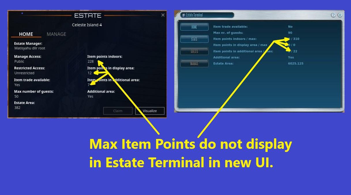
  • Title: Estate Terminal no longer display Max Item Points
Description:
  • Current: Estate Terminal no longer shows Max Item Points for an Estate.
  • Suggested: Estate Terminals should display the Max Item points for each area category in an Estate.
  • Reason: The number of Max Item Points an Estate can display greatly impact its value. Displaying this data on the Estate Terminal is important. This feature was available in the old UI.
Screenshots:

uh0jbzN.jpg
 
Feedback
  • Title: Selecting what residue to use (I know it's mentioned but i have a quick fix if its complicated)
Description:
  • You still cannot select the order of residue to be used while crafting. Please at least sort residue from the lowest quantity (up top) to the highest quantity (in the bottom). This would "fix" the issue but i would much rather just have the option, like i used to, to select the order myself.
 
Feedback
  • Title: (L) items tooltip stats updates in realtime
Description:
  • Current: When the tooltip is showed upon mouseover on an (L) item in the action bar, the information is not updated realtime anymore as it was before.
  • Suggested: Provide realtime information about (L) items on the mouseover tooltip on (L) items in the action bar.
  • Reason: To monitor how much peds are left on an (L) item in realtime while using the item.
 
Feedback
  • Title: Animation around cool down progress bar while tool is active (like in old UI)
Description:
  • Current: Nothing indicates that anything is happening "Is my VSE dead?"
  • Suggested: Add animation as in old UI
  • Reason: Good to see that the tool is busy
 
Feedback
  • Title: UI improvements
Description:
  • Current:
    Too large of a health / name bar
    Large buff icons
    Unable to turn off globals appearing completely
    Every global is recorded in messages slowing down client over time
    Normal font text is too large
    Minimap size too large for windowed play and doesn't go to the bottom of the screen (opacity for map and chat did help)
  • Suggested:
    Adjustable or slightly smaller health / name bar
    Smaller and removable buff icon bar
    Option to turn off globals appearing along with "none, 500, 1000 ped, 2000 ped filters"
    Option to disable storing every global in game in the messages
    Font text reduced or a small choice added
    Adjustability for minimap to be adjusted smaller than currently is or even removed
  • Reason:
    UI speed improvements
    Personal choice
Screenshots:
 
Feedback
  • Title: COPY/PASTE IN GAME INFORMATION FROM VARIOUS WINDOWS
Description:
  • Current: Unable to even highlight information from various windows such as Auction, Market Price, Message Center > Auction Notifications, Crafting Statistics, etc.
  • Suggested: Let us highlight the information to at least be able to copy/paste it into our notes/spreadsheets. Better yet, add a COPY or EXPORT button that would do this for us!
  • Reason: Many people copy/paste data from in game and without this functionality its a manual job, very tedious and tiresome.
Screenshots:

(example for Auction Notifications)
index.php
 
Feedback
  • Title: Loadout organization
Description:
  • Current: Not sure how Loadout was sorted, but no apparent logic in the order of the sets, for sure not sorted by date of creation, nor alphabetically
  • Suggested: Sort it alphabetically
  • Reason: Easier to find what you're looking for

+ Add item sett back to action bar so you can click a key to swtich item set and dont need to open iventory.
 
Feedback
  • Title: Make names over avatars/NPC's bigger/bolder/punchier/clearer against light backgrounds
Description:
  • Current: Names over avatars/NPCs are kinda straight from a word document. Feel they could use a little work in terms of size/clarity, ease of reading against different backgrounds etc. Depending on where you are, sometimes hard to notice a name over an NPC at al all.
  • Suggested: Make them a bit more punchier (perhaps more like the interaction text prompts?) Maybe at best add a slider to options for size and maybe some sort of background opacity. I think as a minimum they should look something like the bold option for text chat.
  • Reason: Doesn't look all that professional at the moment, sort of an after thought using standard writing font. Feels a little unfinished. Also hard to read against bright backgrounds as mentioned.
Screenshots: No need just go take a look at any NPC or avatar's name over their head
 
Feedback
  • Title: Bigger, original(s) or re-sizeable loot window(s)
Description:
  • Current: The new (rather dull/soulless) loot window is kinda small and doesn't seem to be re-sizable
  • Suggested: Ideally bring back the old ones (plenty of soul!) but keep the total value indicator (nice move there on that one) or make something new but similar to the old illustrated versions. If that's going "too much against the grain of the new UI", make the new/current one re-sizable or simply the same size as the old one (at least in terms of area for the icons).
  • Reason: Alf's art was awesome, the old windows were fun/unique and a nice nod to the history of the game. But regarding size, the new one is simply too small. It very quickly gets hard to see what is in it even by moving things around. It feels like a "first hack" or "unfinished"
Screenshots: Not needed just try hunting with the new window and see how quickly you loose track of what's actually in it. Can reference old loot window(s) assets for a bring back or reference for creating something new/similar/in the same spirit as the original
 
Feedback
  • Title: Bring back option to free rotate and zoom in on items in item view dialog
Description:
  • Current: Fixed distance/side on view of item e.g. gun, option to auto rotate around Y axis.
  • Suggested: Add back old ability to zoom in/out on and free rotate (multiple axis) in item view
  • Reason: It's a "work around a bug" I appreciate, but historically MA/Planet Partners have not exactly covered themselves in glory regarding item views. To date, it has been super common for an item to be displayed too close, too far away or other issue so as to make viewing it properly a challenge without use of zoom/freelook. I'm concerned the current rotate won't cut it. If nothing else though, even with item view mistakes not happenning, it's nice to be able to view something in more than one axis or to be able to zoom in on details.
Screenshots: Not needed. Just note that current options are only static side view or auto rotate around Y axis. I bet if someone put a gun to my head though I could find an item that isn't centered properly in the item view screen or is being viewed at an inappropriate distance.
 
Note: This one is me going a little (ok a lot) left field of the UI update, but forgive me for sneaking it in anyhow ,-)

Feedback

  • Title: Add functionality to shops to allow try on/out of clothes/equipment.
Description:
  • Current: Any appearance based purchase decision has to be made on the grounds of viewing an item's view dialog and not how it might look when activated on one's avatar. As such you might end up getting something that doesn't appeal once you try it on. Additionally, shops lack benefit over other sales options
  • Suggested: Give shops an advantage by adding a "try on" option for items that allow visitors to see what said item looks like when equiped on their avatar, say while ever they are within the bounds of the shop (or a distance range in the case of SC NPCs).
  • Reason: Advantage for shop owners, add benefits to owning a shop, boost to economy. Get malls populated by "window shoppers", see more activity in deserted areas of the game. More chances for social interaction as a result. Better community, better player retention rates.
Screenshots: Not needed but the way it would work would be identical to the current inventory item equip option. The only difference being the item would be auto unequiped once leaving shop/range of SC NPC. Item would never appear in avatars inventory though. [So no chance of duplication/selling]
 
Feedback
  • Title: Repair Terminal Clear Button
Description:
  • Current: Before the update, there was a "clear" button on repair terminal to remove all items from window. It's gone now.
  • Suggested: Bring back the button
  • Reason: 1st: It was there before; 2nd: People now have to close the window and re-operate the terminal
 
New hotfix is out!

If you're inside the game, you need to log out and back in to apply it:
  • It is now possible to hide an action bar, but still use any actions and items bound to it!
  • Nameplates should now show the Society correctly.
  • The notification UI (location banner) should no longer be stuck. We are aware that it is still not working entirely as intended though.

Could you provide a list with the things you will correct so that users of your service can look up if they have to post their findings or you already are aware of that bug?
 
Feedback
  • Title: Chat: tab-header should be visible without focus to see activity bulb
Description:
  • Current: No tab-header of the chat is visible if mouse isn't over chat
  • Suggested: At least show the tab-headers with the activity bulb on
  • Reason: I'm missing all messages, including system messages
 
Feedback
  • Title: Message Center-action icon should show indicator just like Message Center in standard toolbar
Description:
  • Current: the action icon stays the same until the end of time
  • Suggested: similar to the Message Center in the standard toolbar it should have a flag or bulb or something to indicate a new message there
  • Reason: We can't modify the standard toolbar. Because it requires too much space and I'm not happy with (the location of) the icons, I moved it behind the health bar, so I can't see or click it. I know, it's a personal preference, but the icons could still provide the same feature.
 
Links copied outside of game no longer stays as link , they never did 😅
its not outside the game necessarily, many of my backup notes in-game have the same issue. first item appears linked, if i link another item from a note it unlinks the first one as if it was only text. the guy has a point
 
its not outside the game necessarily, many of my backup notes in-game have the same issue. first item appears linked, if i link another item from a note it unlinks the first one as if it was only text. the guy has a point
Since when linked with onedrive for backup ?

Current issue is if u paste link in chat move focus out and again focus chat it goes to plain text but it's not same.
 
Since when linked with onedrive for backup ?

Current issue is if u paste link in chat move focus out and again focus chat it goes to plain text but it's not same.
that would be it!! thx!
 
Since when linked with onedrive for backup ?

Current issue is if u paste link in chat move focus out and again focus chat it goes to plain text but it's not same.
I do a backup in word with all my notes, speaking about onedrive has nothing to do with it i know, however as you mentioned after you past them in chat window and click inside inventory for example and go again to chat window they will turn plain text, i think both issues are co-related because before this update i could click on links that i had outside game in backup and now i can not
 
Back
Top